|
When I began blogging just over 2 years ago one of my goals was to give more insights into a common question - How do I create my unique chromogenic photograms? Over the past 2 years I have shared several posts which explain and illustrate my process as best I can in writing and photographs. See them below. Same Same but Different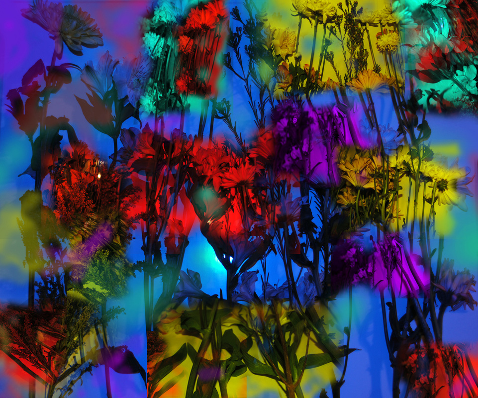 I work in darkness, and therefore feel more than see what I am working with. This allows me to create several pieces exactly the same but which yield different results. Read more here. Some New Works in the Wine Series |


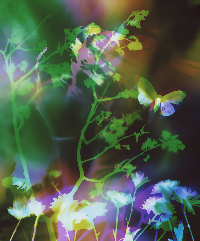
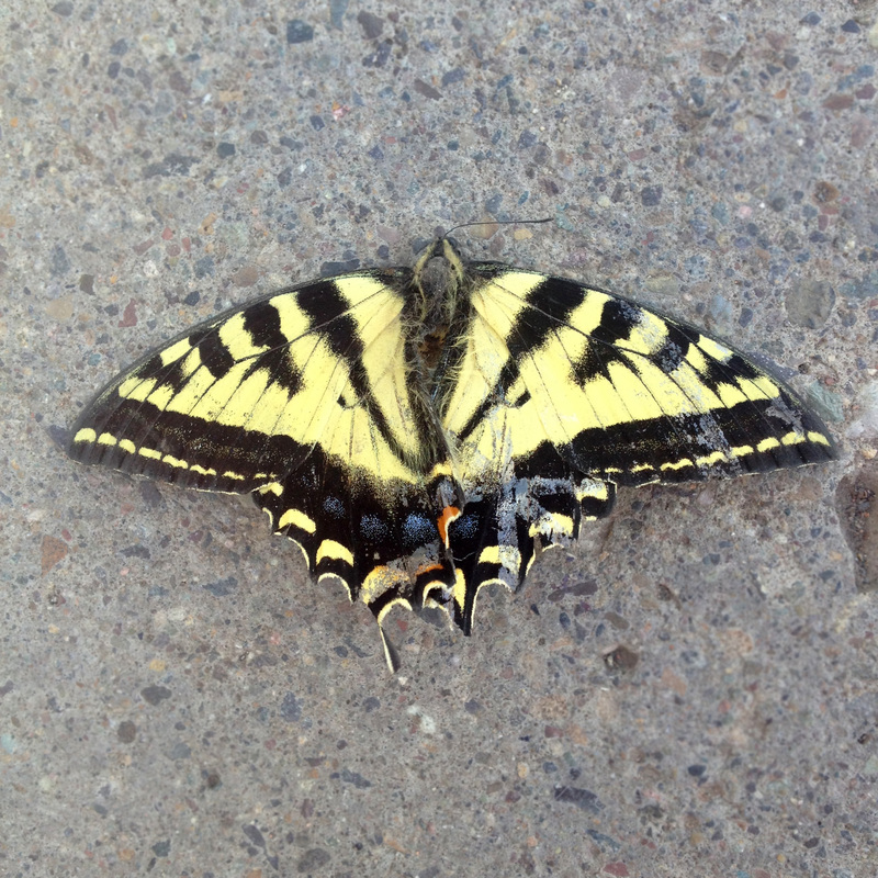 I found this butterfly on the sidewalk while walking down the street in Telluride, Colorado. | 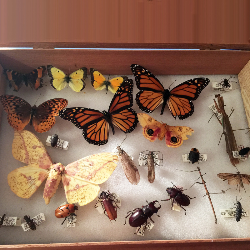 My husband bought me this set of insects and butterflies to continue my new explorations. |
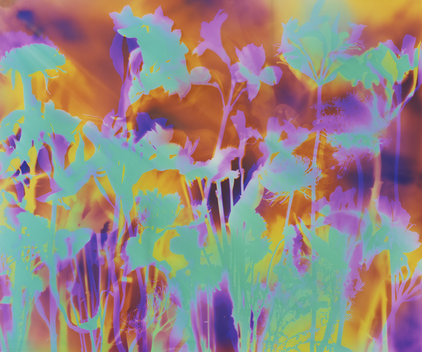
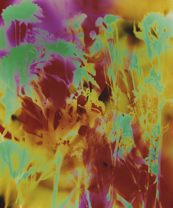
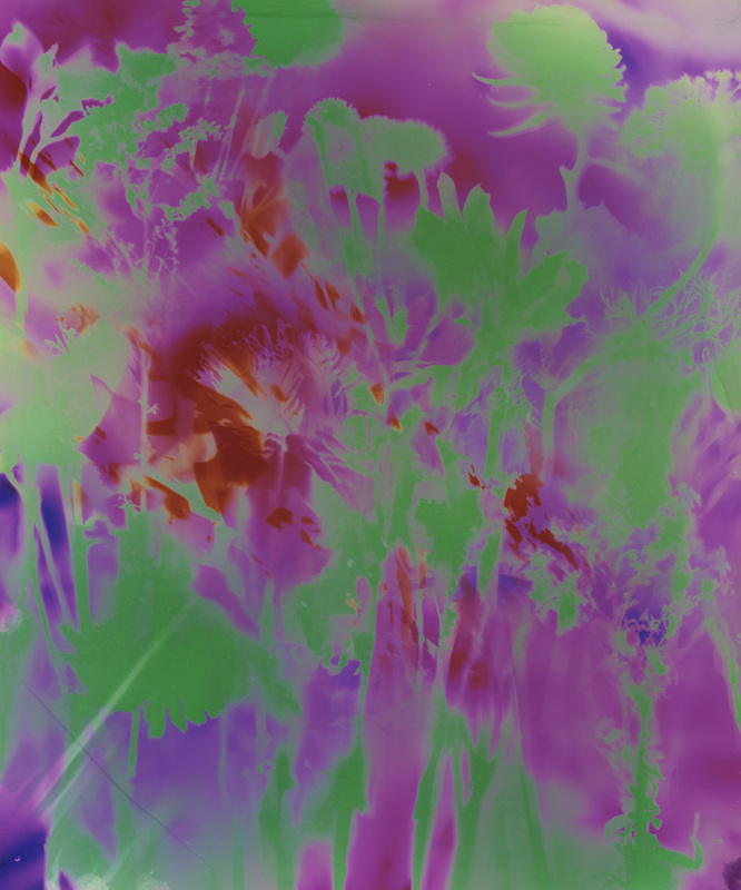
I created the below 10 butterfly images last quarter.
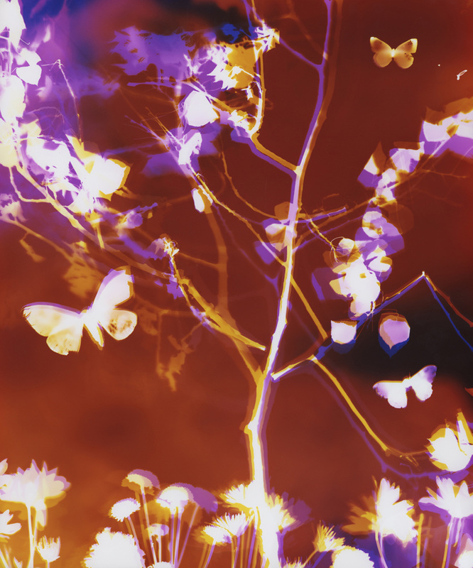
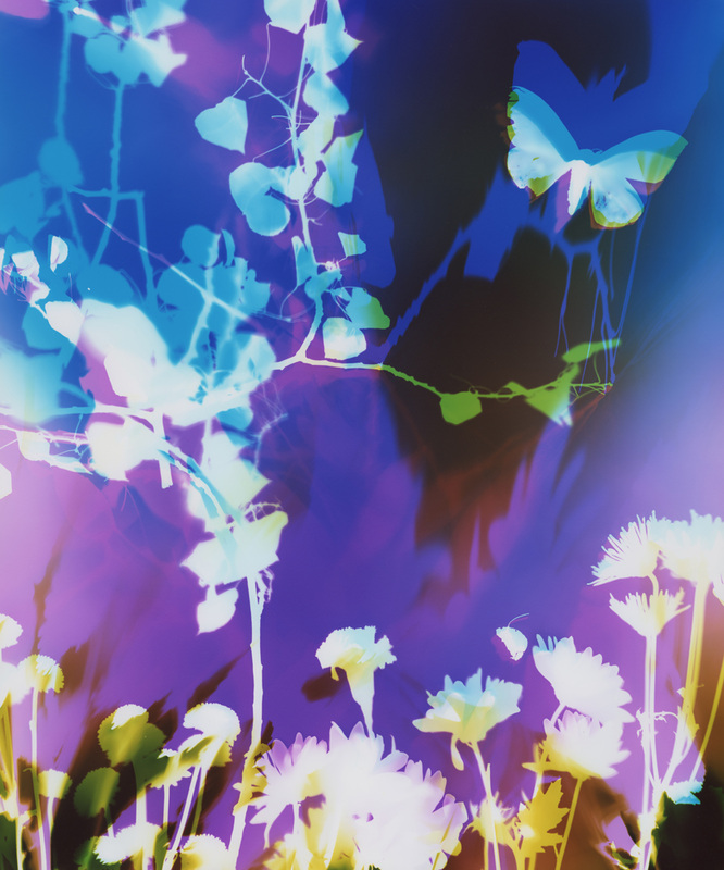
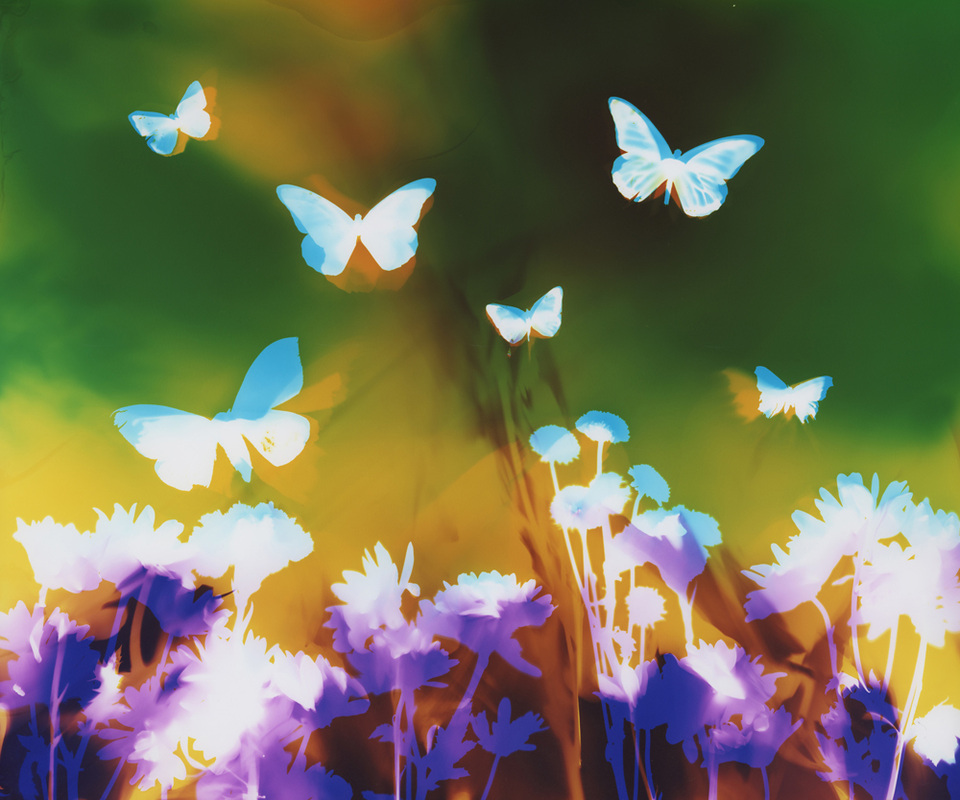
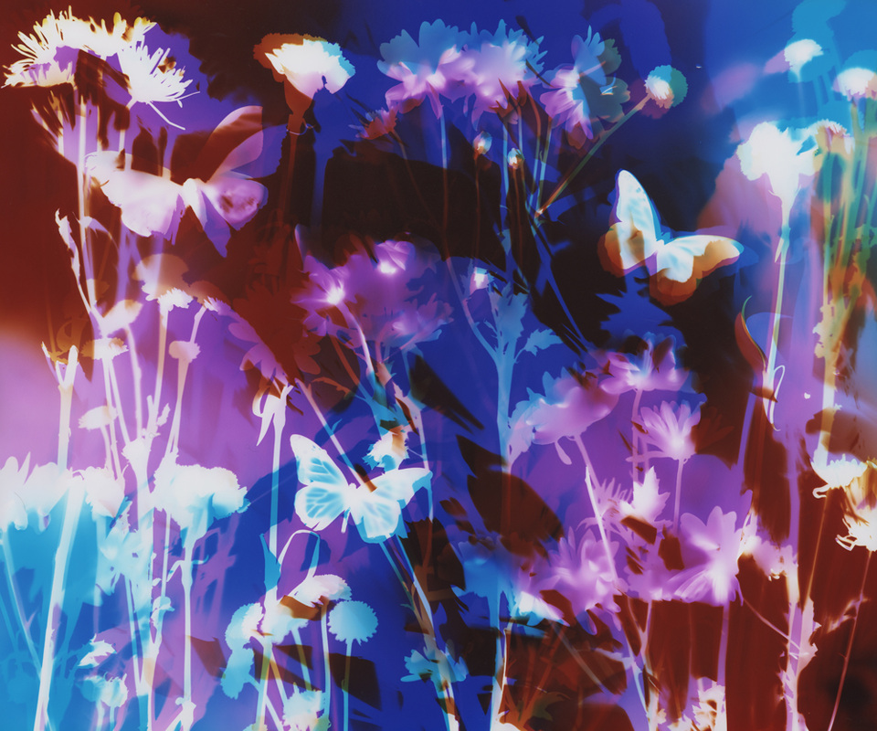
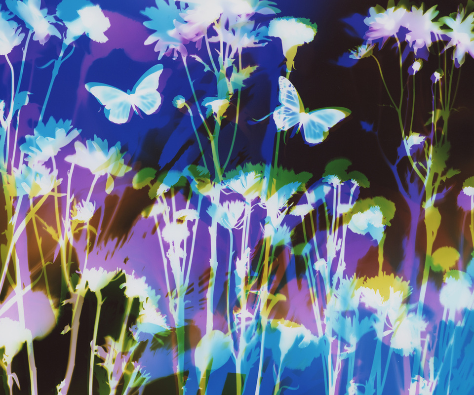
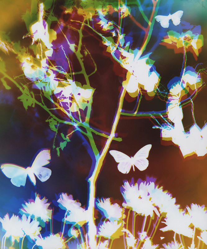
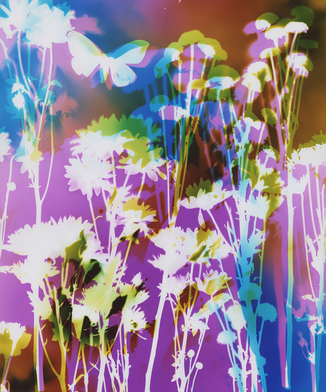
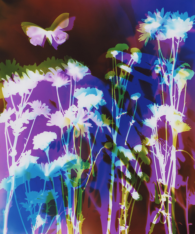

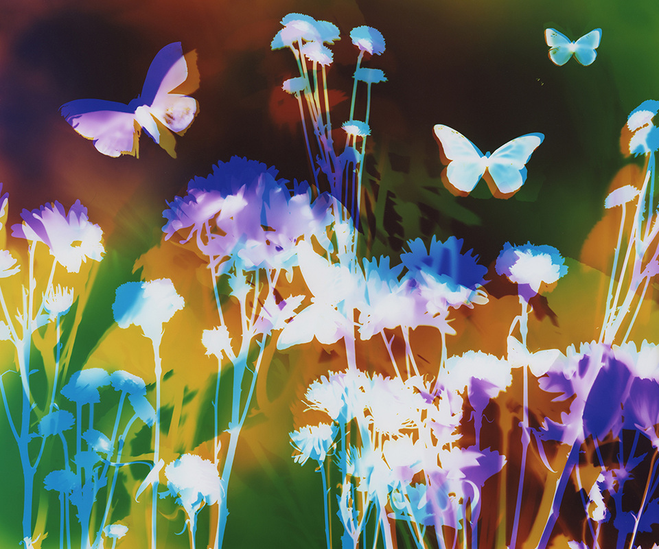
I am continuing to work on this series this quarter.
This is one of my favorite pieces from this quarter's work so far.
What do butterflies symbolize to you?
What ideas of growth and transformation can you relate to in your life?
If you have questions or comments I would love to hear them.
Much love to you all!
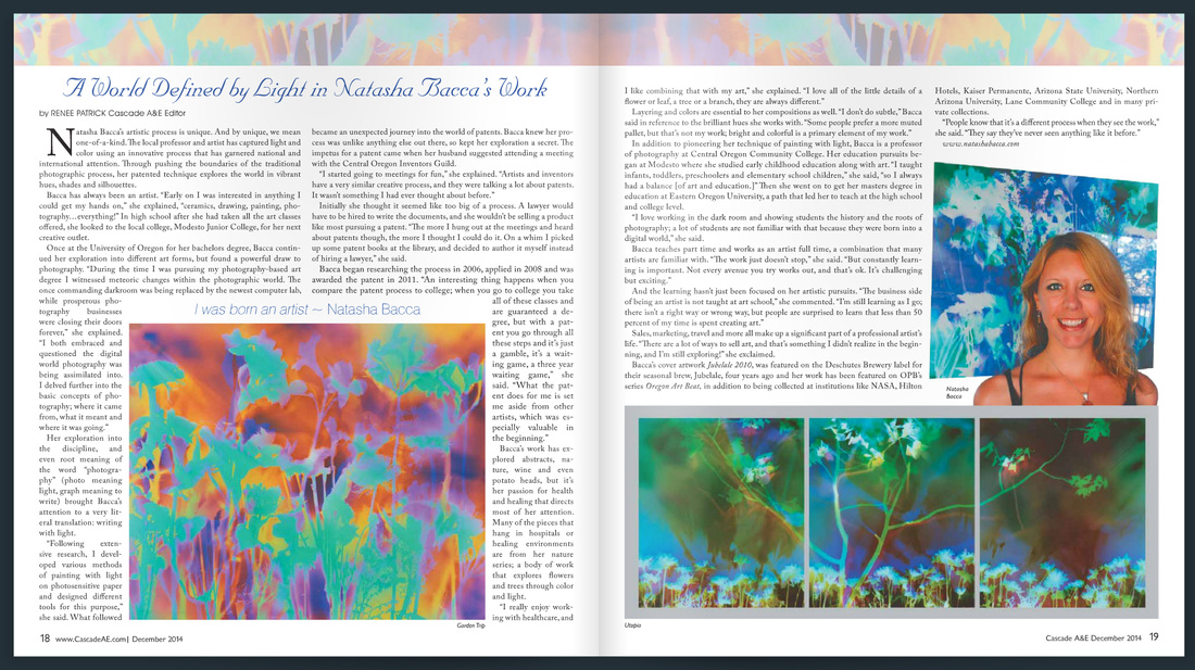
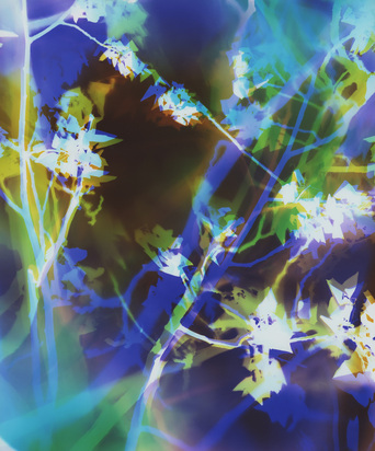
Also included in this publication is a great article outlining my journey to obtaining a US patent for my artistic process. See the feature here. The article is on pages 18-19.
If you have questions or comments I would love to hear them.
Much love to you all!

Embracing and enjoying the journey (process),
without dwelling on a specific destination (outcome)
~ in the darkroom and in life. :)
The process is achieved by re-exposing a print mid-way through the development process.
~ Typically, a print is exposed then developed.
~ With solarization, a print is exposed, partially developed, re-exposed, then fully developed.
The silver halide that was originally exposed has been developed enough to no longer be as effected by more light, whereas the silver halide that was not yet exposed can now be exposed.
This effect is well-known in black and white photography and can be controlled fairly well working only with with gray tones. This effect is much less common in color photography for a variety of reasons, including most prints not being hand processed and the results being much less predictable.
I was familiar with the process of solarization and thought I might explore it someday. One day when working on a piece I made a mistake in the creating of it, and I realized it was not going to turn out as I desired. So mid-process I decided to just re-expose it to light and see what happened.
 The image I was trying to create (and later did). | 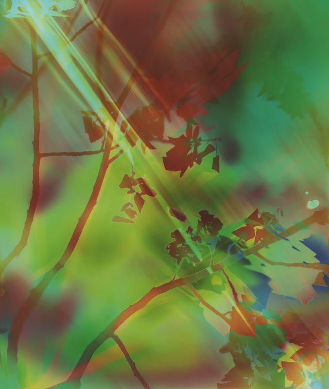 My first solarized piece. Happy accident! :) |
Solarization requires careful choices in of the amount of light used in both initial exposure and in second exposure, as well as the precise moment in the development process when re-exposure happens. These factors in combination with color choices yield very different outcomes. This all needs to happen very quickly as well, making solarization difficult to yield consistent results with.
Since my first accident-piece-turned-solarized-piece I have occasionally set out to solarize intentionally. However, I usually just use this technique when I "accidentally" do something unintended in the creation process. Because I know the piece won't turn out as I originally desired I take the opportunity to play with the solarization technique to see what else I can make of the piece.
Embracing and enjoying the process (journey),
without dwelling on a specific outcome (destination)
~ in the darkroom and in life. :)
More solarized pieces:


Last month F-Stop Magazine, featured some of my solarized pieces along with other "happy accidents." See more "happy accidents" here.
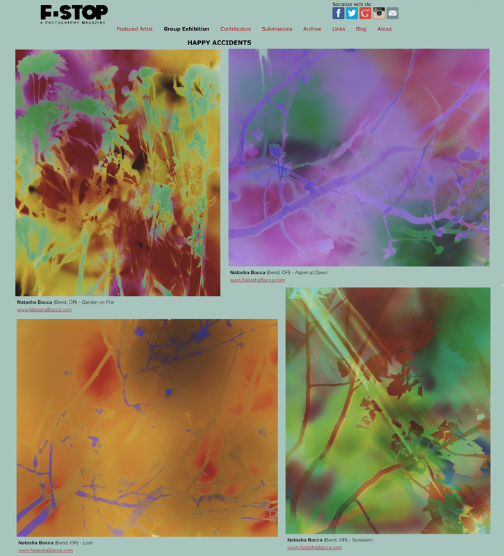
Shop for solarized prints here.
If you have questions or comments I would love to hear them.
Much love to you all!

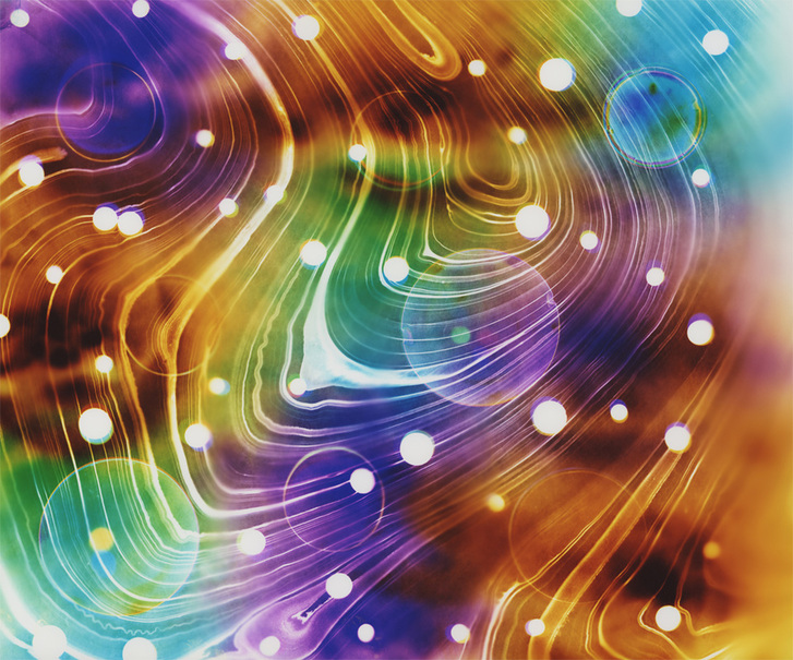
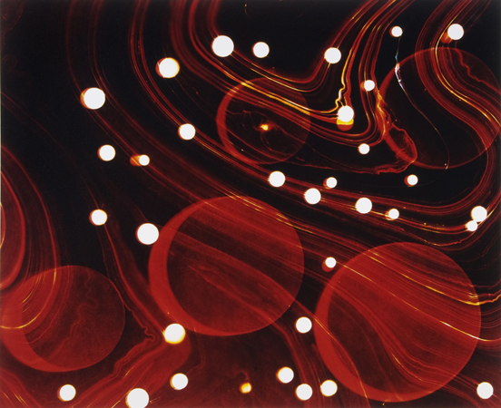
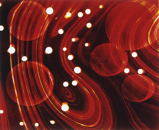
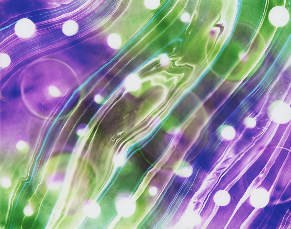
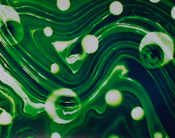
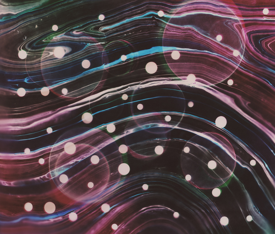
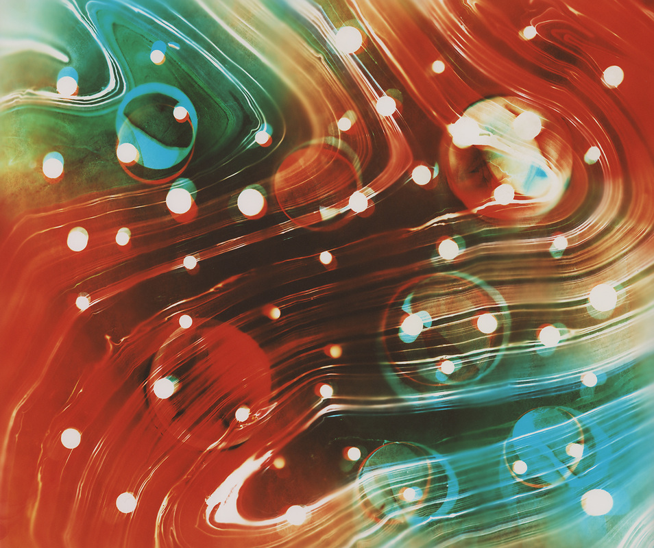
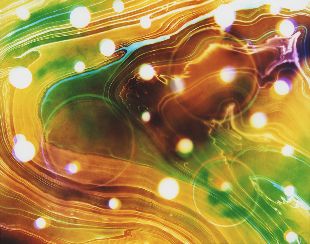
Images in this series explore space. The unknown and unexplored realms of the physical world are imagined as one might experience them. This series falls into the genre of Space Art, also known as Astronomical Art, which is modern artistic expression that strives to show the wonders of the Universe.
Like other genres, Space Art has many facets and encompasses realism, impressionism, hardware art, sculpture, abstract imagery, even zoological art. Though artists have been making art with astronomical elements for a long time, the genre of Space Art itself is still in its infancy, having begun only when humanity gained the ability to look off our world and artistically depicted what we see out there. Whatever the stylistic path, the artist is generally attempting to communicate ideas somehow related to space, often including an appreciation of the infinite variety and vastness which surrounds us. ~ Excerpt from Wikipedia found here.
Like many artists, I am expressing ideas surrounding "an appreciation of the infinite variety and vastness which surrounds us." Additionally, I am drawn to the mystery of it all ~ a truth that one can know only by revelation and cannot fully understand. Swirling lines and patterns represent energy ~ the dynamic quality of positive spiritual force ~ the fundamental being of nature that is transferred between parts of the system. Circles represent form ~ a mode of existence, action, or manifestation of a substance.
3 of my favorite artworks in this series
I created earlier this week:
More will be released soon...
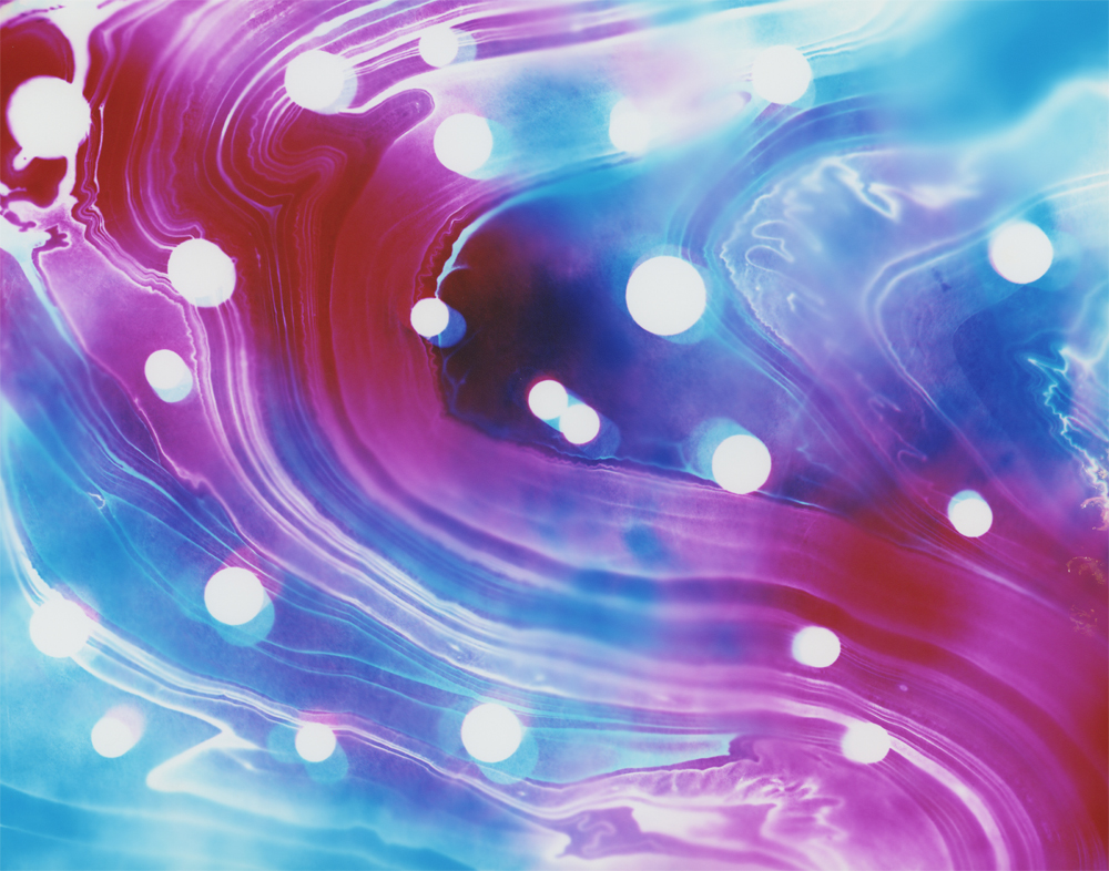

Some of my favorite past artworks in this series:


If you have questions or comments I would love to hear them.
Much love to you all!

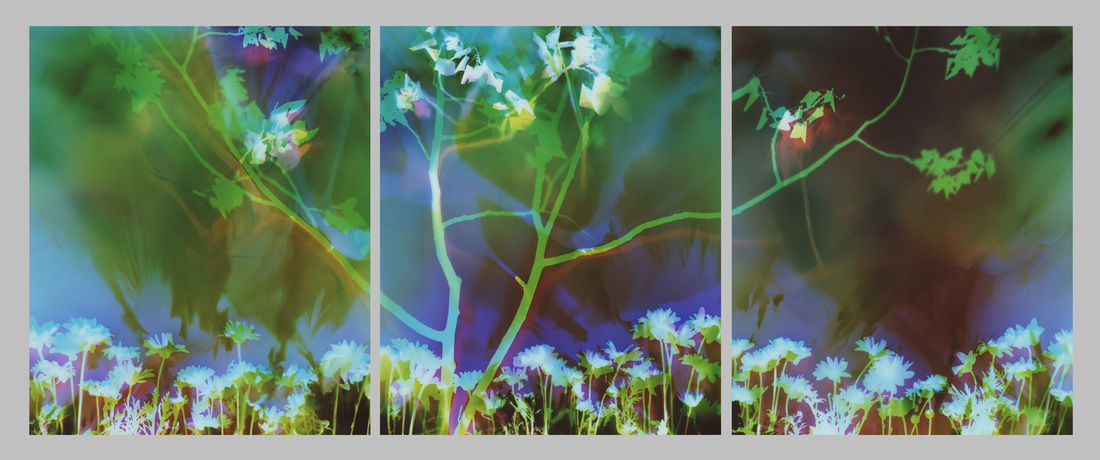
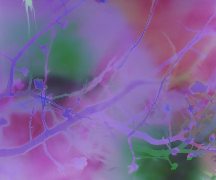
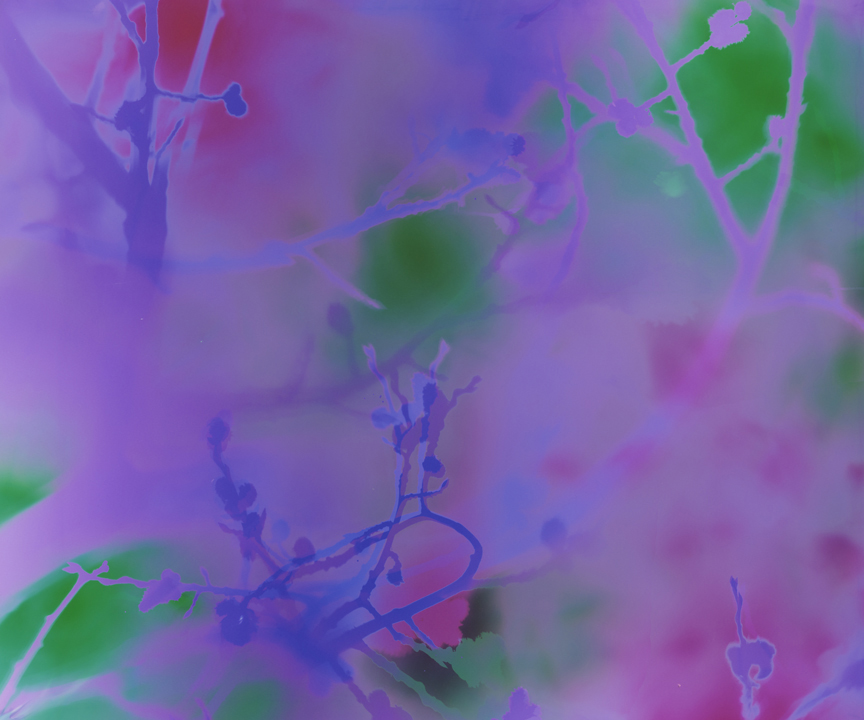
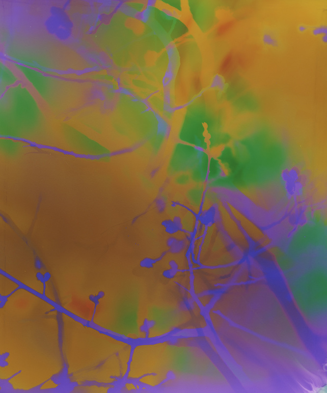
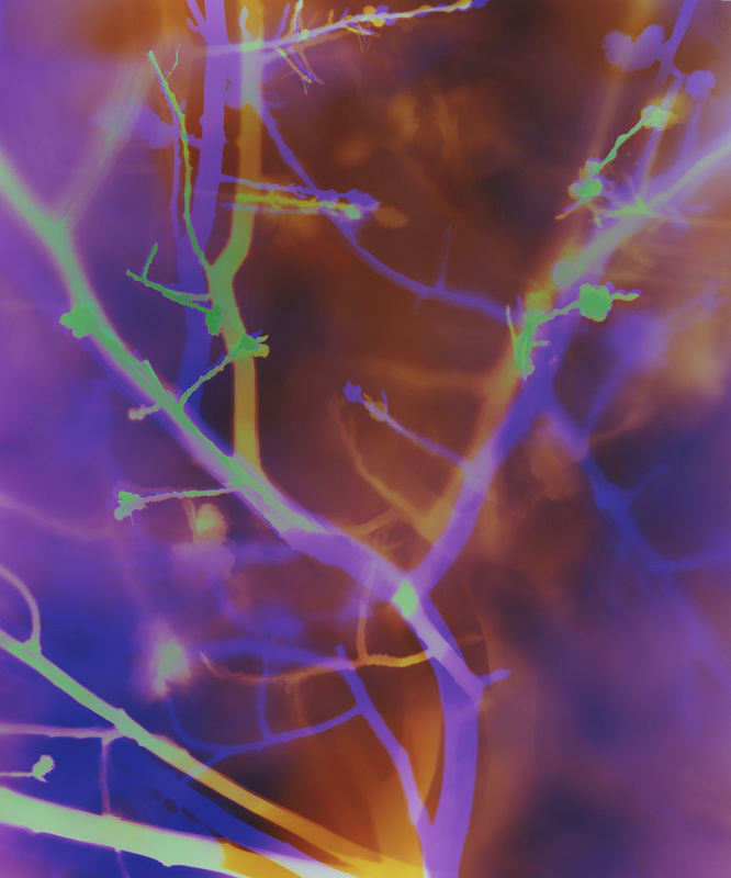
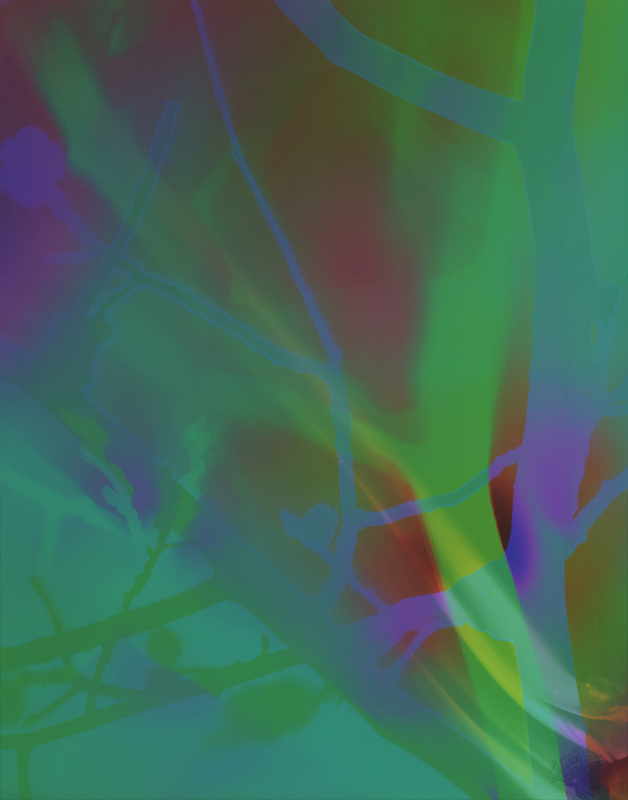
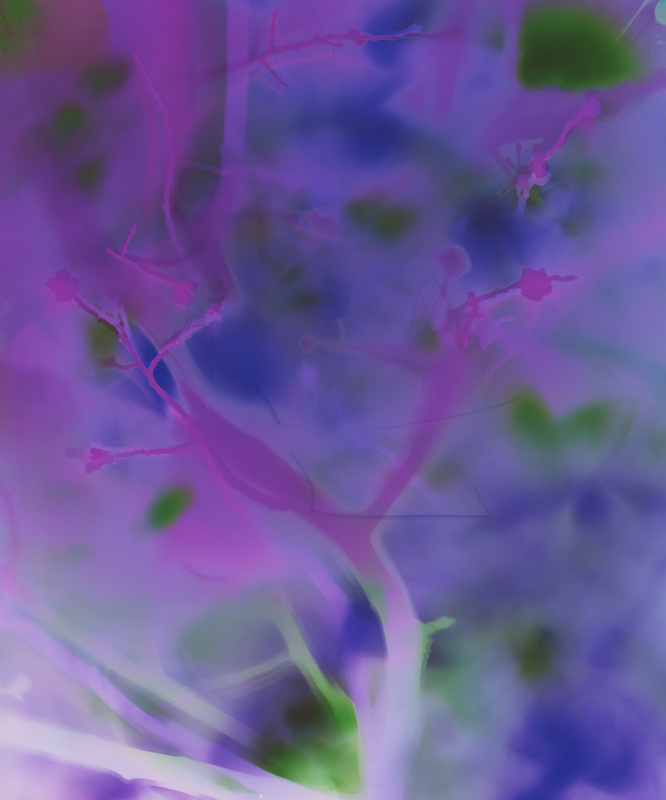
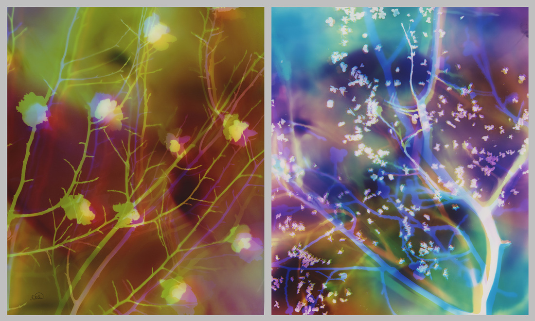
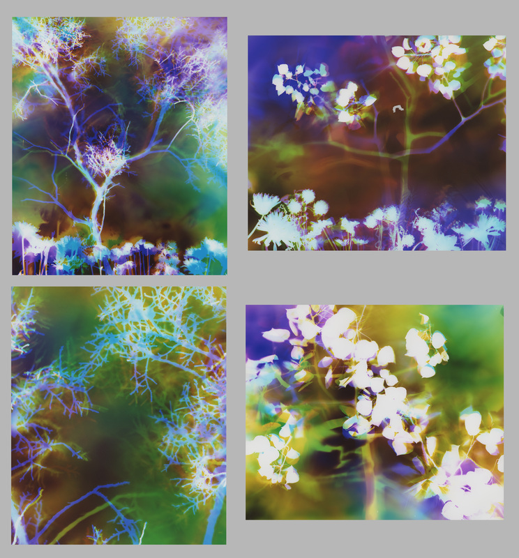
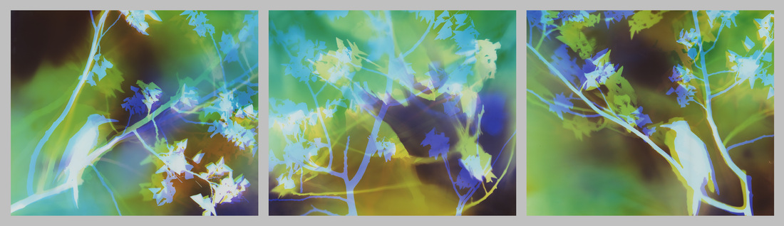
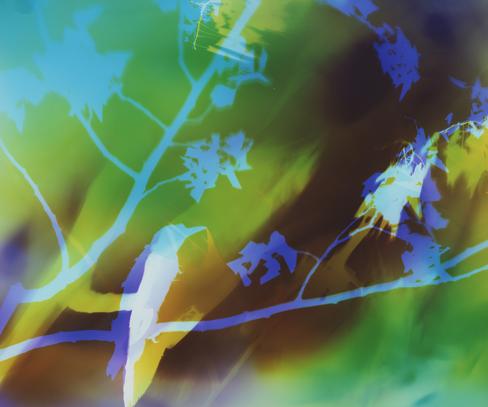
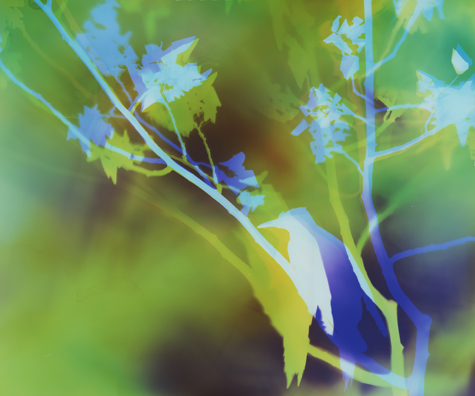
I release my artwork in quarterly batches, and about half way through each quarter I like to give fans a glimpse at what I'm working on. Last quarter was dominated by my wine series, but this quarter I am back to nature with more multi-panel pieces as well as new specimens.
Multi-panel pieces:
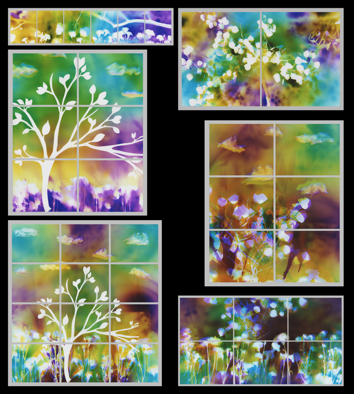
New specimens:
Please comment below or join the conversation on Facebook here.
If you have questions or comments I would love to hear them.
Much love to you all!
♥ Natasha
If you would like to purchase a print of this piece do so here.
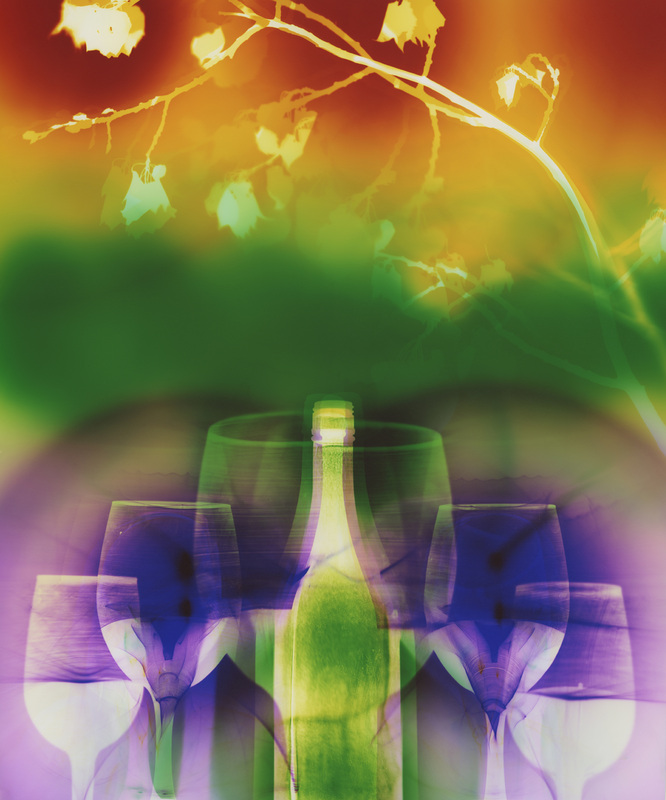
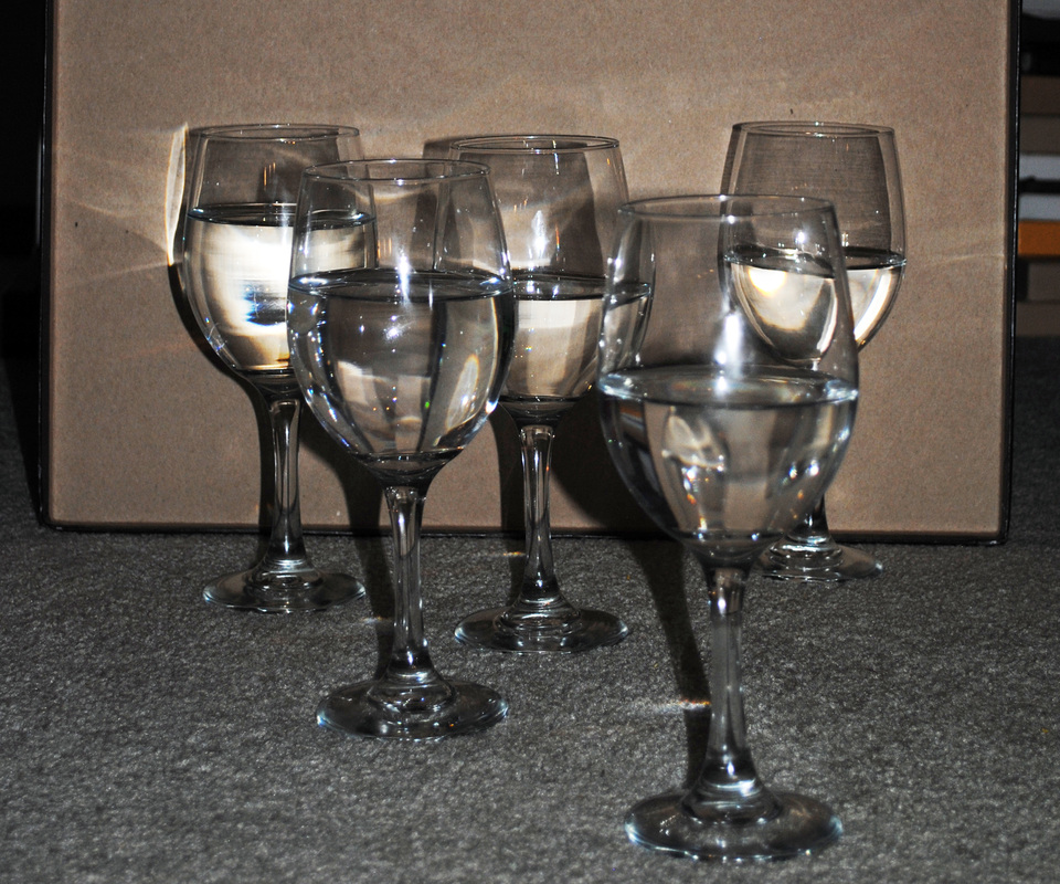
How I created this piece:
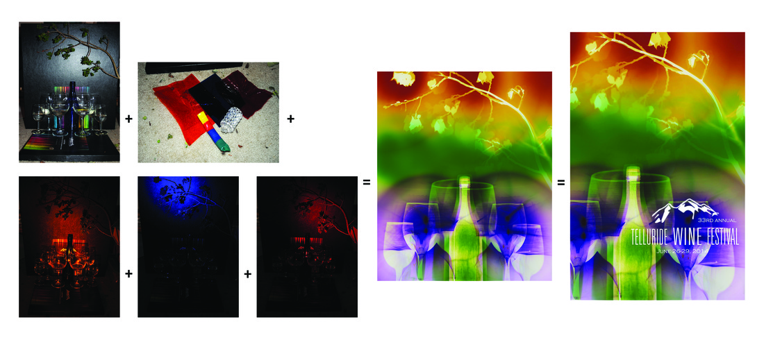
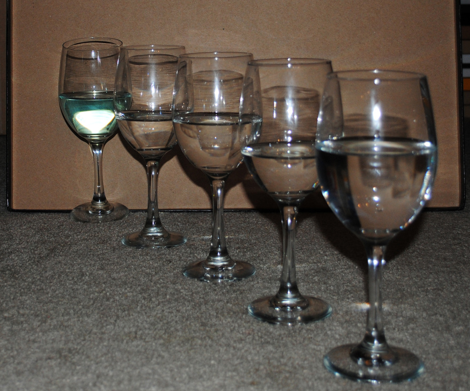
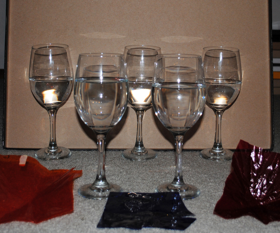
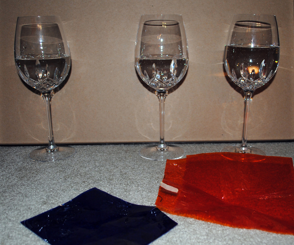
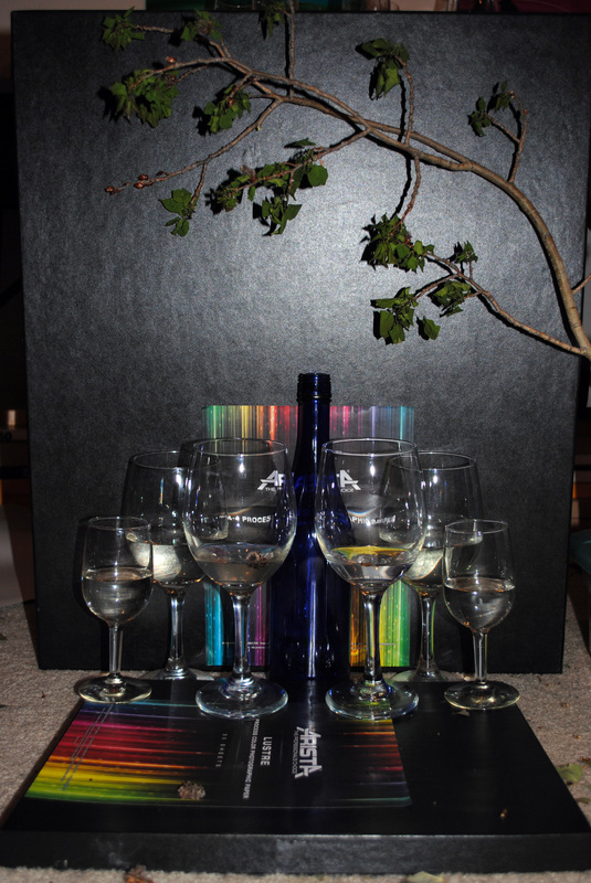 | 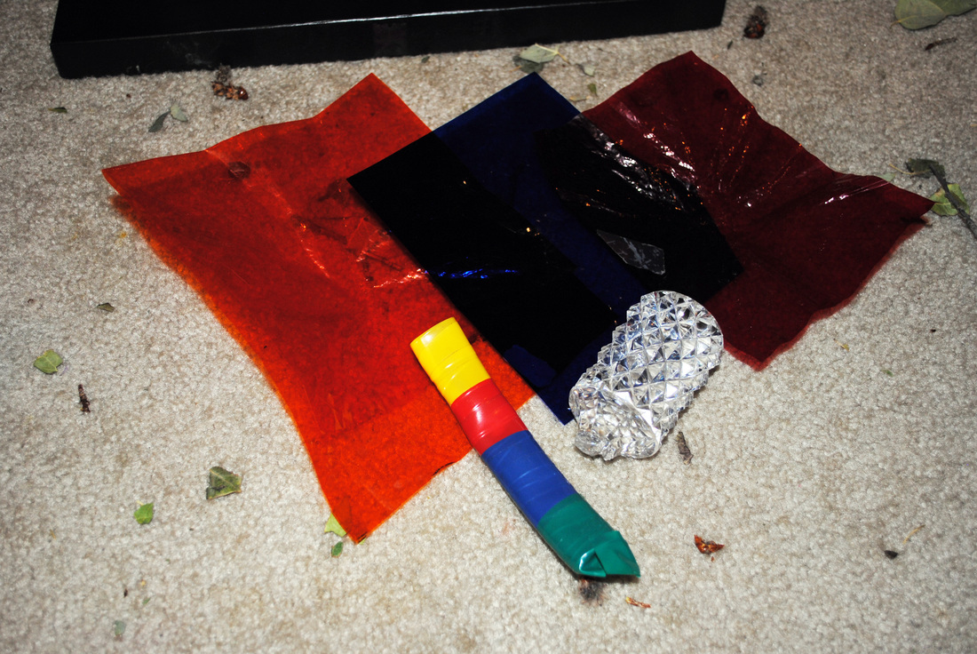 The image to the left shows how I set the piece up. An aspen branch from my front yard is propped up on the top, and a wine bottle is in the center. Wine glasses of various sizes are placed at set distances from the paper, and they are filled with different amounts of water. The image above shows my tools. A hand-made LED light device + crystal to diffuse and refract the light + orange, blue, and red color gels. |
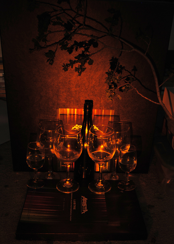 | 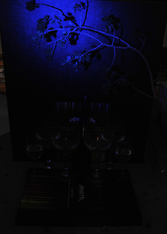 | 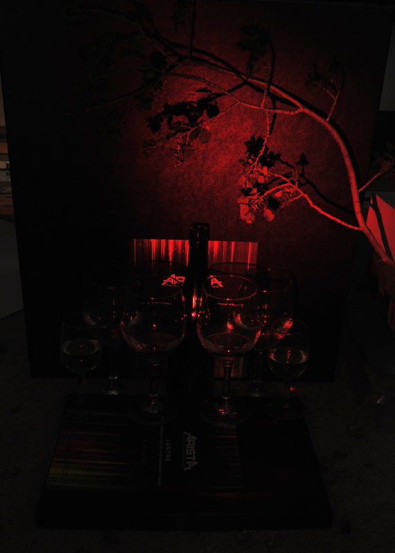 |
I then painted blue light around the aspen branch, which resulted in yellow and red.
Last, I painted red light around the middle and the wine bottle, which resulted in green.
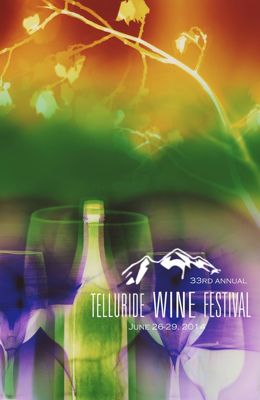
I will be signing posters, which are 18" x 24" on high grade paper. Posters will be sold at the festival. If you cannot attend the festival but would like to buy a poster, let me know and I can get one for you.
I will also be exhibiting a selection of artwork from my wine series at Arroyo, an art gallery and wine bar in Telluride, throughout the month of June.
If you have questions or comments I would love to hear them.
Much love to you all!
♥ Natasha
Mackenzie Wilson visits the studio of Natasha Bacca -- a Bend artist who harnesses the power of light to paint.
In February, news reporter Mackenzie Wilson contacted me saying she was interested in profiling me for the lifestyle TV show she works on in Bend, OR. I was flattered - and nervous! Mackenzie and videographer, Matt, came to my studio in March to video me creating a piece of Artwork by Natasha Bacca, and last week the video aired on local television. For those that missed it, see it below.
I love the amazement at someone working in a darkroom! :)
What would you like to see in my vlog?
Please comment below.
These pieces, however, were:
unique chromogenic photogram
20" x 72" (3 20" x 24" panels)
Purchase a print here.
Or contact me to purchase directly from me at a discounted price.
unique chromogenic photogram
20" x 24"
Purchase a print here.
Or contact me to purchase directly from me at a discounted price.
unique chromogenic photogram
20" x 24"
Purchase a print here.
Or contact me to purchase directly from me at a discounted price.
If you have questions or comments I would love to hear them.
Much love to you all!
♥ Natasha

In January I asked Facebook fans which series they would like to see more of in 2014. The wine series was popular, but not the most popular. Birds and skyscapes received the most votes, and I planned to begin working on them. And I will! :)
But I felt called to work on the wine series. And like many creatives, I go with the calling. And like universal support responding in kind, as soon as I began working on the wine series opportunities (gifts) for it came my way.
The first gift was an email from the senior editor of Wine Enthusiast Magazine saying, “We have a page every month called, Our Crush, and we want to make your wine photos April’s.”
~Stay tuned for details, which I will share first on Facebook, Twitter, and Instagram.
The second gift, just one week later, was a sweet voice mail from my friend Leanne. She was at Naked Winery talking to the manager about my artwork. The manager looked up my website and loved my wine series. I had considered contacting Naked Winery several times before but for some reason never did. I am so grateful for the selfless kindness of Leanne (who I had never talked to about Naked Winery) for generously sharing my artwork with others.
~My wine series will be featured at Naked Winery during the month of March, with an opening reception during First Friday Art Walk on March 7th from 5:00 PM – 9:00 PM. Join the event on Facebook and invite your friends!
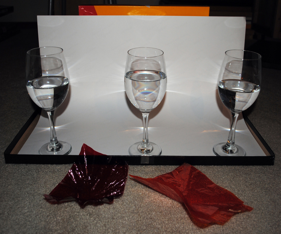
The third gift was from my friend Lindsay. She was the first participant in The Wine Project, and a while back she had suggested I use her crystal wine glasses in my artwork. Three days after gift number two, I took her up on her kind offer.
~See results below.
 staggered wine glasses = different sizes & sharpness + white light (no color filter) = red | 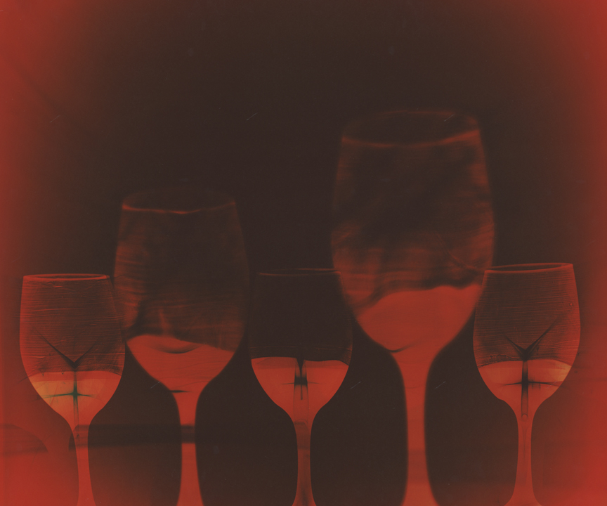 |
 bent photo paper = distortion of shapes & sizes + color filters = opposite colors on negative photographic paper (red = cyan, orange = violet) | 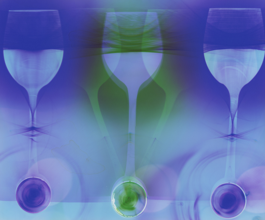 |
 staggered wine glasses = different sizes & sharpness + this piece was solarized | 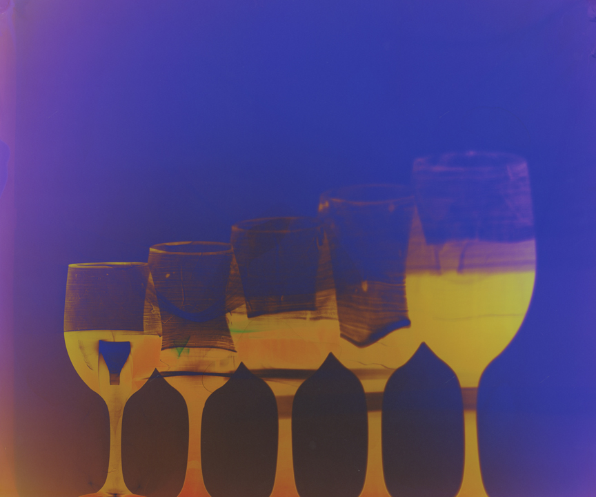 |
 staggered wine glasses = different sizes & sharpness + different color filters combined = a variety of colors on negative photographic paper (red = green, blue = orange, orange = violet) | 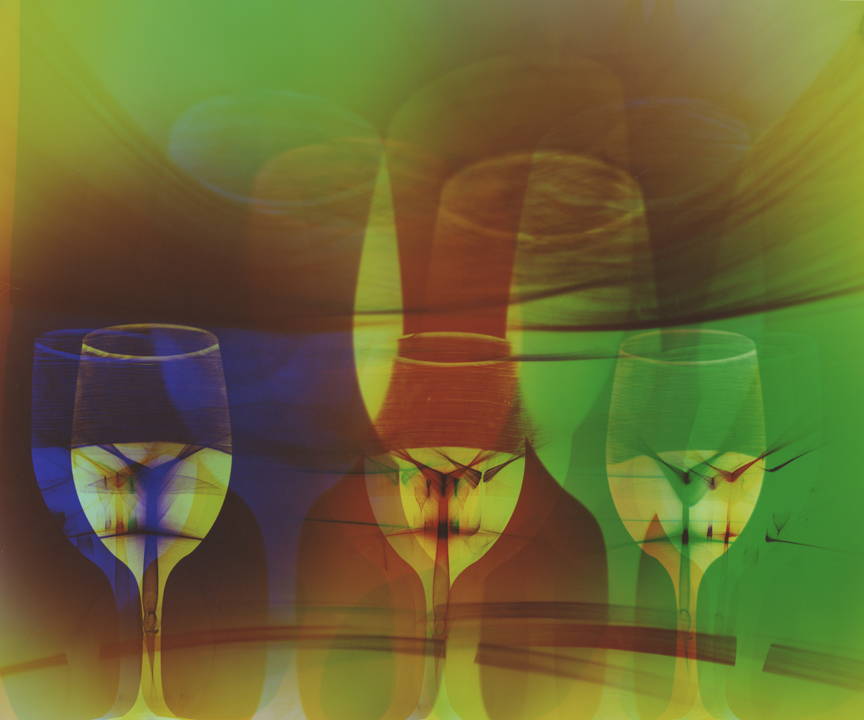 |
 crystal wine glasses refract more light + different color filters create a variety of color patterns | 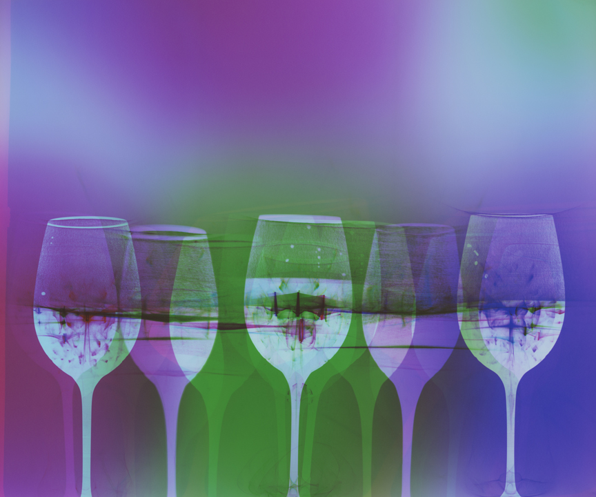 |
 same as above + bent photo paper = distorted shapes | 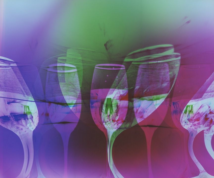 |
Thank you for viewing!
If you have questions or comments I would love to hear them.
Much love to you all!
♥ Natasha
I recently began a new series. I just happened… I didn't plan it. I constantly explore new ideas, but this one caught me… I was SO EXCITED when I first realized I had a new series beginning! Though I'm always experimenting for one, it felt like forever since I had a new series and I was beyond thrilled to see where this one was heading! The excitement was quickly replaced by frustration and a myriad of other emotions. I spent SO much time… with such little result. I remind myself to enjoy the process (journey) and not worry about the outcome (destination), as I often remind my students. With any new technique comes a learning curve. Hours, days, weeks in the darkroom… sometimes with a great piece as a result, and sometimes with nothing to show for my efforts.
And later I see what I have created after stepping away from it… I feel less attached. I can now look at these images without the expectation of what I intended. Yet I still do not know what to make of them. Are they “good”? What does that even mean, and does it matter? Are they worth continuing to explore? If so, where should I go with them? Or where will I let them take me?
Yes, the creative process is beautiful, surprising, interesting, fun, and CHALLENGING! :)

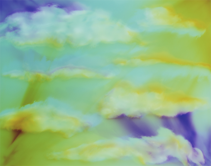
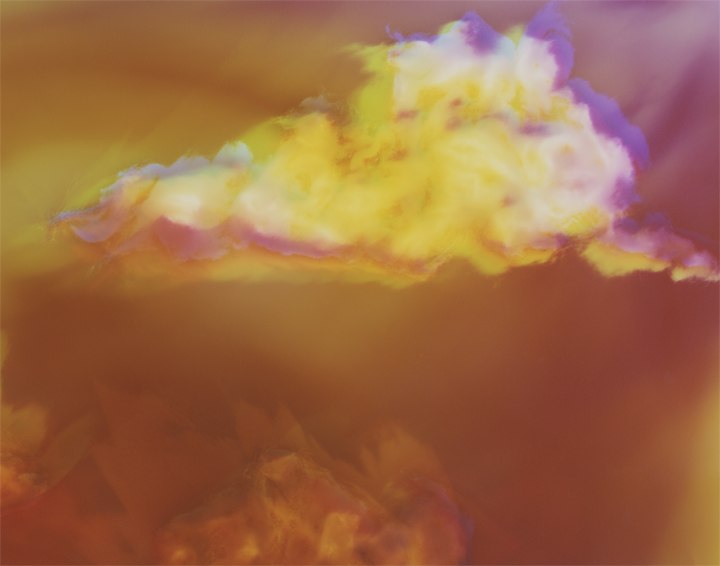

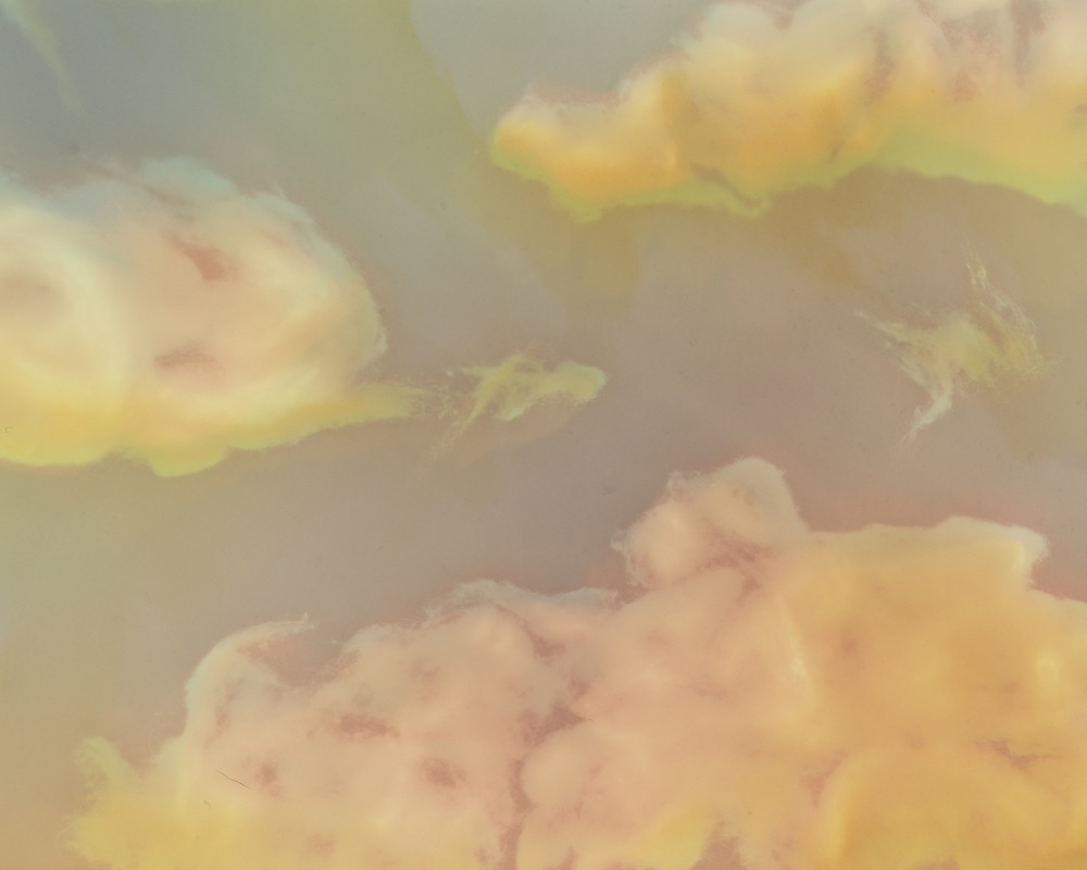
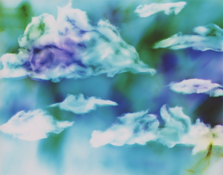

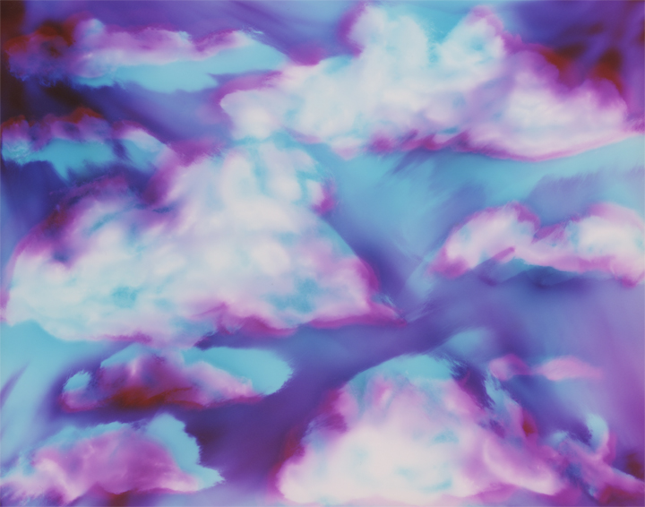
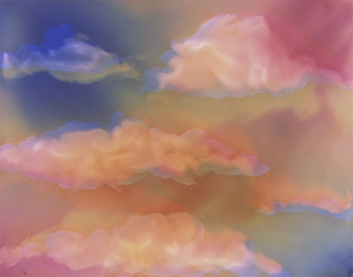


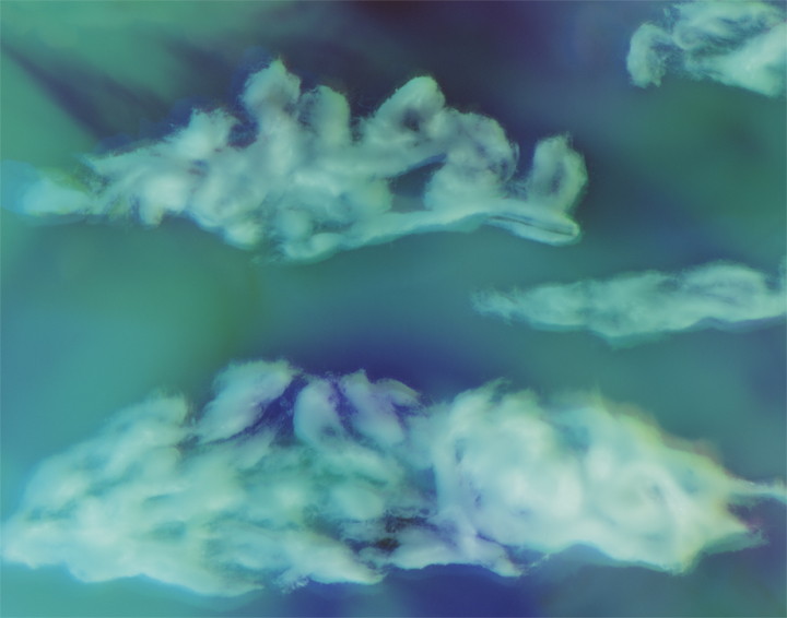

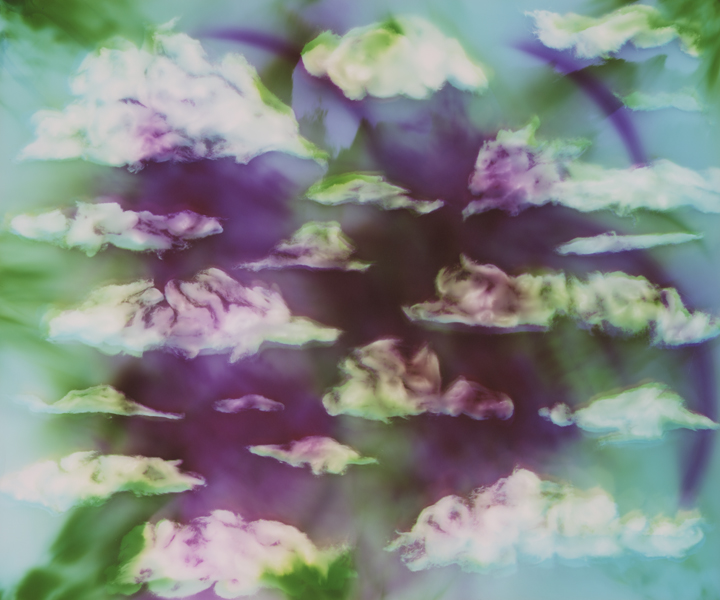
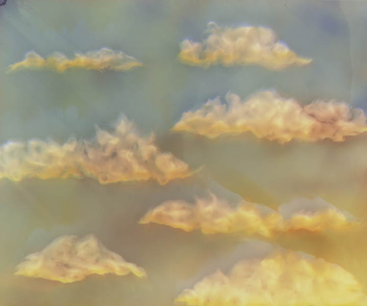
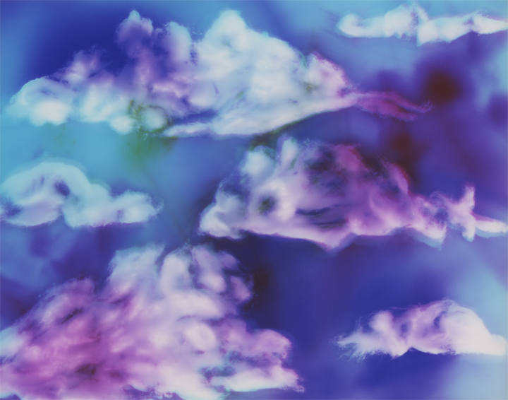
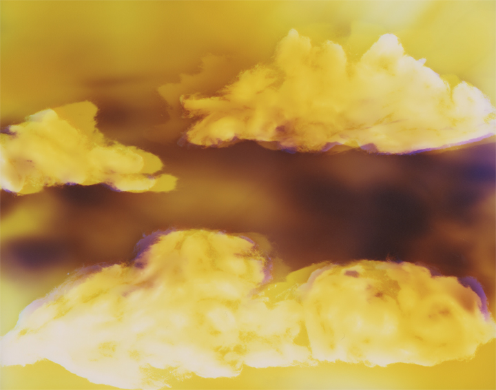
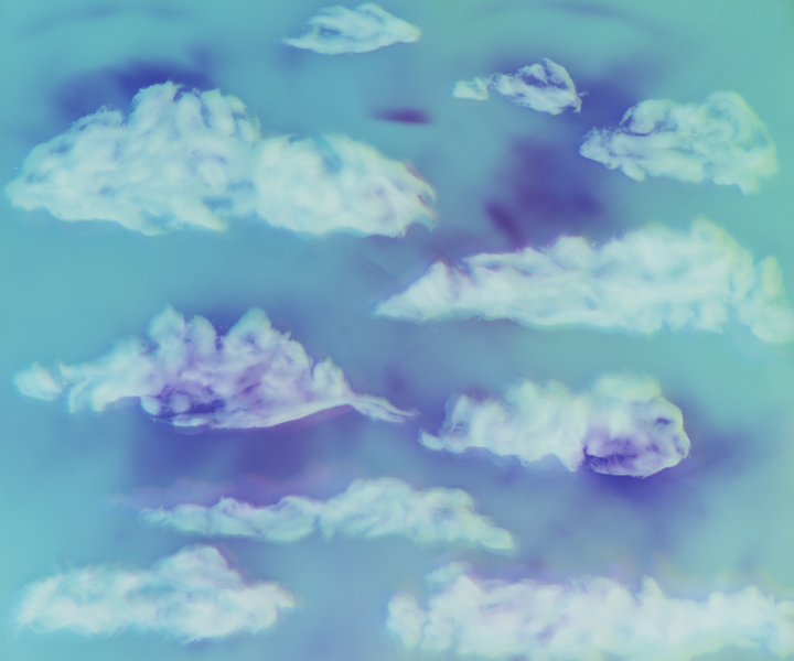
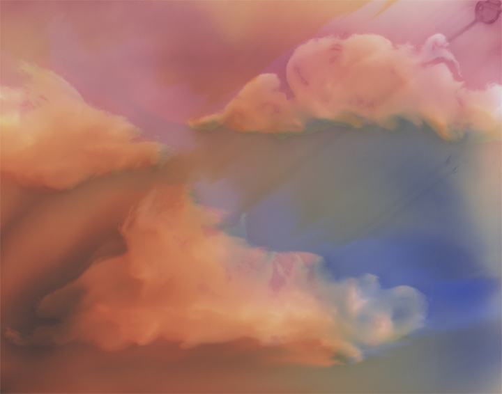
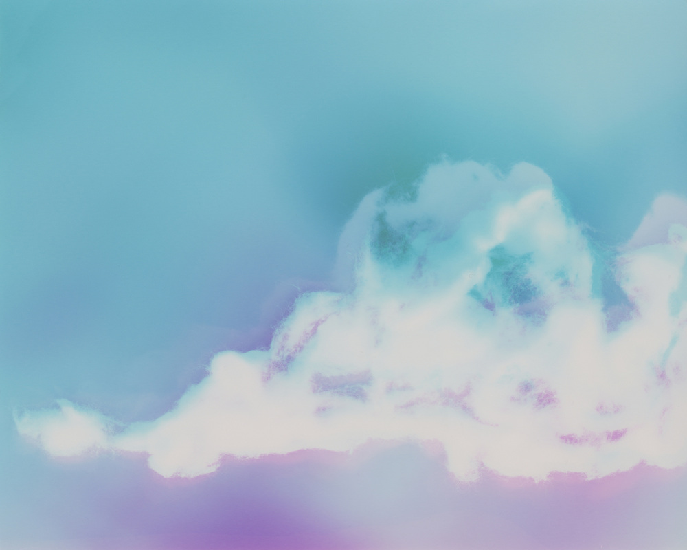

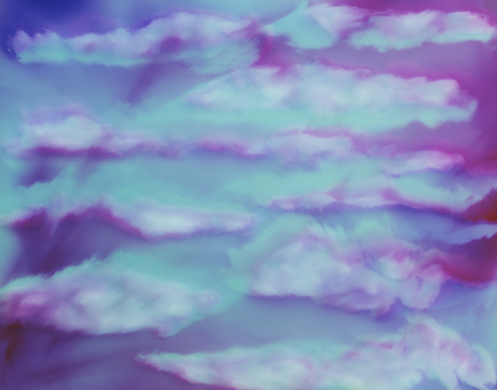
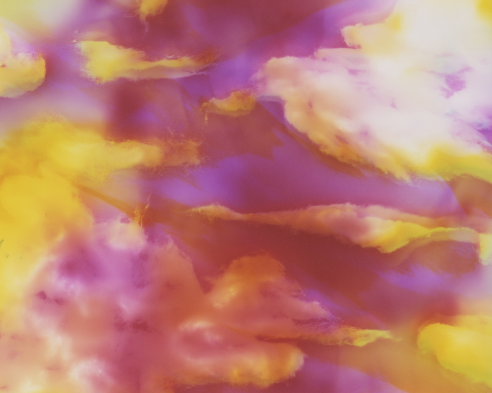
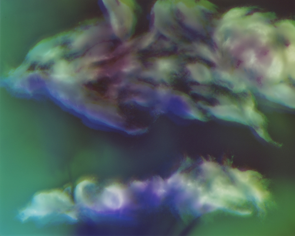
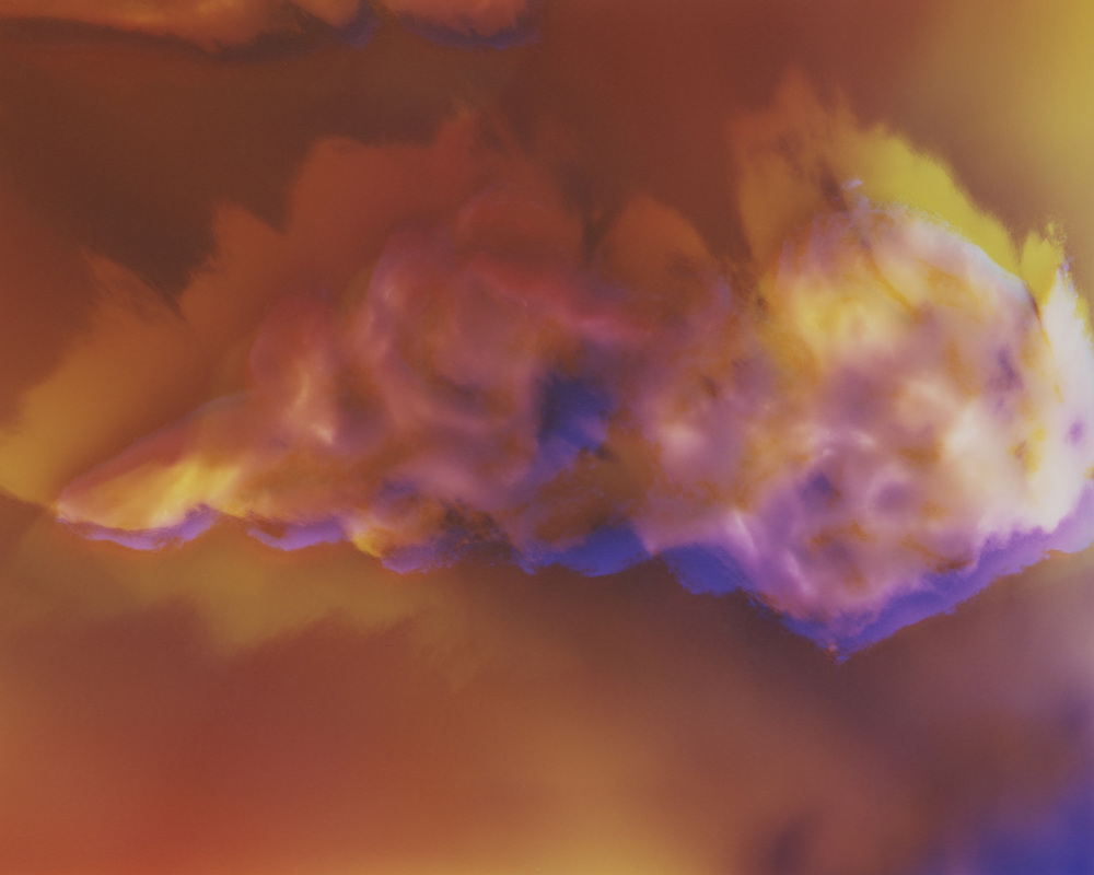
The warm colors? The cool colors?
More clouds? Less clouds?
More realistic color schemes? Bright, whimsical color schemes?
Any other ideas or suggestions for the direction of this series?
Comment below or on Facebook and you will be entered to win an 11" x 14" print of the Skyscape of your choice! Comment below AND on Facebook and you will be entered twice! Enter twice per day! The winner will be drawn on December 9th.
Thank you for viewing!
If you have questions or comments I would love to hear them.
Much love to you all!
♥ Natasha
Welcome to my blog!
I am an artist working with light, combining contemporary & archaic processes to push the bounds of conventional photography.
In this blog I share information & images about my process, installations of my artwork, & more.
If you have questions or comments I would love to hear them.
Much love to you all!

Archives
August 2015
July 2015
June 2015
May 2015
April 2015
March 2015
February 2015
January 2015
December 2014
November 2014
October 2014
September 2014
August 2014
July 2014
June 2014
May 2014
April 2014
March 2014
February 2014
January 2014
December 2013
November 2013
October 2013
September 2013
August 2013
July 2013
June 2013
May 2013
April 2013
March 2013
February 2013
January 2013
Categories
All
Art In Every Room
Art In Hand
Artist's Dates
Collections
Curating
Darkroom Doodles
Epicurious Potato Heads
Galactic Series
Giveaway
Inspiration
Inspired By Nature
Installations
Licensing
Memento Mori
New Artwork
New Artwork
Newsletters
Performing Art
Preliminary Sketches
Process
Purchase
The Wine Series
Trades
Trees
Year End Review
 RSS Feed
