
|
The following preliminary sketches are all from artworks I created in the 3rd quarter of 2013. You can read more about my preliminary sketches on this previous blog post. I sell my preliminary sketches to offer my original art affordably for everyone. I am offering the following preliminary sketches for $20, $30, and $40 +$5 shipping anywhere in the US or free pick-up locally. This is an excellent way to collect Artwork by Natasha Bacca or get great gifts for loved ones! Each piece is an original so get the one-and-only piece while you can! If you want to purchase one simply be the first person to post a comment with the # and it is yours!
|


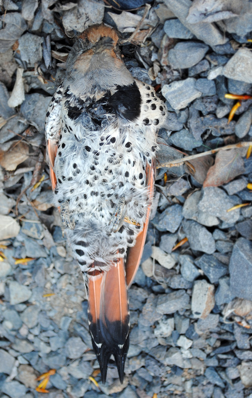
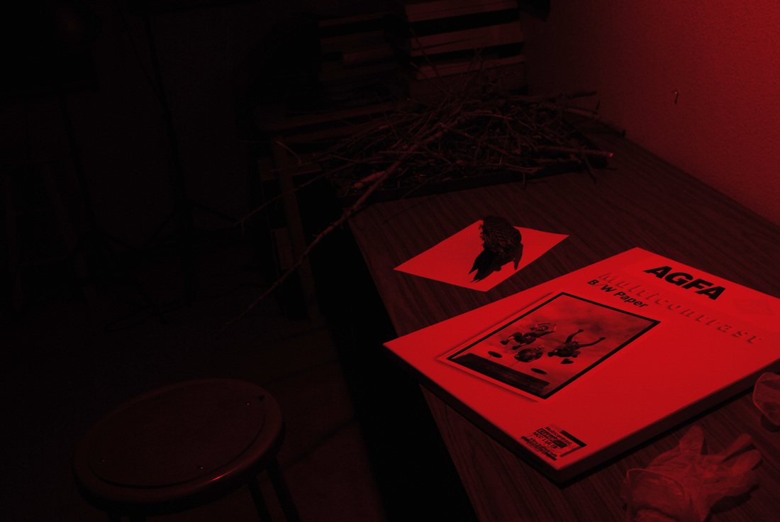
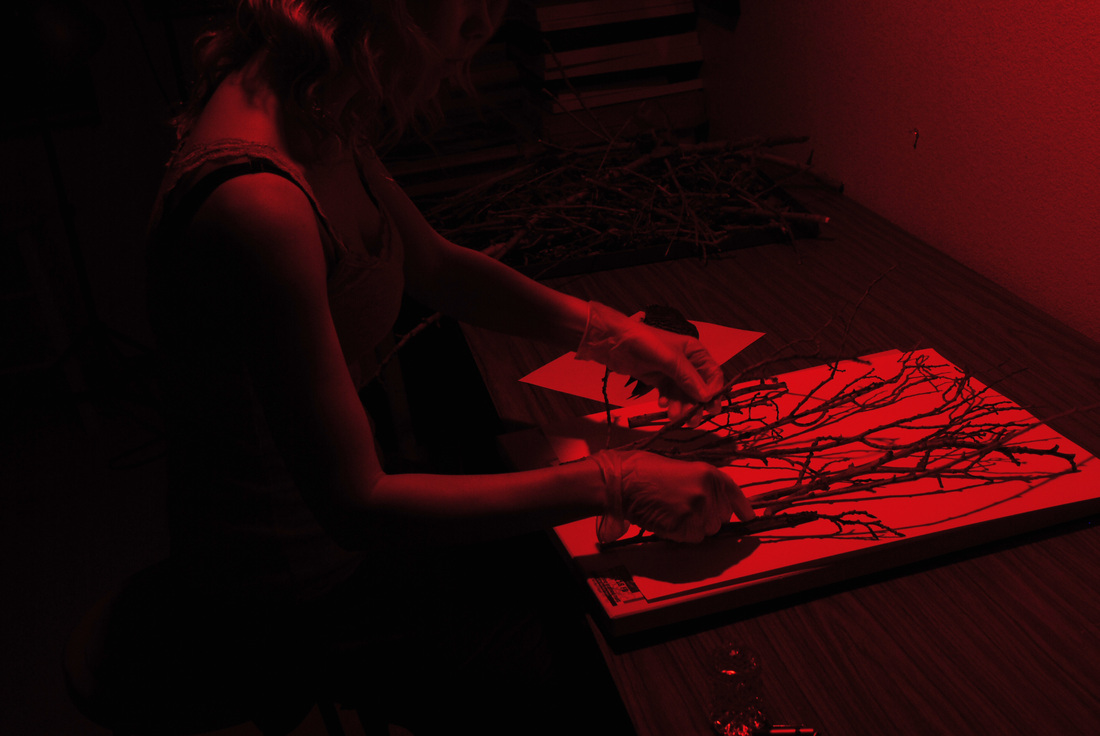
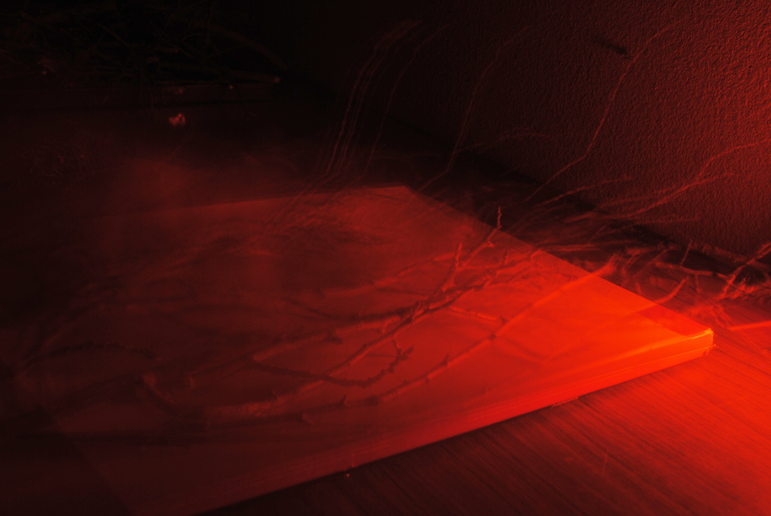

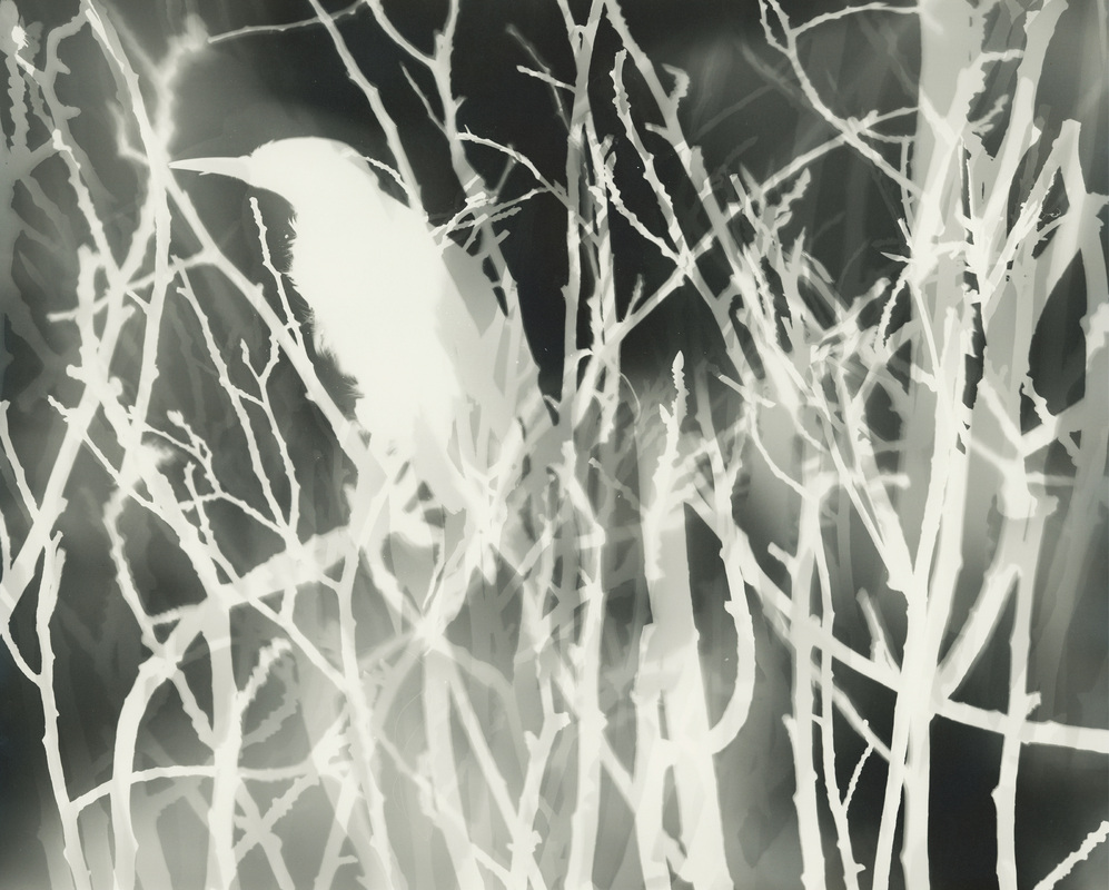
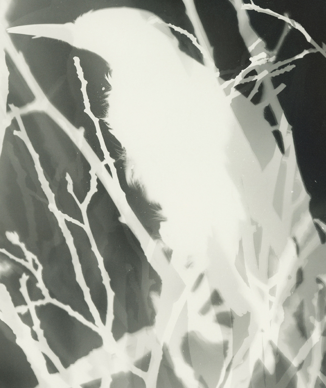
| 1. bird + B&W paper + red light 3. long exposure of me arranging branches on photo paper | 2. arranging branches on photo paper 4. long exposure of me arranging bird with branches |
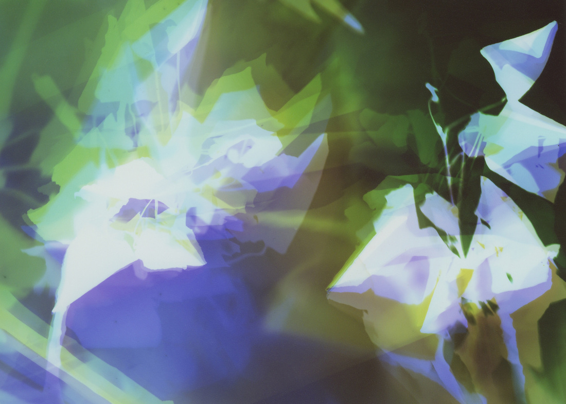
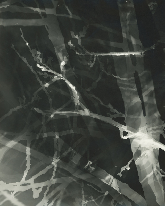
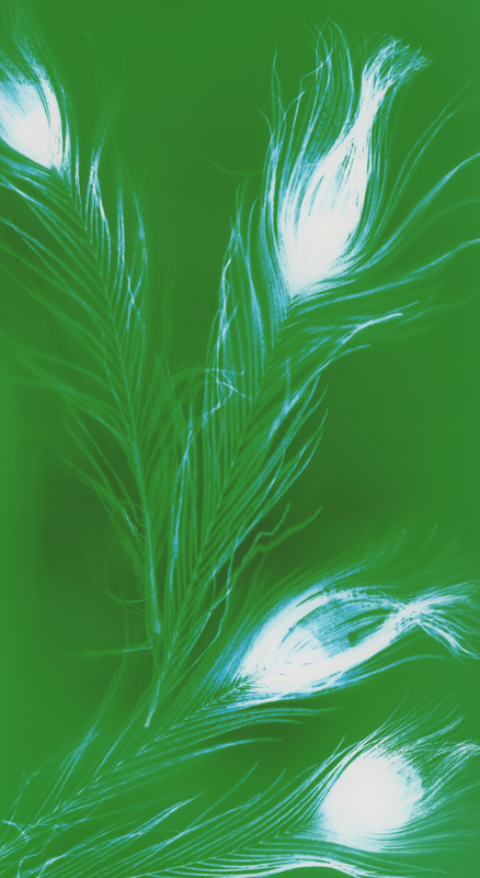
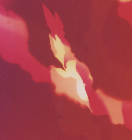
These are the 1st black & white artworks I have made with my patented process.
The very 1st piece:
I just guessed on exposure time.
The dots below the bird is dirt that came from it when I moved it.
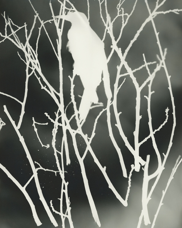
It has better composition with more tones and depth.
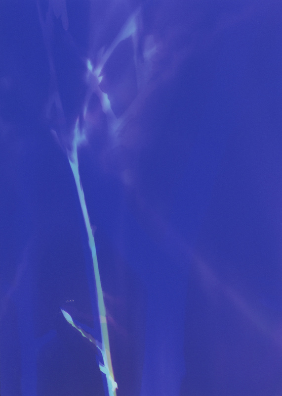
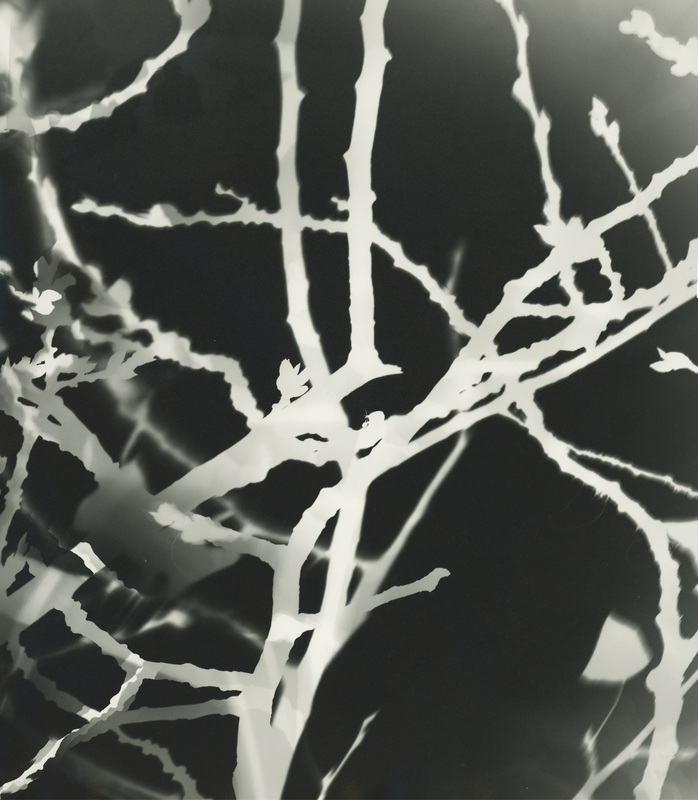
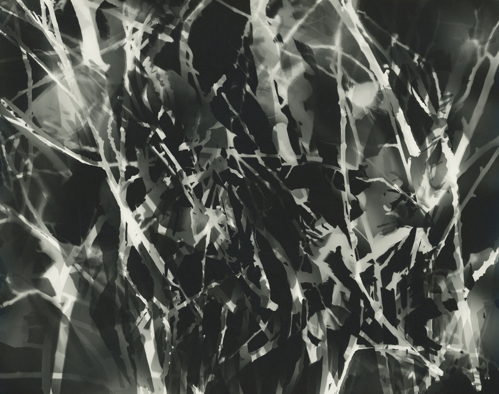
Some branches only pieces:
Thank you for viewing!
If you have questions or comments I would love to hear them.
Much love to you all!
♥ Natasha
The Portfolio Reviews are the heart of the Photolucida 2013 festival. Gallery owners, curators, critics, collectors and publishers representing small, mid-sized, and major venues from all over the US and abroad, gather in Portland to review work.
Photographers at the mid-career level register for one-on-one meetings with the reviewers of their choice. Each review session lasts for 20 minutes and the number of participants is limited to assure that everyone receives 4 or 5 reviews per day for four days. It's a great way to network. Numerous photographers have walked away with opportunities to exhibit, publish and sell their work after attending the Portfolio Reviews.
In addition to the primary Reviews appointments, Photolucida provides an informal meeting room with “roving” reviewers that look at work and give feedback and potential opportunities. Additional programming also includes “lunchtime chats” — a daily lecture or talk from a luminary in the photography world.
Ann Pallesen, Gallery Director of Photo Center NW in Seattle.
David Bram, editor, founder, and curator of Fraction Magazine.
Mary Virginia Swanson, marketing consultant.
Blue Mitchell & Libby Rowe, the Founding Editor of Diffusion: Unconventional Photography, and Curator of Plates to Pixels Gallery.
A photography historian, curator, and educator; editor of Exposure, the journal of the Society for Photographic Education.
Gordon Stettinius, founder of Candela Books.
Jan Potts & Elizabeth Corden, co-owners of Corden|Potts Gallery in San Francisco.
Chantel Paul, the Assistant Curator at the Museum of Photographic Arts.
JJ Estrada Toledo, the Director and Co-Founder of La Fototeca, a Contemporary Photography Center based in Guatemala City.
Roy Flukinger, Senior Research Curator of Photography of the Harry Ransom Humanities Research Center at The University of Texas at Austin.
Aline Smithson, founder and writer of the blogzine, Lenscratch.
Kirsten Rian, an independent curator and picture editor.
Hamidah Glasgow, the Executive Director/Curator at The Center for Fine Art Photography.
Conor Risch, Senior Editor of Photo District News.
Peter Johnson, the Founder/Director of Indiegroup, an award-winning partner marketing and integrated marketing agency.
Gail Gibson, owner and operator of the G. Gibson Gallery in Seattle.
Anna Goldwater Alexander, photo Director at Dwell magazine.
Ann M. Jastrab, the Gallery Director at RayKo Photo Center in San Francisco.
A post- Portfolio Reviews blog post will follow...
Have you been to a Portfolio Review? If so, I would love to hear about your experience!
If you have any other questions or comments I would love to hear them too.
Much love to you all!
♥ Natasha
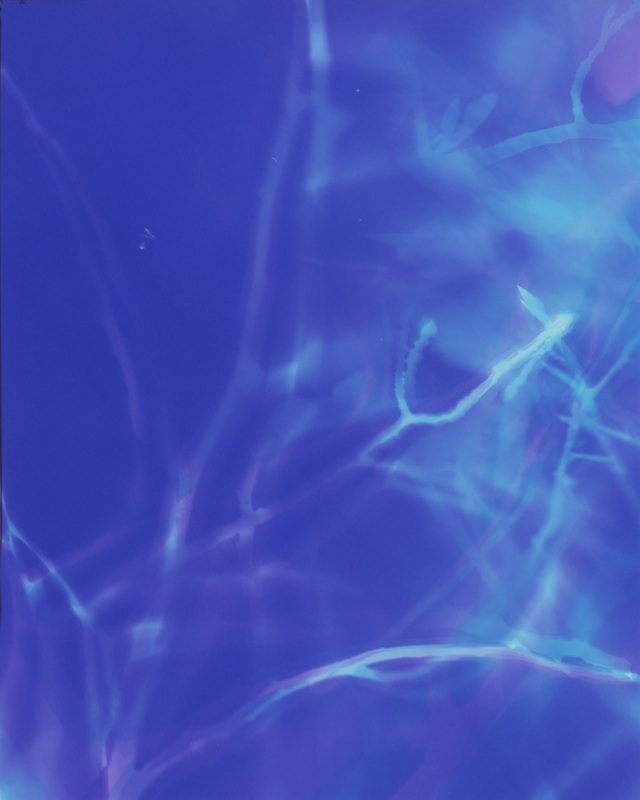
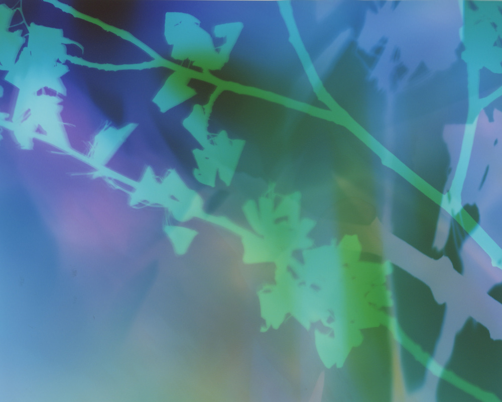
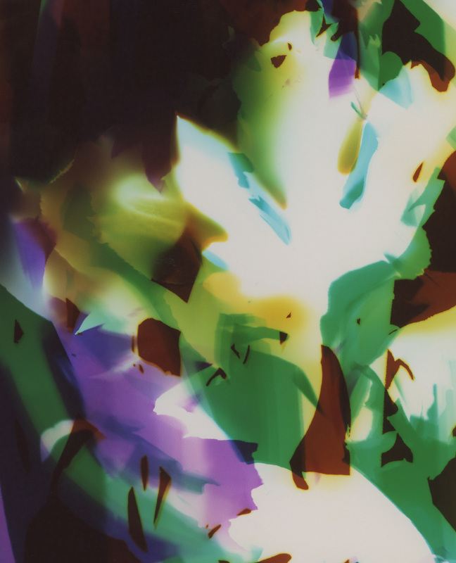
Recently, I took a marker in the darkroom and drew directly on photo paper before exposing it to light. The marker washed away in the photo chemicals, but the lines remained.
These are the results:


{free shipping in the US}
5" x 7" photo print = $20 -30% = $14
8" x 10" photo print = $30 -30% = $21
11" x 14" photo print = $40 -30% = $28
16" x 20" photo print = $50 -30% = $35
20" x 24" photo print = $60 -30% = $42
If you have questions or comments I would love to hear them.
Much love to you all!
♥ Natasha
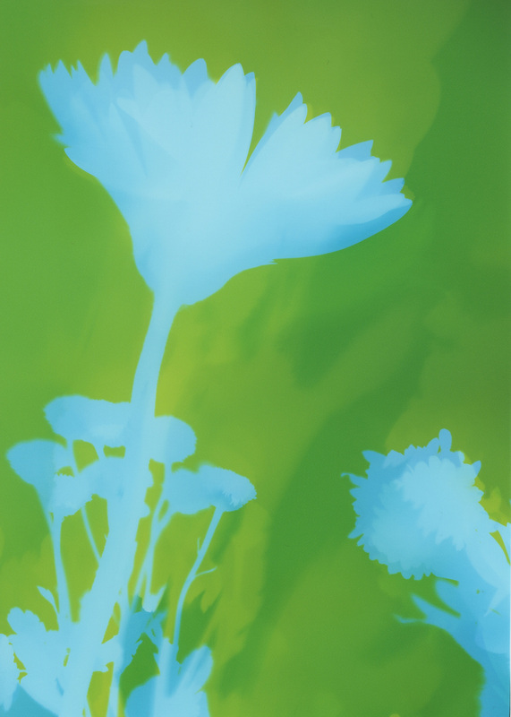
If I could see in my work in process, this is what this step might look like:
If I could see in my process in time-lapse, this is what this step might look like:
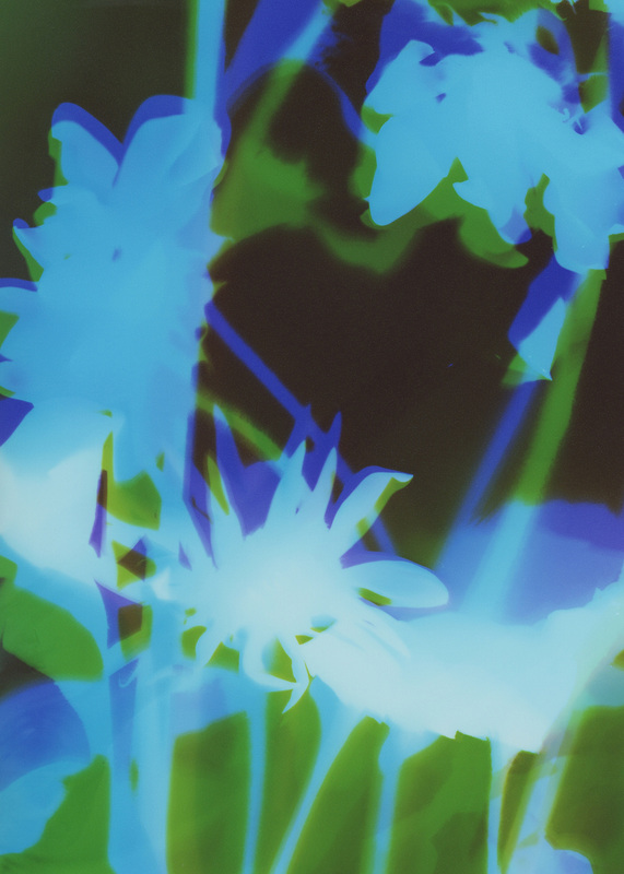
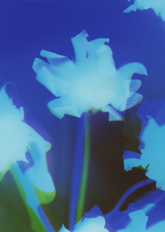
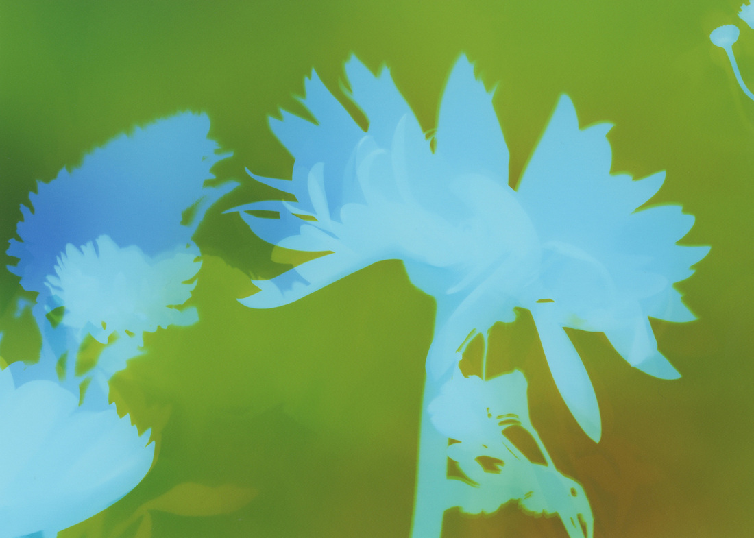
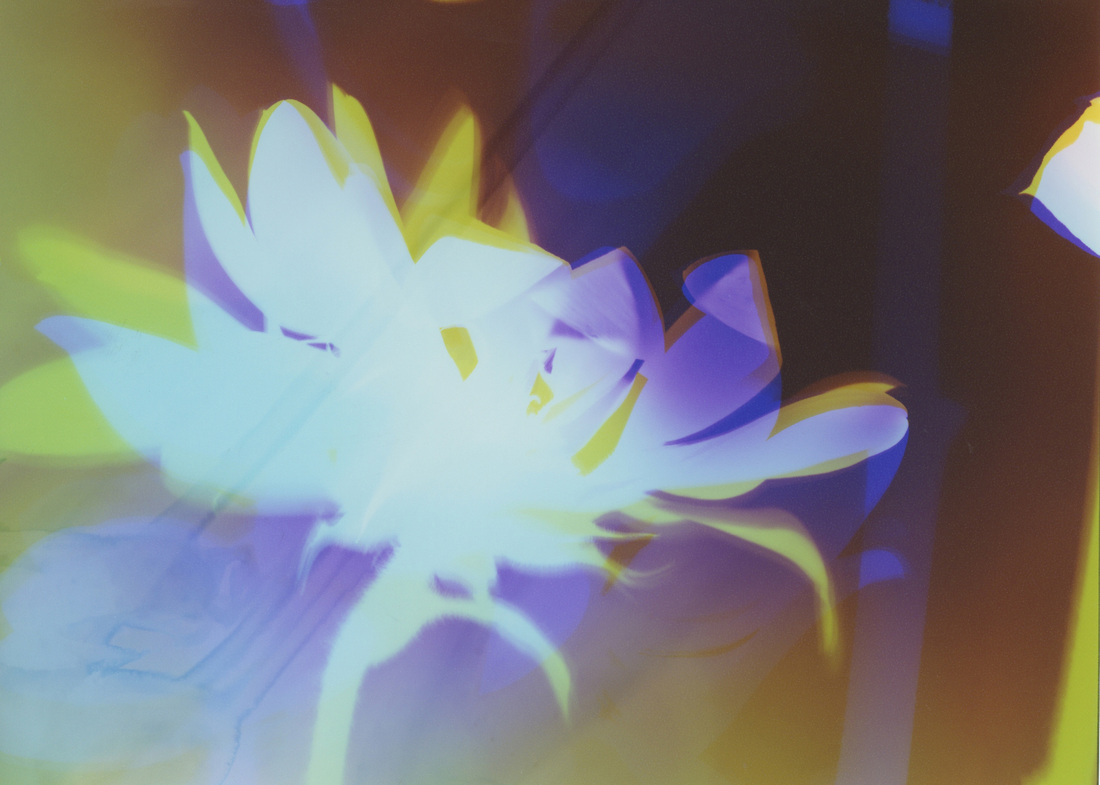
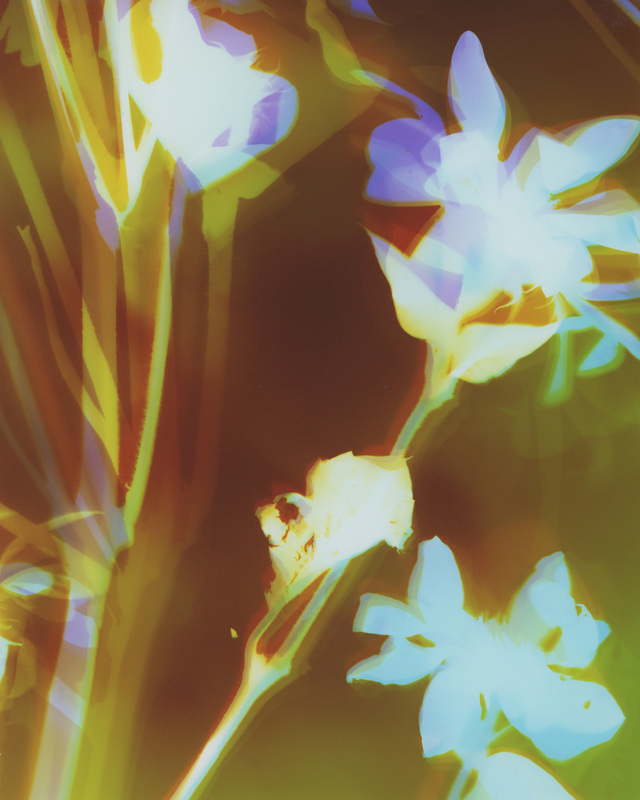
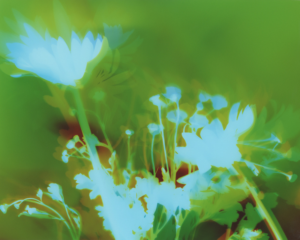
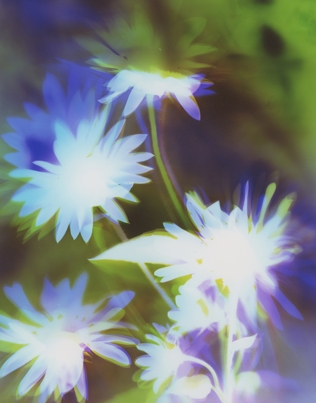
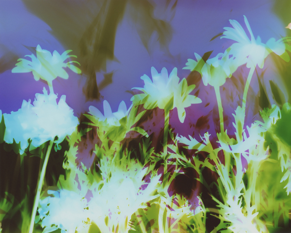
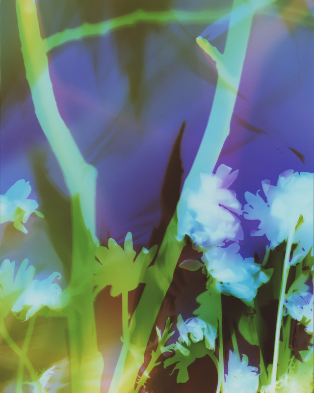
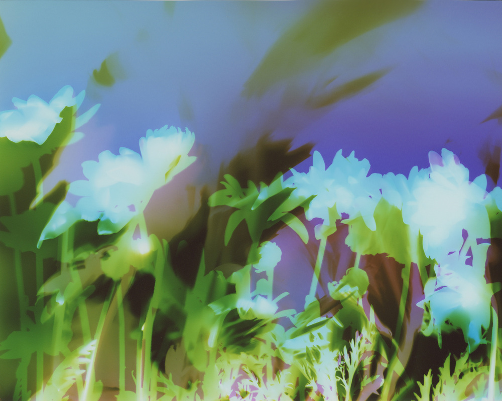
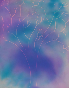
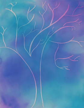
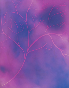
This allows me to create several pieces exactly the same but which yield different results.
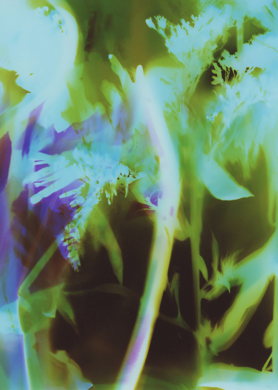
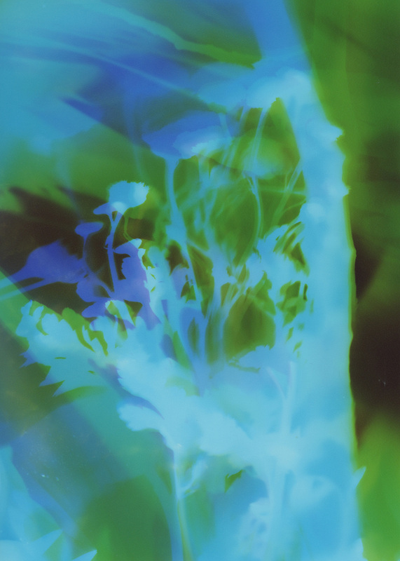
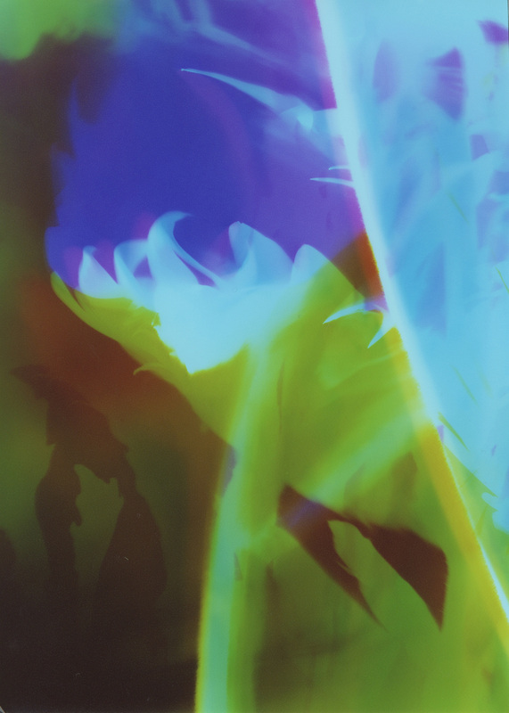
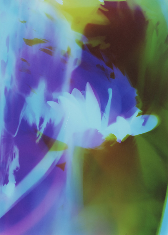
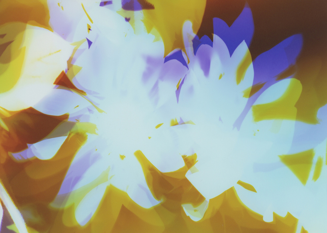
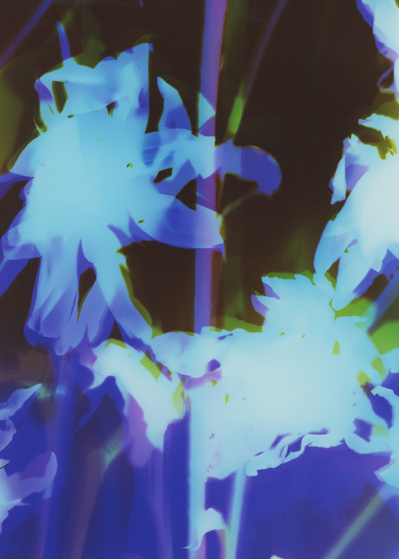
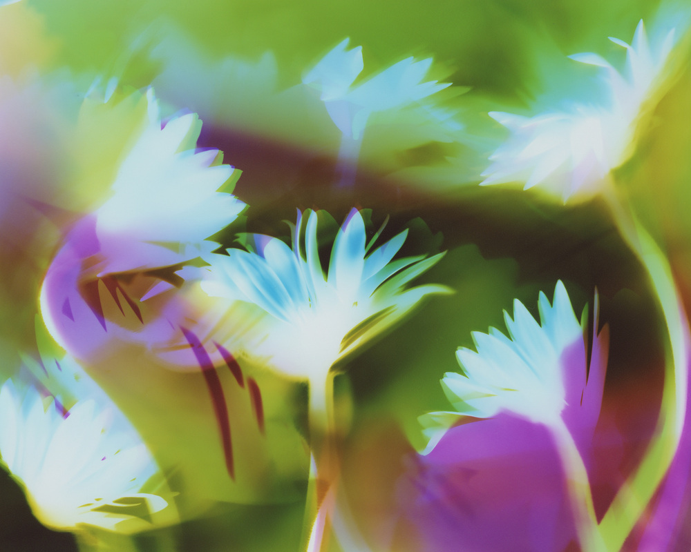
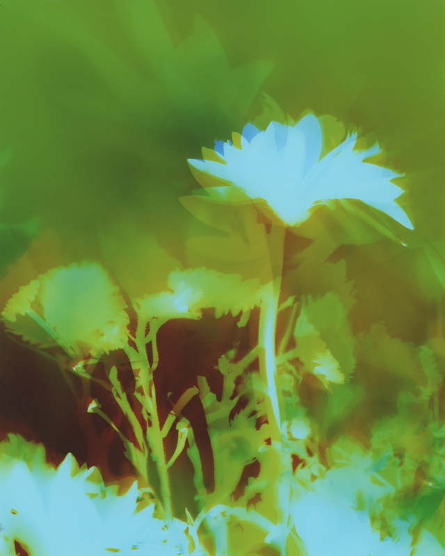
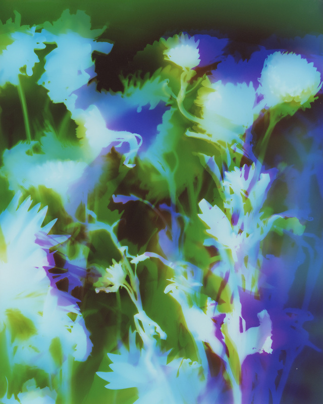
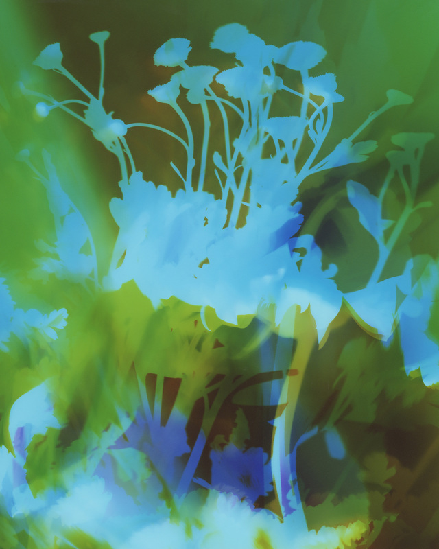
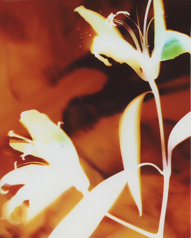
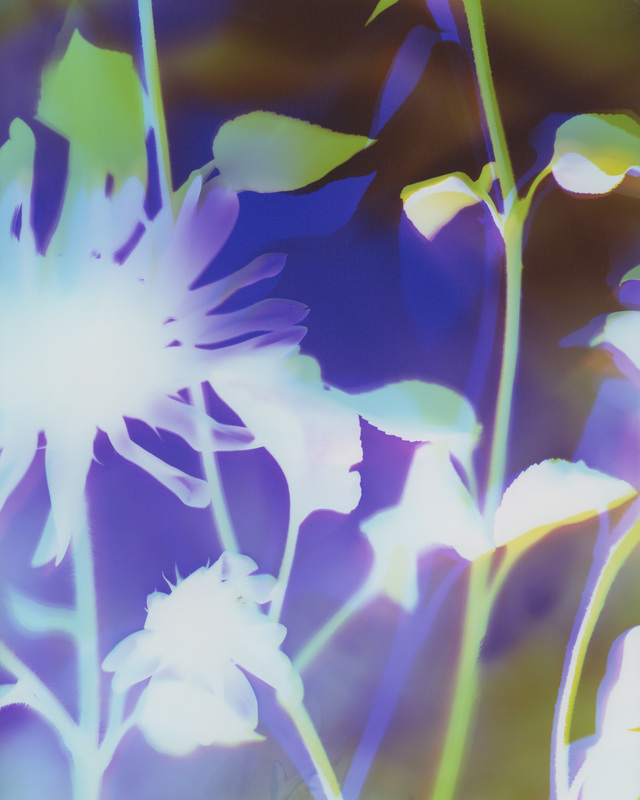
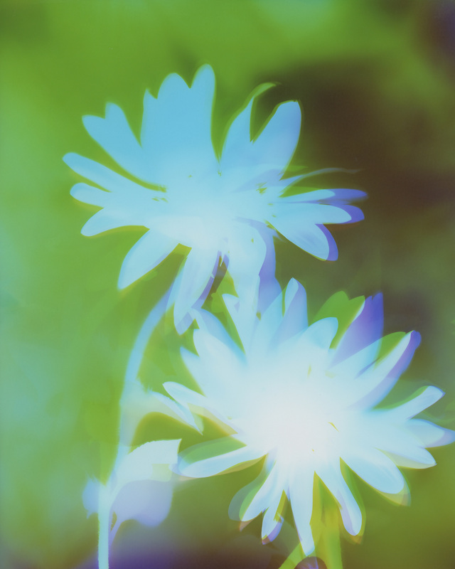
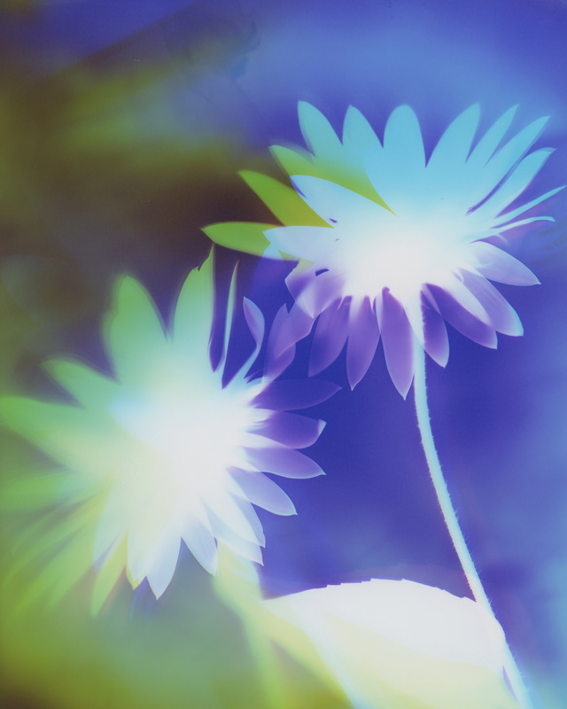
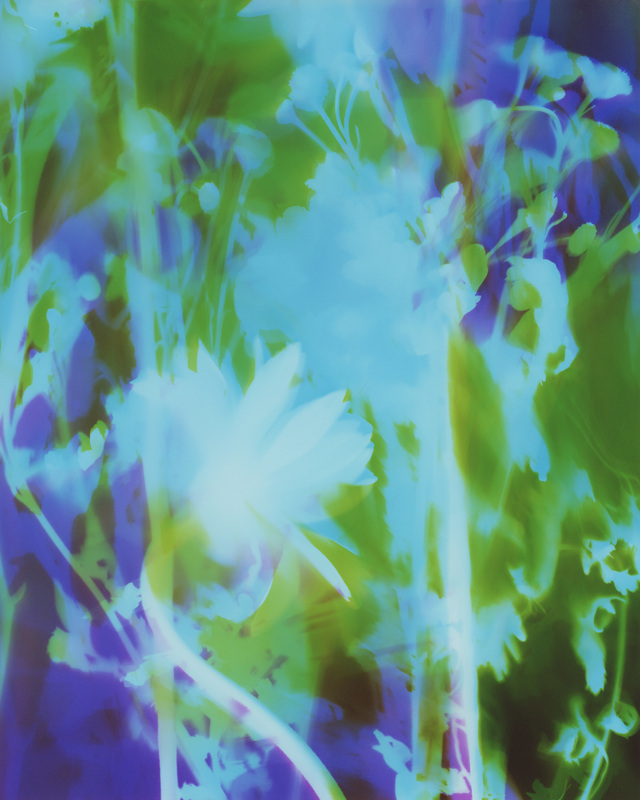
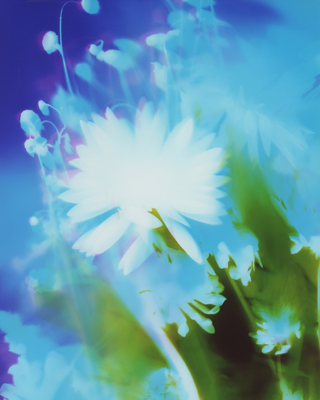
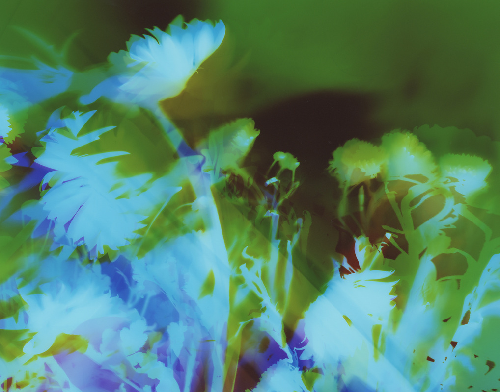
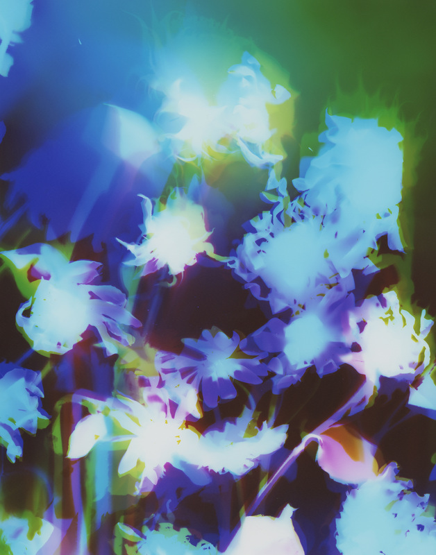
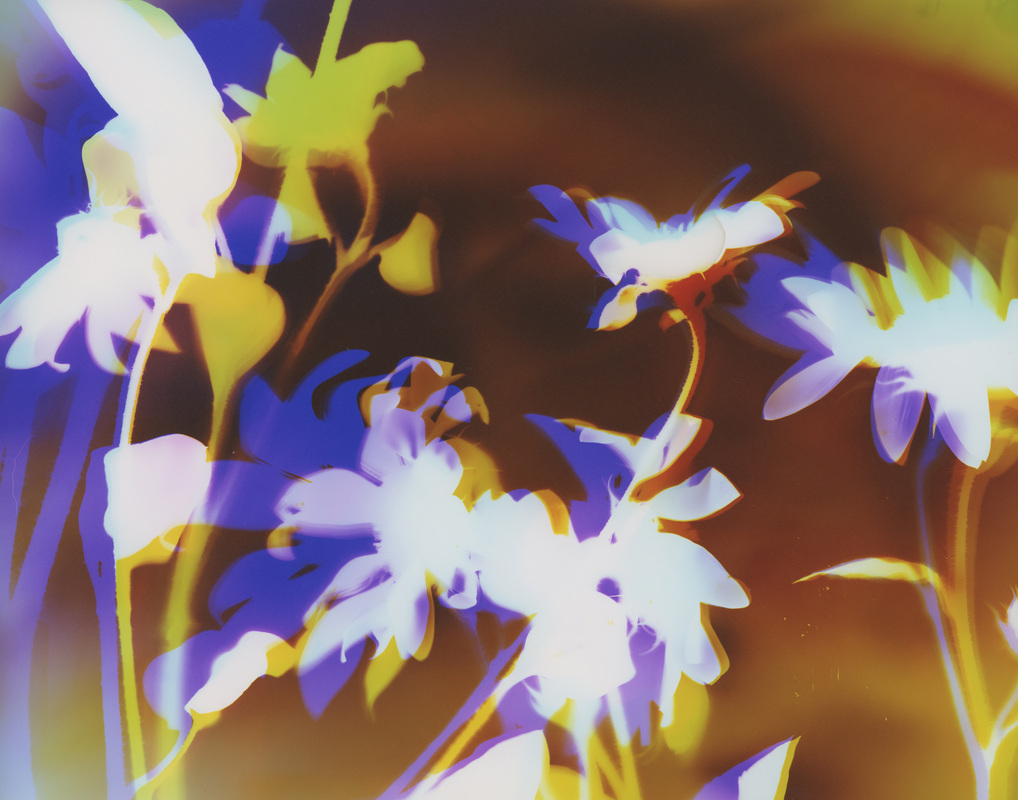
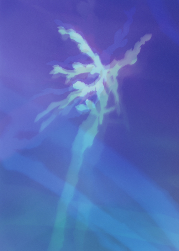
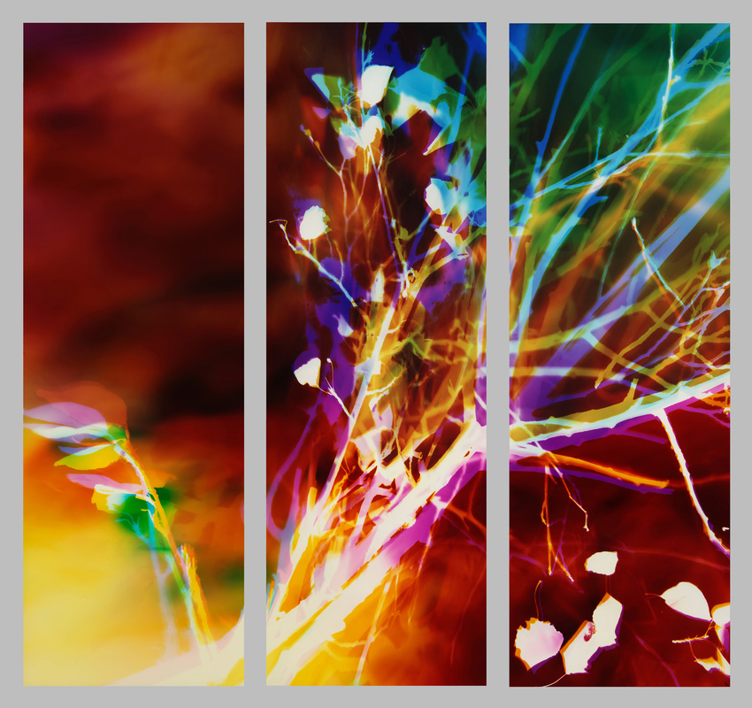
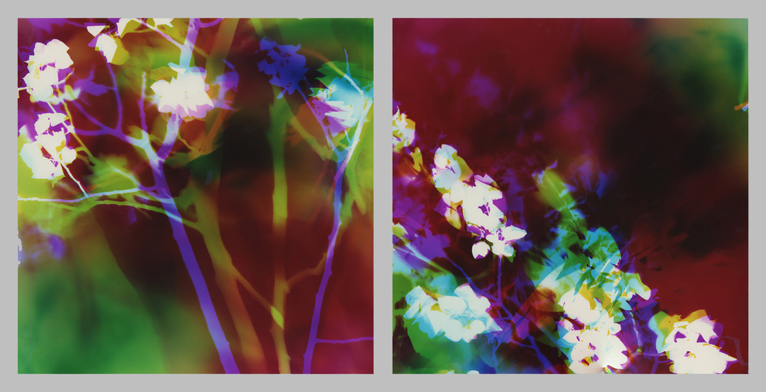
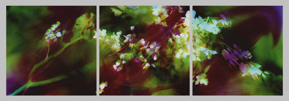
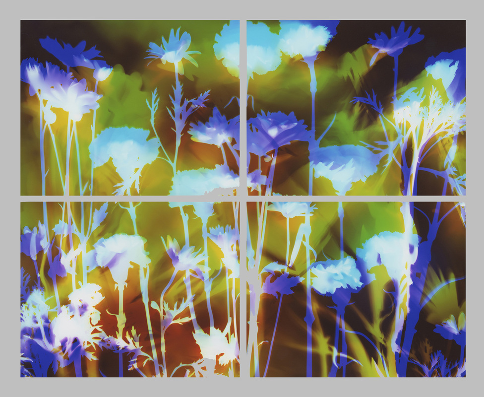
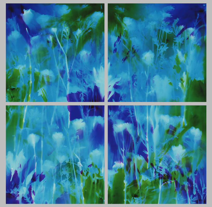
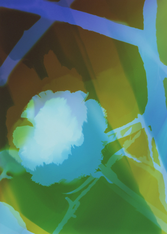
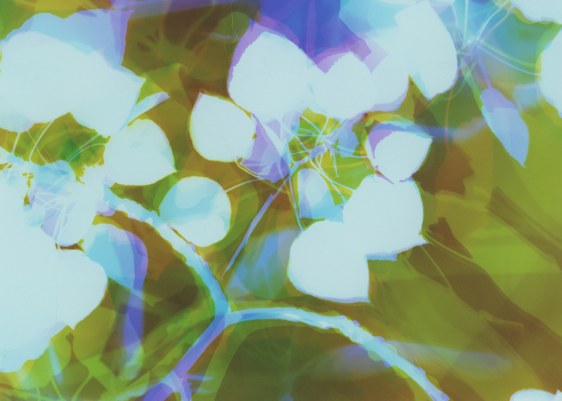
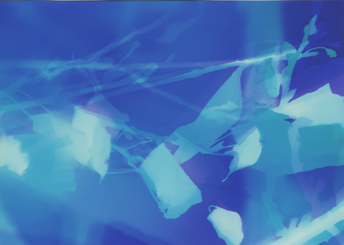
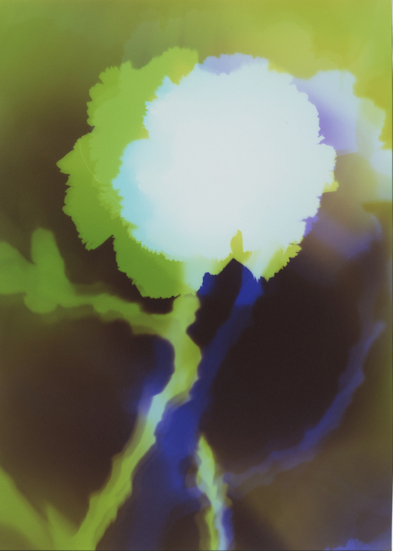
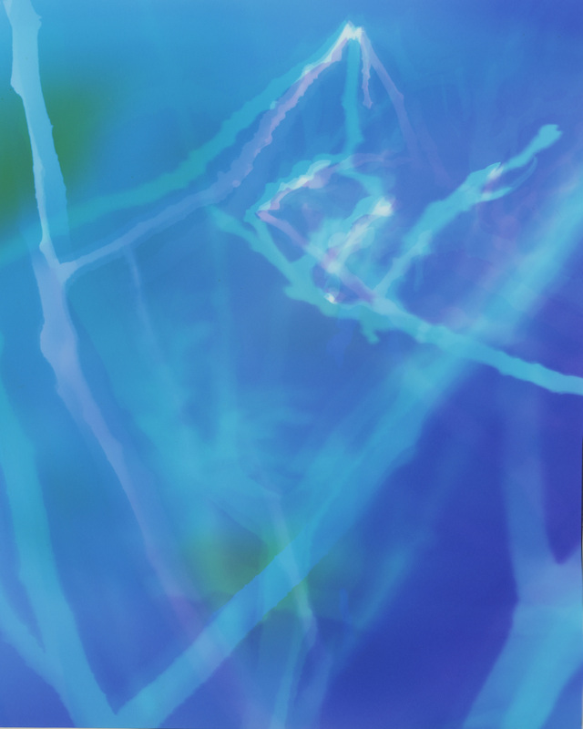
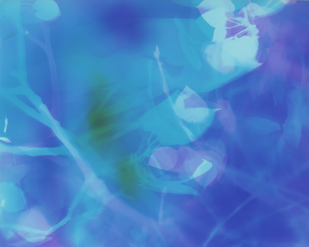
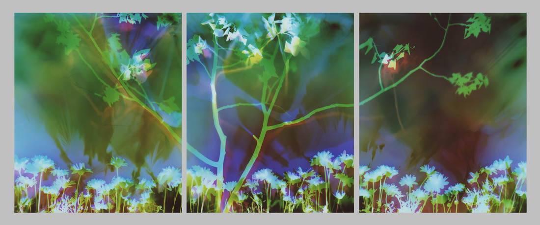
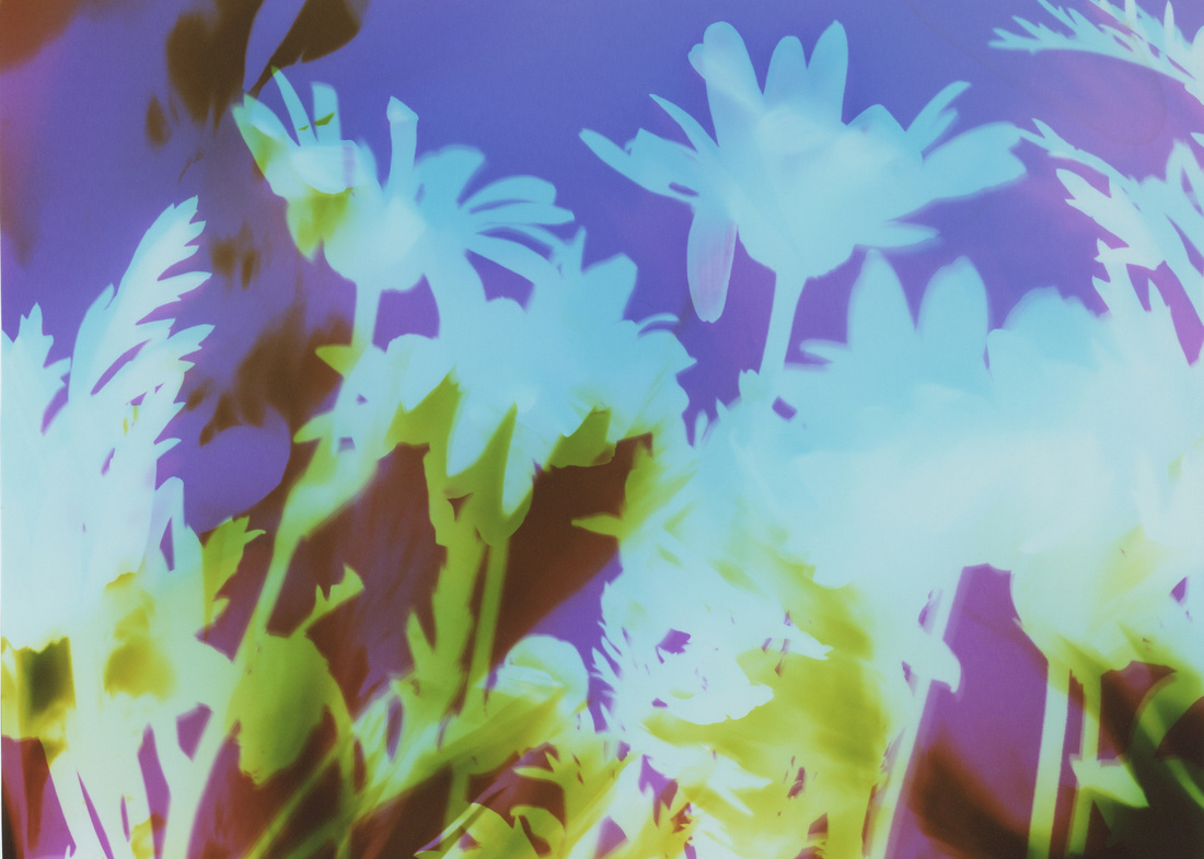
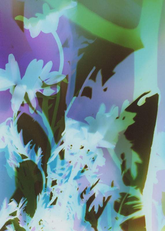
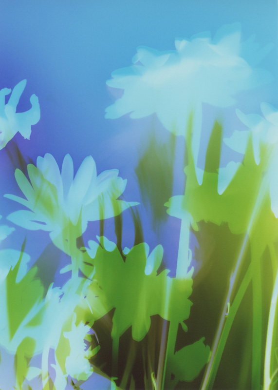
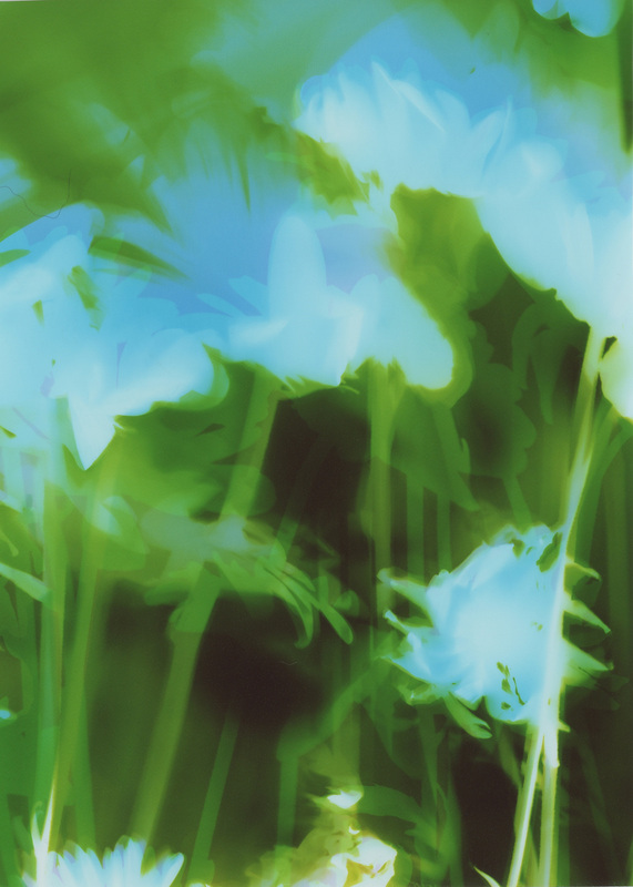
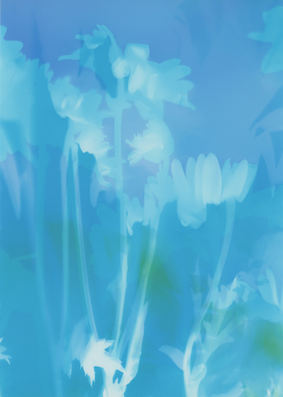
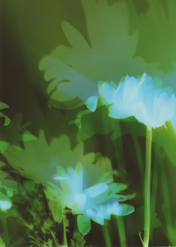
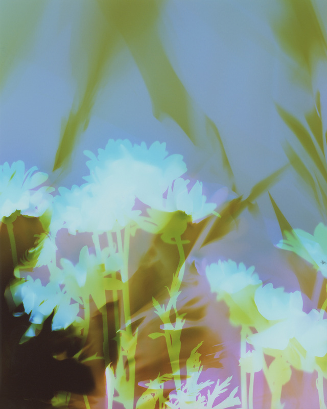
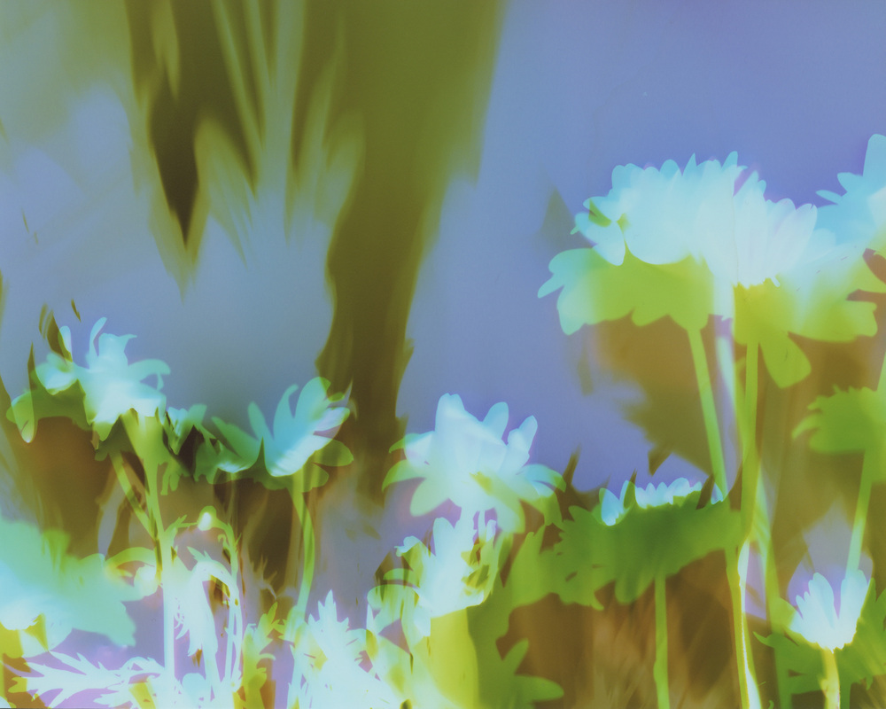
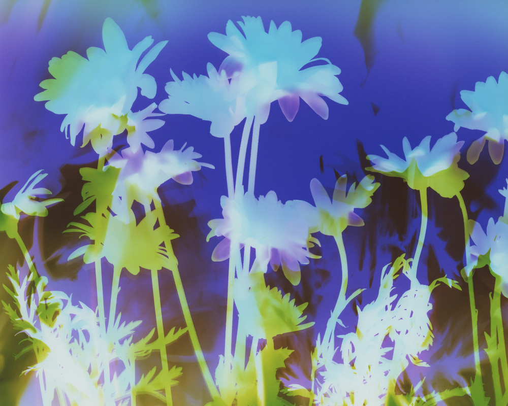
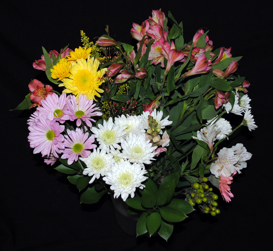
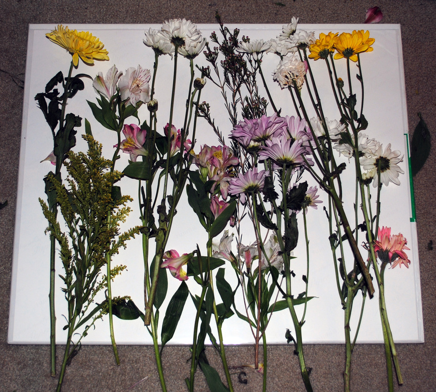
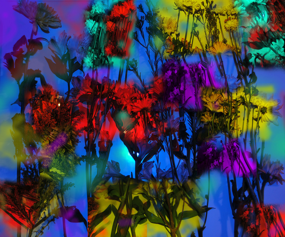
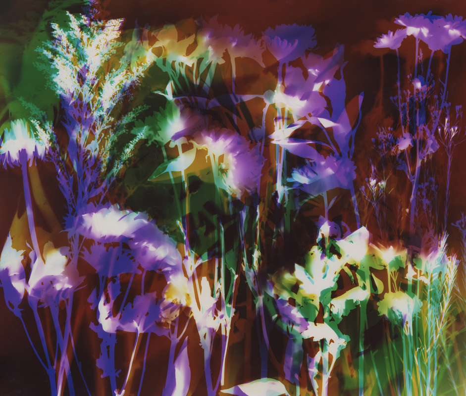
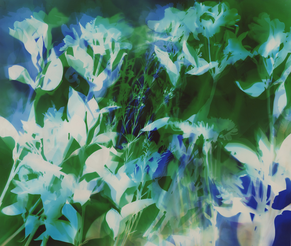
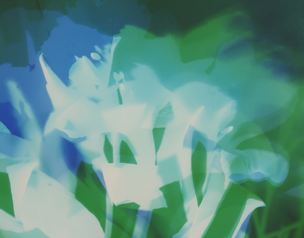
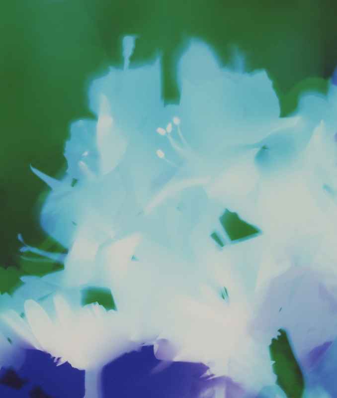
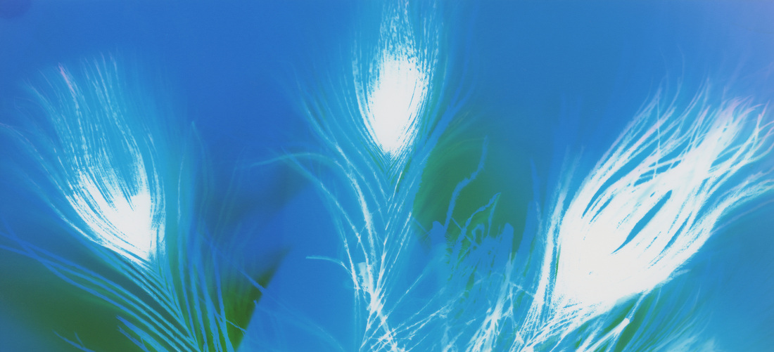
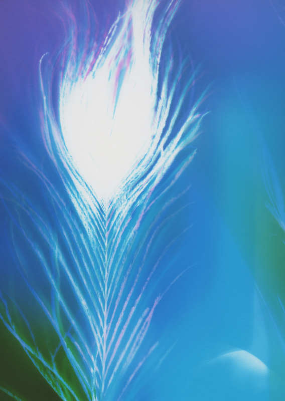
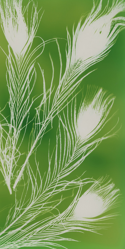
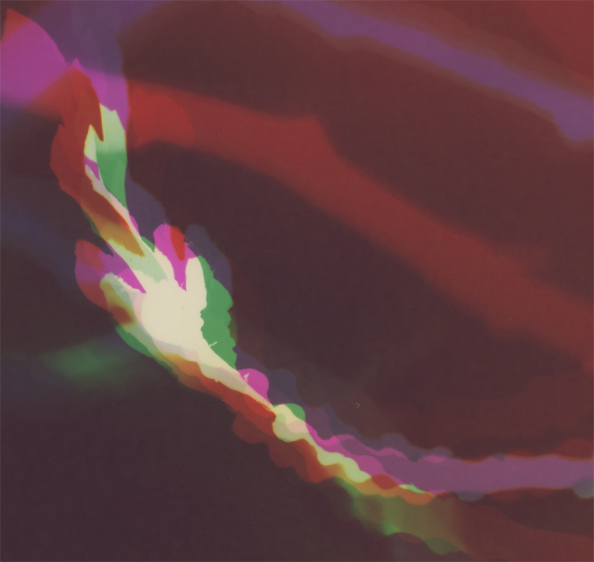
The 3 images below were all created the same.
I used the same flowers, the same photographic paper, the same colors of LEDs.
I placed the flowers in various locations on the photographic paper, feeling around the paper,
and layering the flowers in different patterns.
I then exposed the paper to the same amounts of the same colors of light, but in different places.
green = purple | purple = green | blue = yellow | yellow = blue | red = cyan
the mixed colors = brown | the white areas = no light
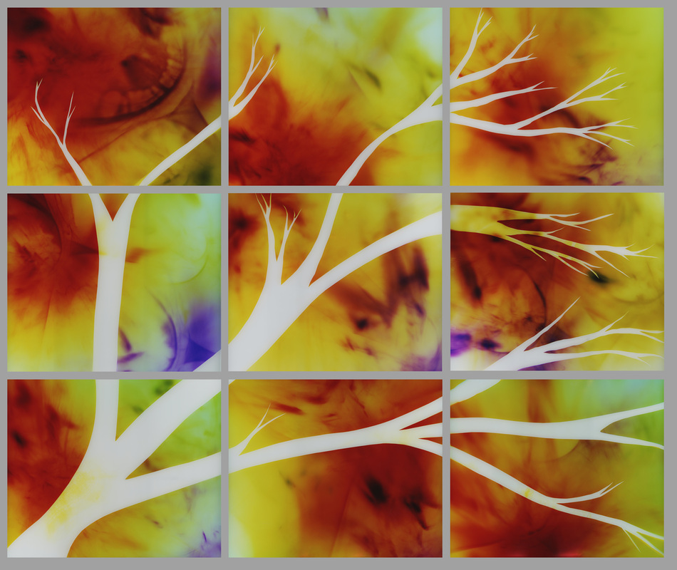
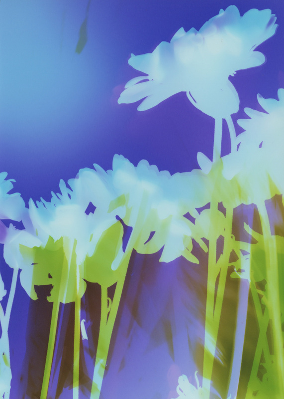
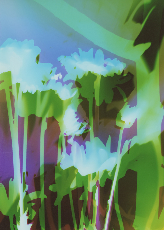
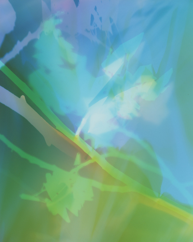
The results are below.
The top row is the final artwork, and under each piece are 2 details within the artwork.
{Click on images to enlarge & view in slideshow format.}
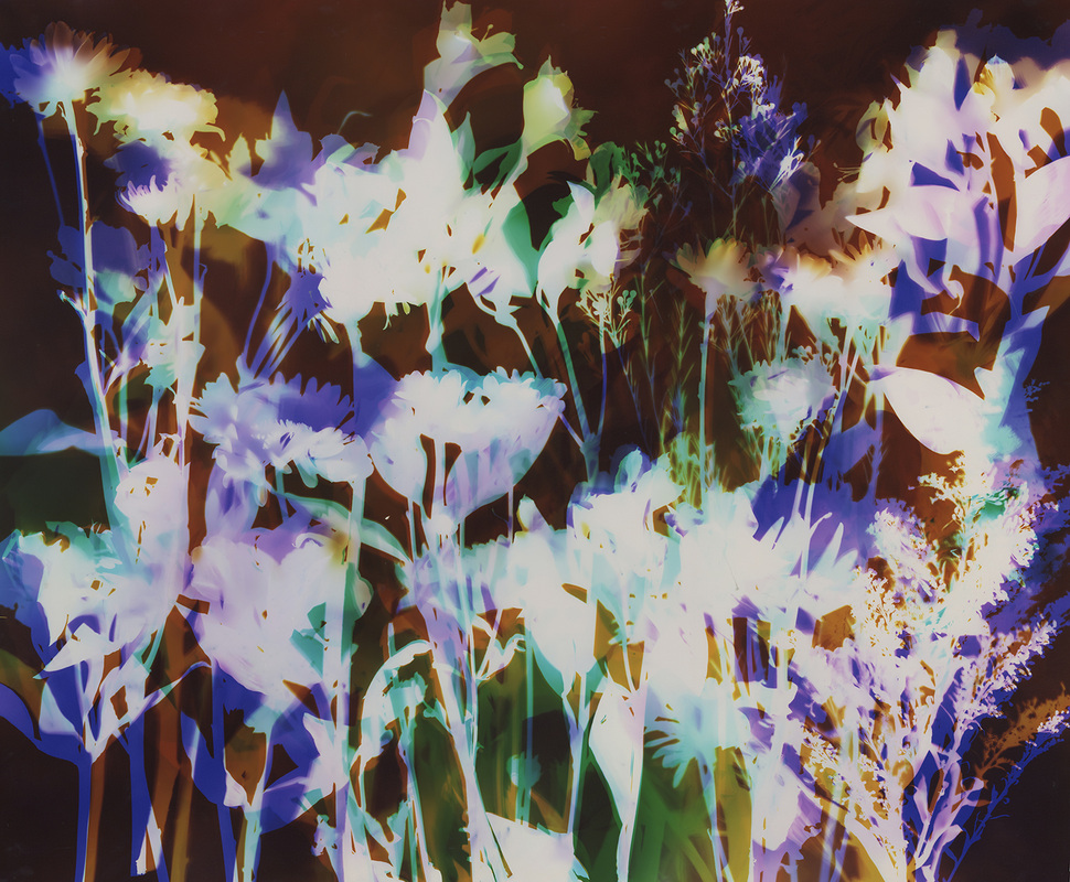
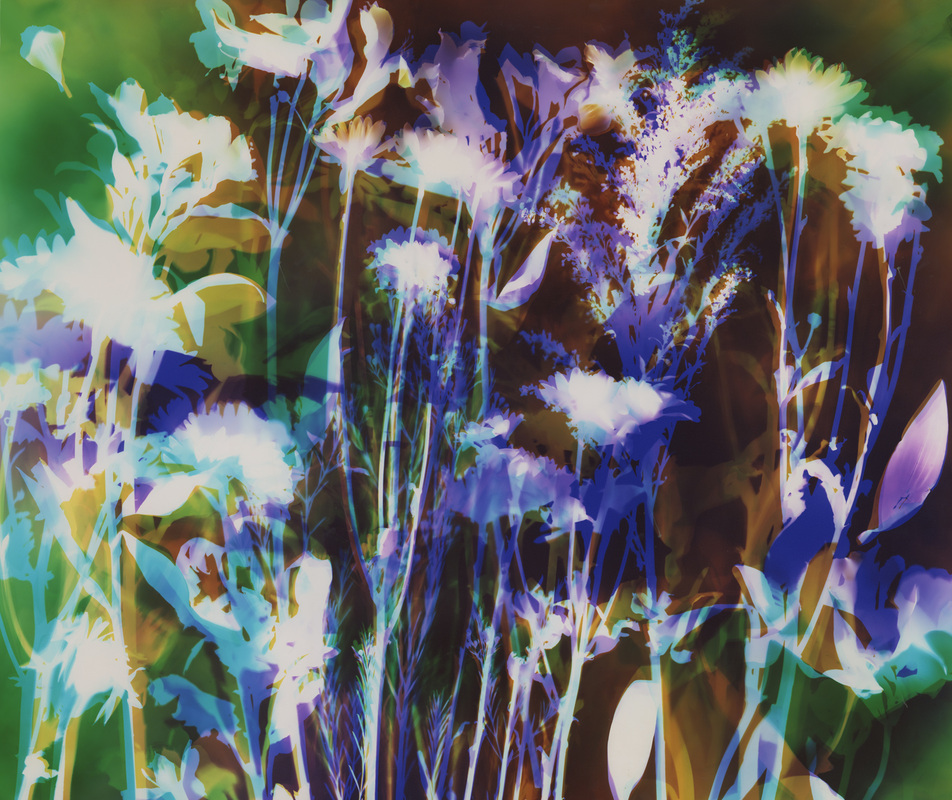
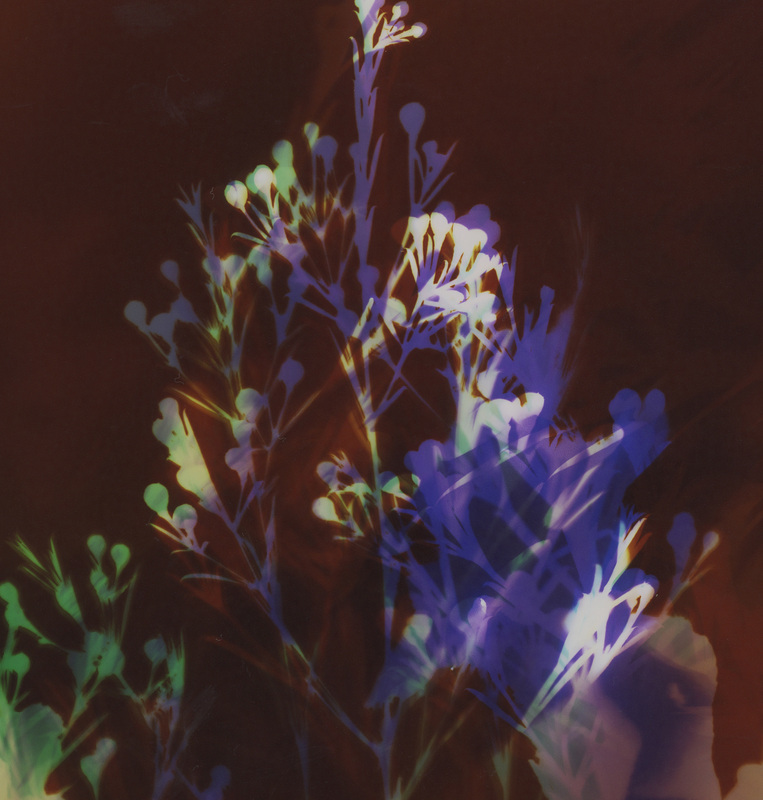
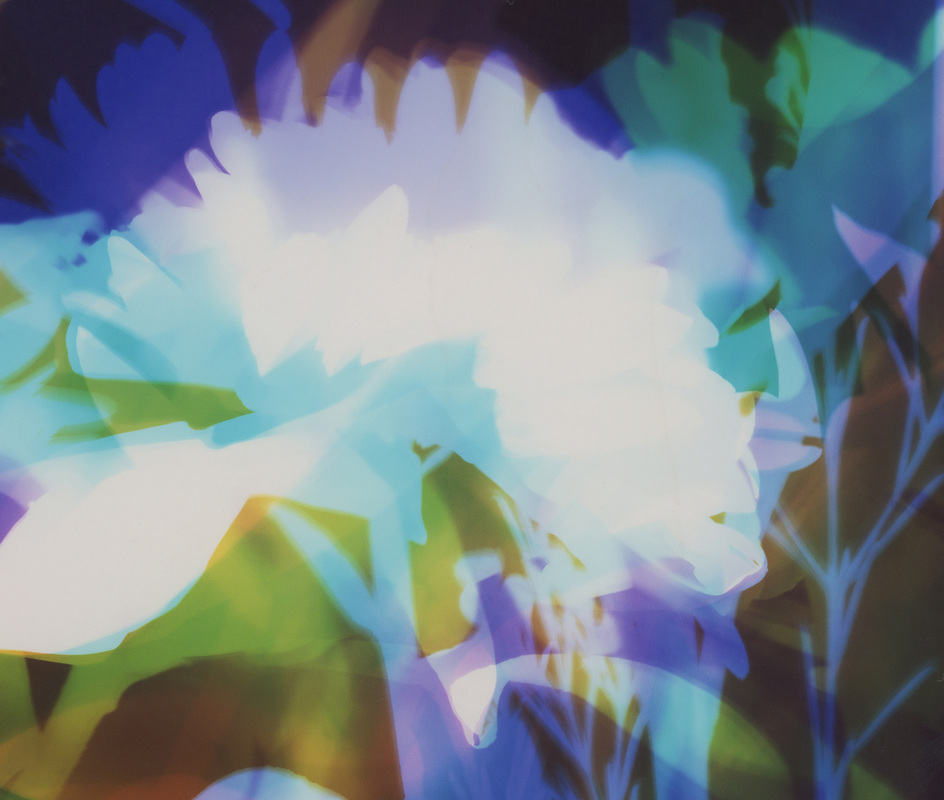
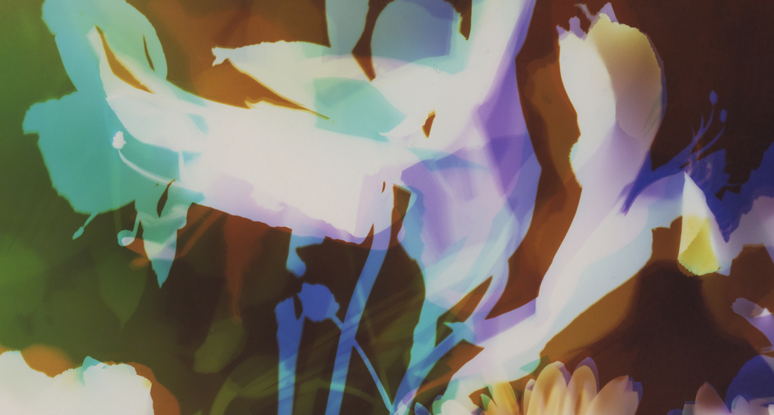
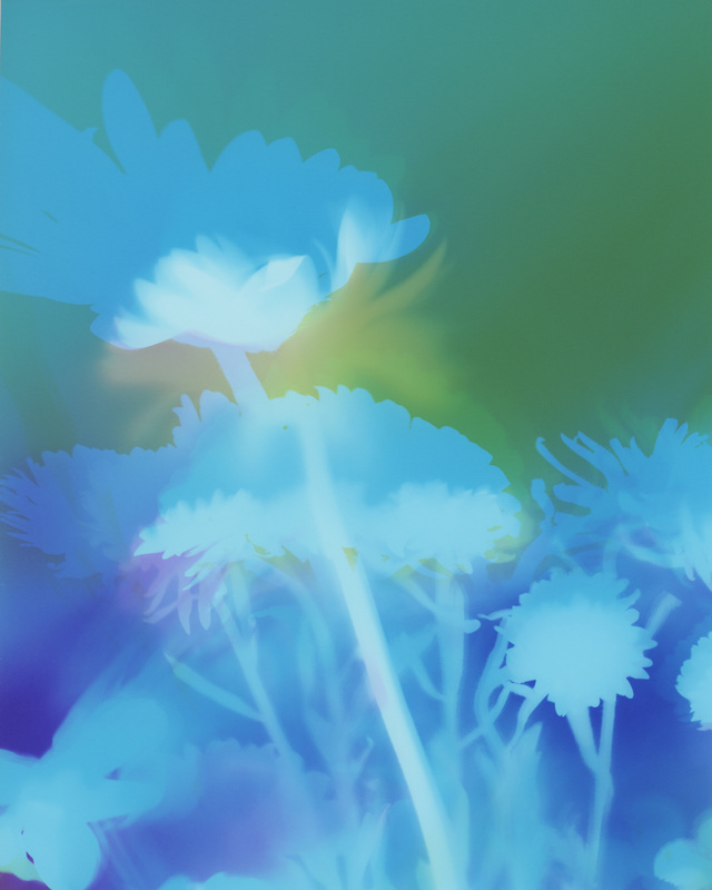
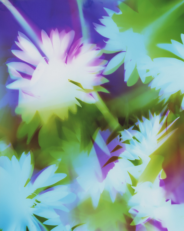
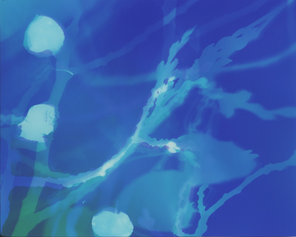
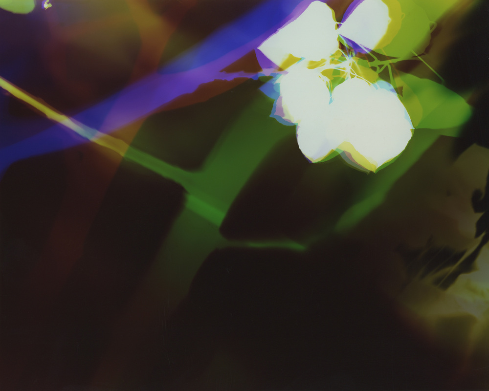
The left and right pieces are more violet with green, while the center piece is more blue with green.
I actually used the same colors of light (magnet = green & chartreuse = violet).
The variation in color is a result of altering the temperature of my developing chemical.
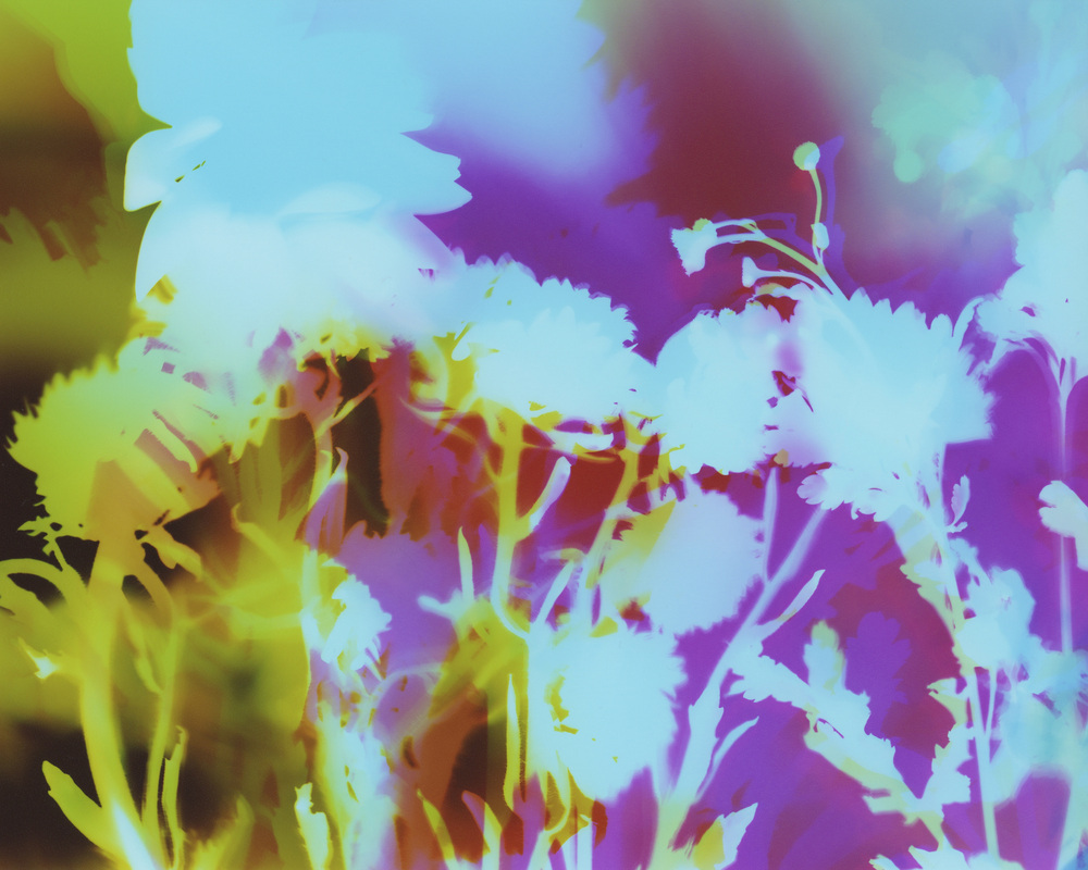
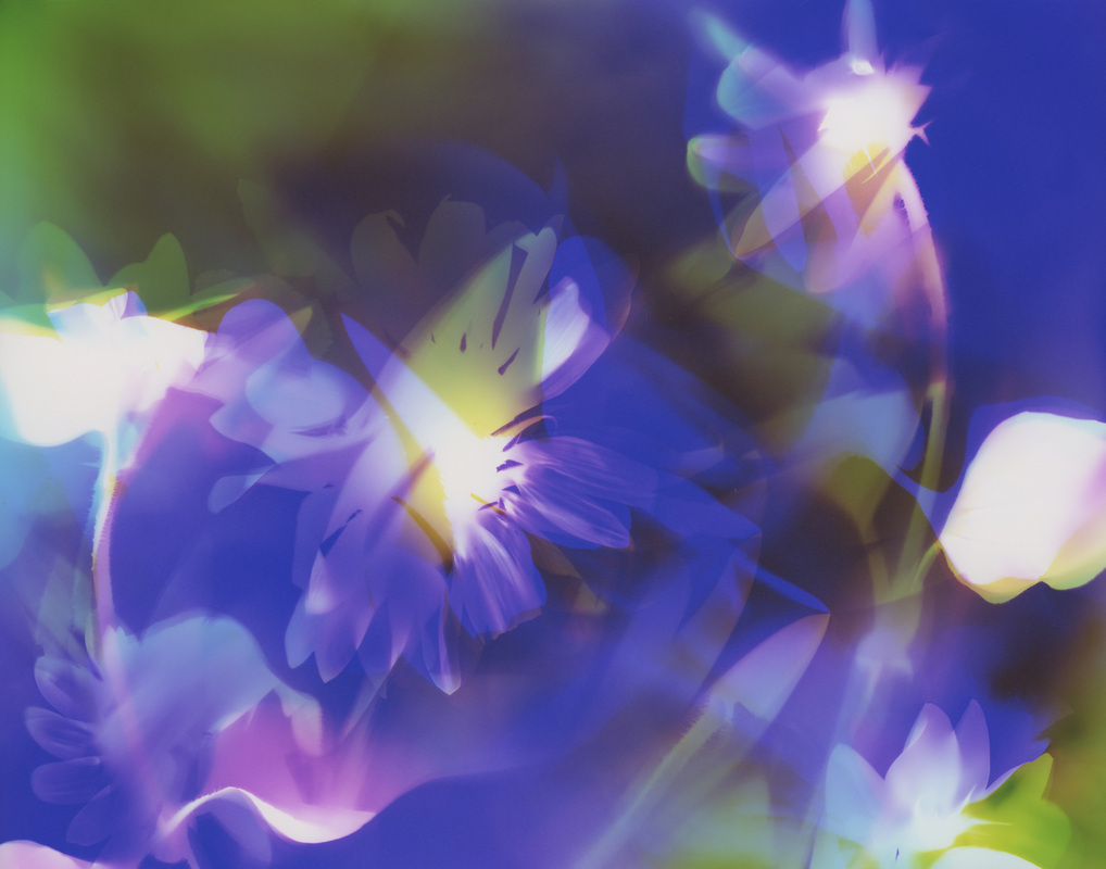
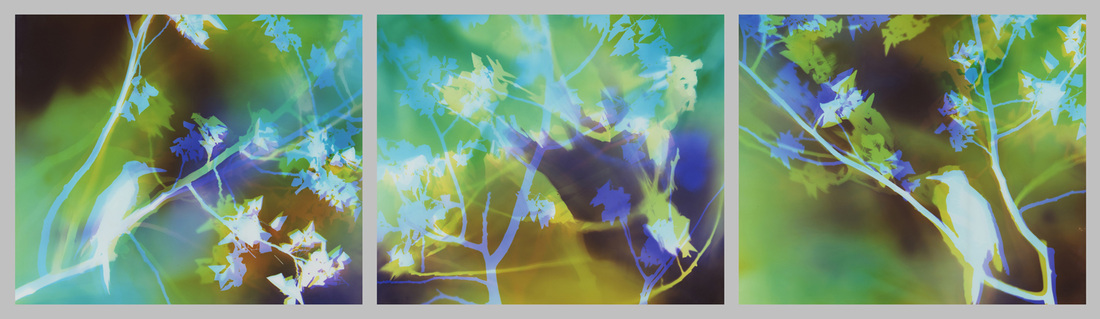
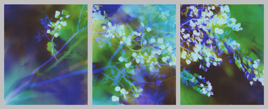
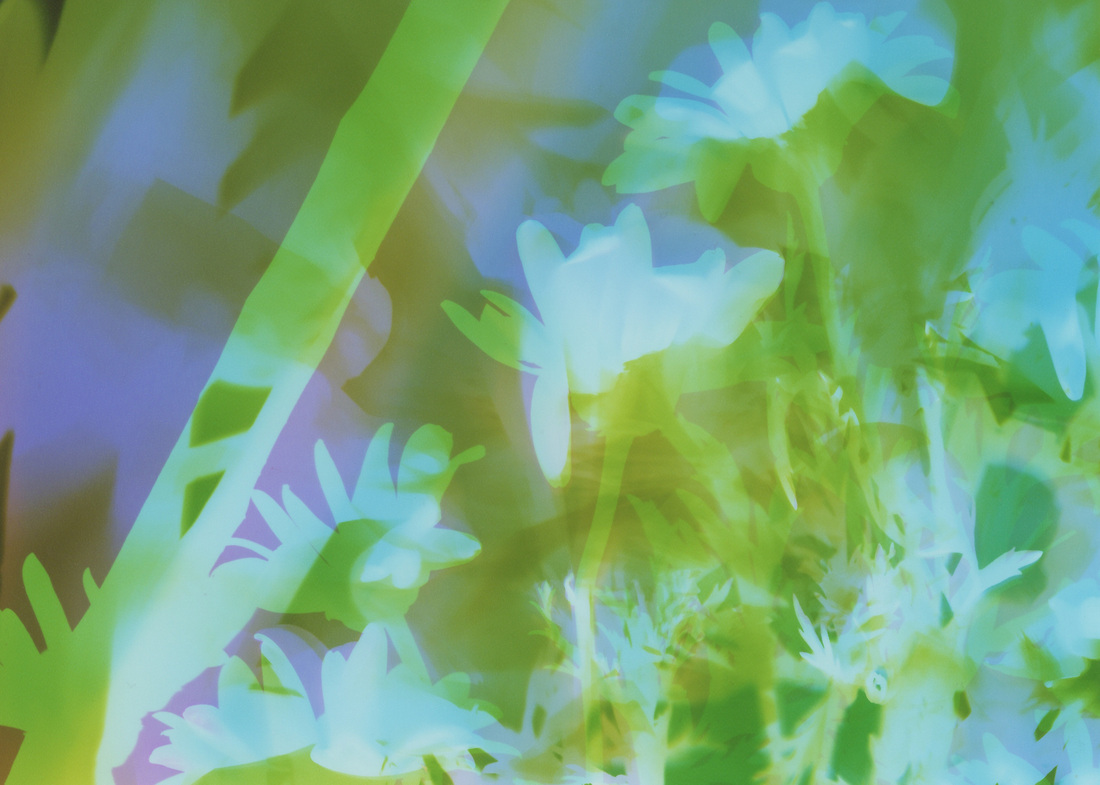
The top row is the final artwork, and under each piece are 2 details within the artwork.
{Click on images to enlarge & view in slideshow format.}

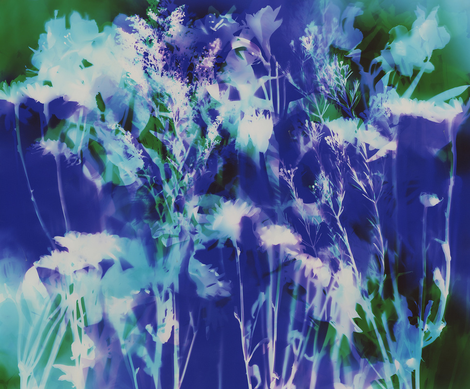


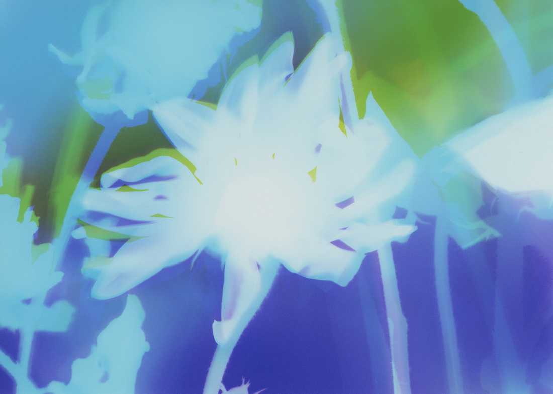
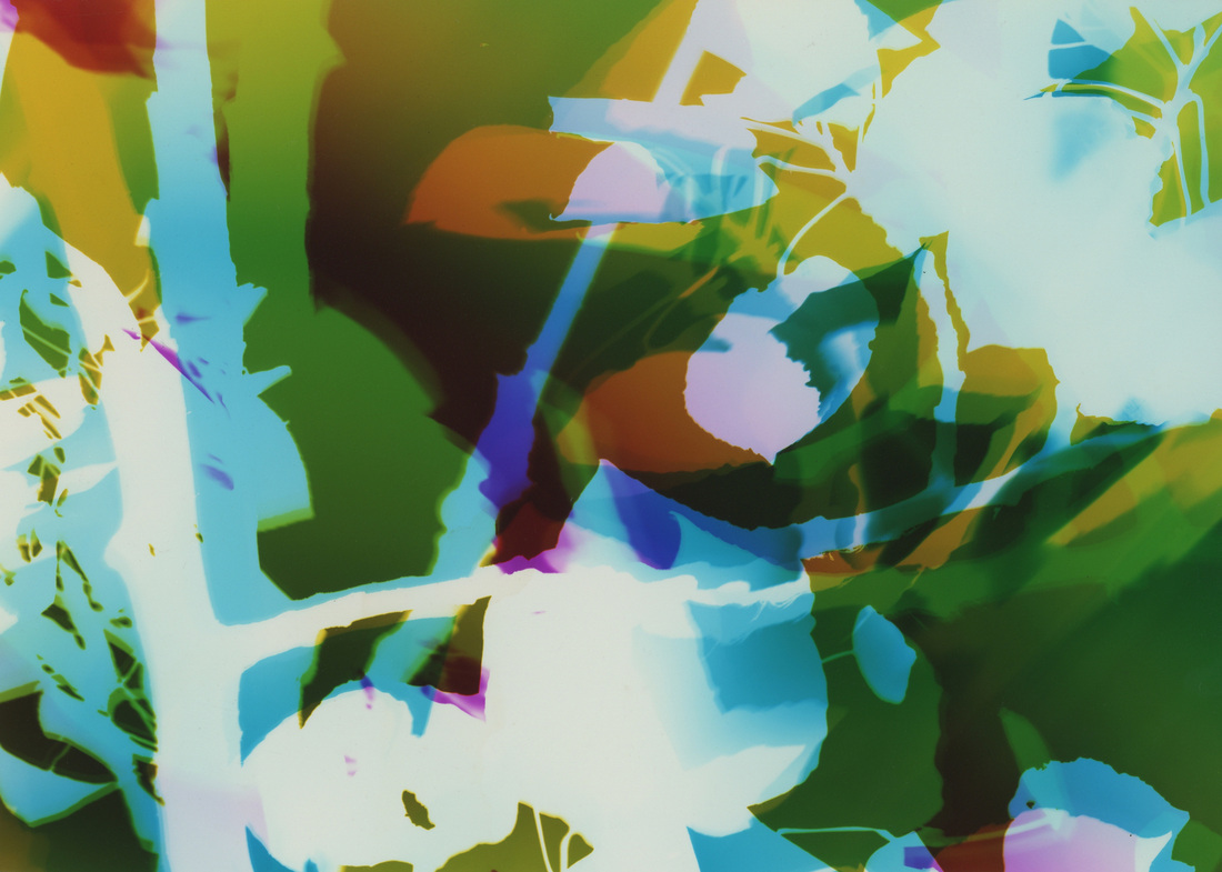
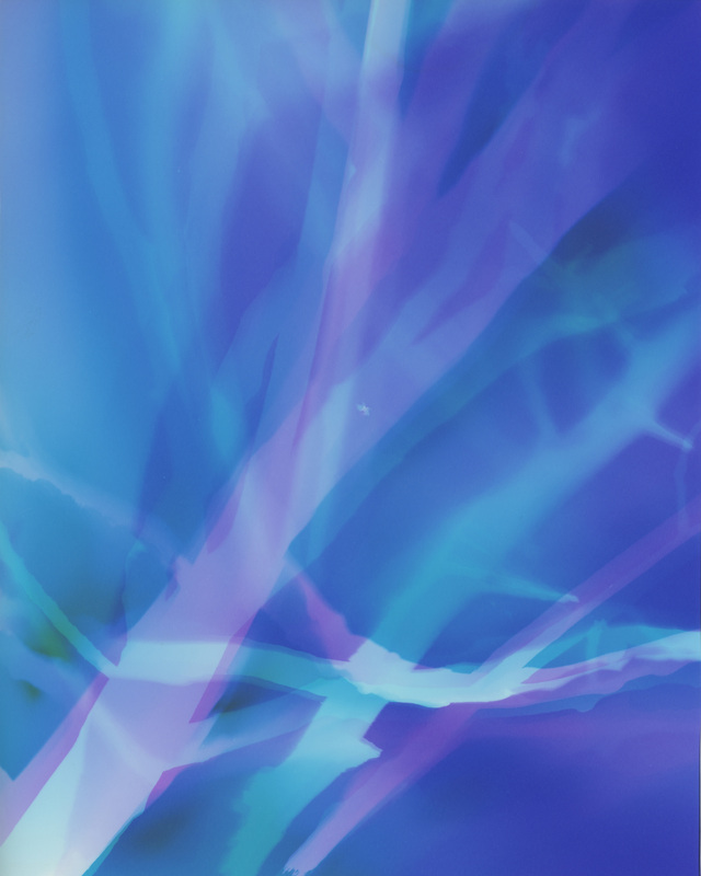
remains white during exopsure. So I do not know how much of what color is where until after processing. Once the paper goes through the developing chemical the image appears, however
the room is still dark at this point. The paper then goes through fixer which makes it no longer sensitive
to light. At this point I can turn on the lights and see the results.
This makes the process very exciting and magical for me! It is always a mystery until the end.
The many variables including colors of light, intensities of light, temperature of the chemicals,
and my manipulation make each piece the unique artwork that it is.
So while I create many same, same pieces, they are all different.
If you have questions or comments I would love to hear them.
Much love to you all!
♥ Natasha
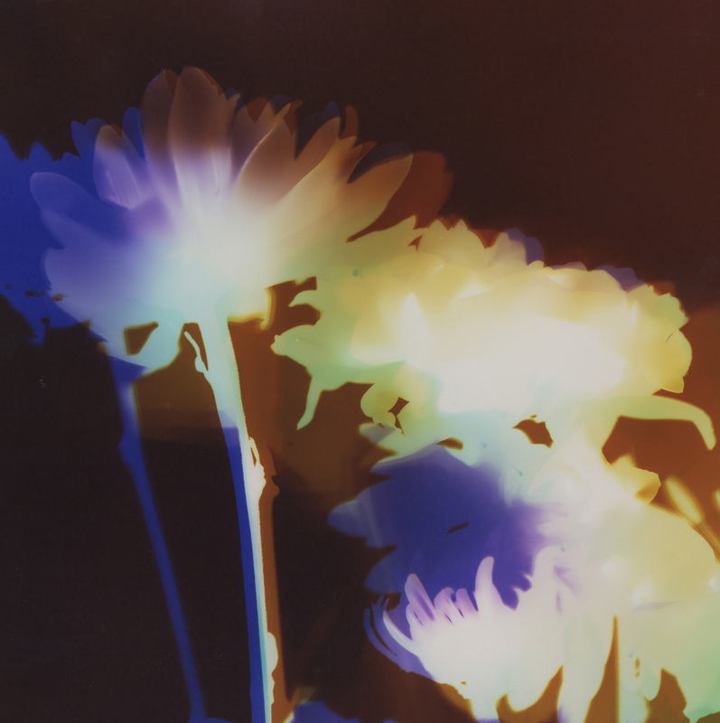
11x14 inches
Collection of The Artist
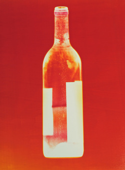
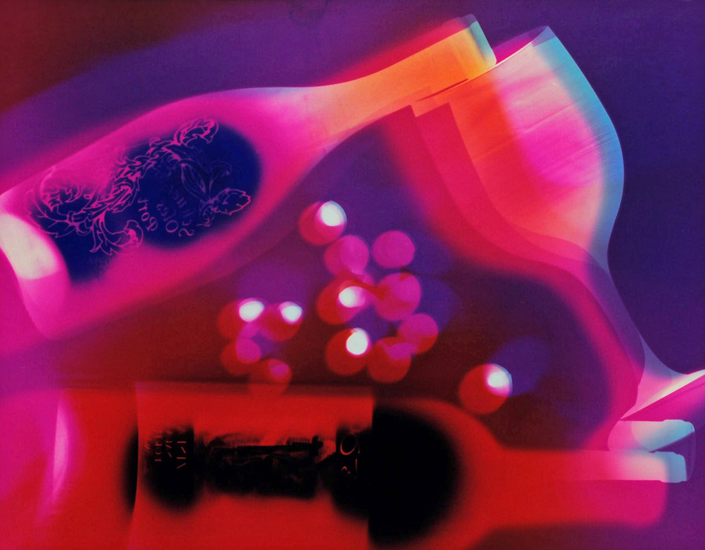
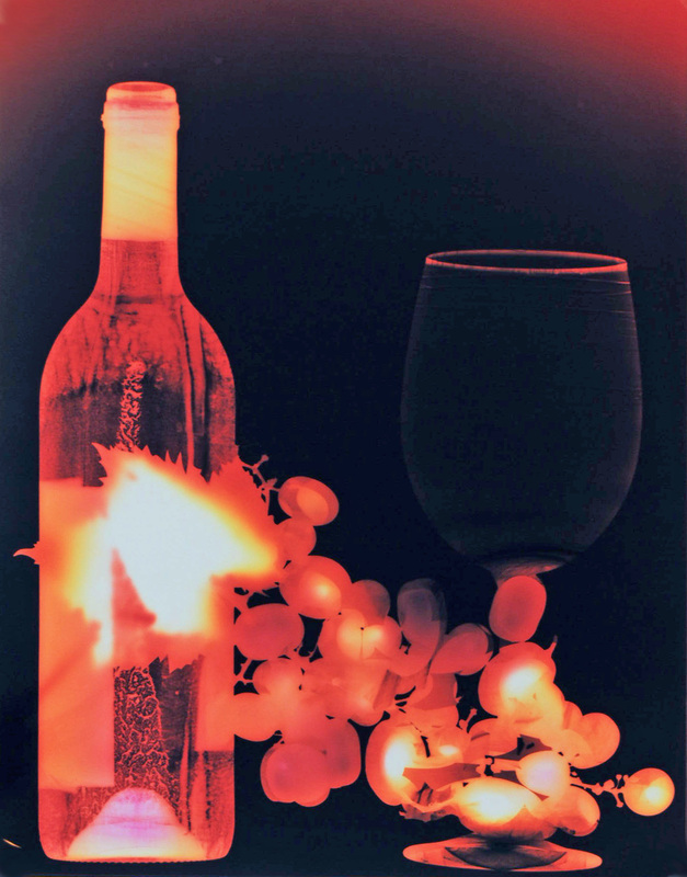
I first drank (vintage 1997) Penfolds Grange in 2003. My twin brother, Nick, gave it to me as a gift. He picked it up while in Australia and casually said it was recommended as a good wine. One day I grabbed the bottle while on my way to Heavenly Mountain Ski Resort with my husband (then boyfriend), Tony.
While on a ski lift, we opened the bottle and noted the amazing bouquet. We poured the wine into paper cups and noted the beautiful color. Taking our first sip we were amazed by the rich and complex flavors. As it is described on one website, “Penfolds Grange is a wine of extraordinary dimension and power. Richly textured, intensely concentrated and packed with fruit sweetness... Immensely complex, beguiling wines that seduce the senses.”
Later that day Tony returned from the restroom explaining he dropped and broke the bottle losing the last quarter of the remaining wine; but he salvaged the cork so we could look up the wine when we returned home. Upon searching we quickly realized we could not afford another bottle of Penfolds Grange which retailed for over $400. Our amusement at losing a bottle of wine on a ski resort bathroom floor turned to disappointed when we understood that over $100. worth of wine was lost; but we were grateful for the wine we were able to enjoy and for Nick’s incredible generosity.
We remembered the bottle fondly, and to our fortune Nick gifted me another bottle in 2005 when I completed my Master’s Degree. We saved the bottle for years, and finally drank it in 2011 to celebrate our 10-year anniversary. This bottle is lovingly displayed in our kitchen.
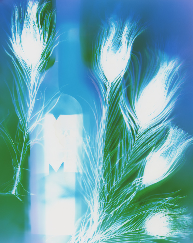
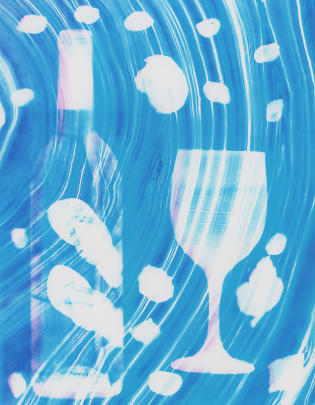
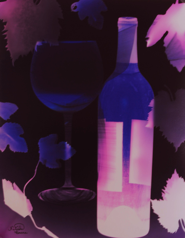
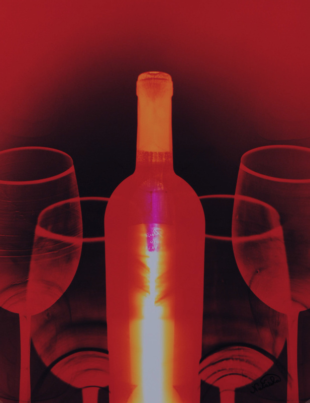
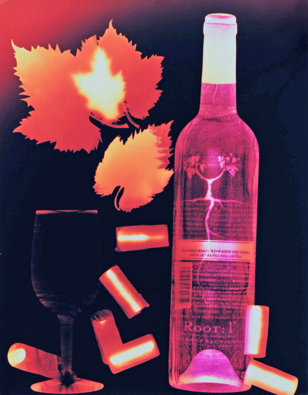
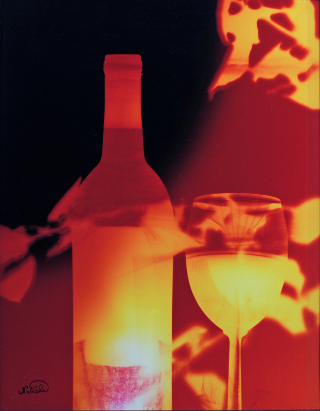
One day I took the bottle down to my studio and created the above photogram of it. I love wine and I thought a series of wine photograms might be interesting, but I did not have much inspiration for variety within the series. I also love trading my artwork, and I thought trading people wine for a customized photogram of the bottle they gave me could be fun. So I began The Wine Project.
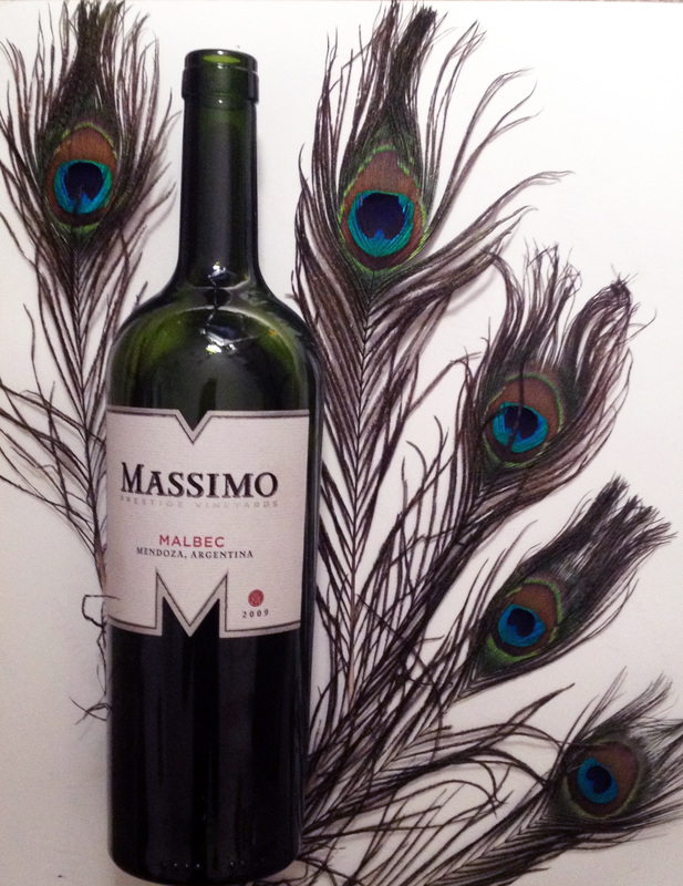
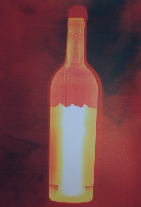
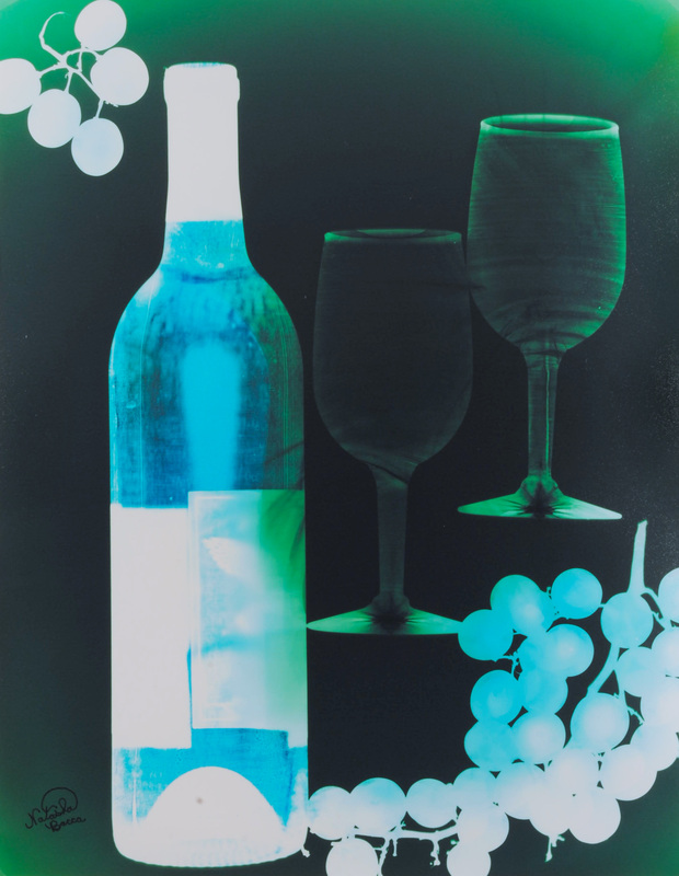
For each piece in the series the participant gave me a bottle of wine. Most participants chose a bottle they enjoyed and wanted me to try, or they chose a bottle with an interesting design element in the label. This has allowed me to try many excellent and unique wines I would not have otherwise explored. I gladly drank each bottle of wine to the participant’s health, and then created them a customized photogram of it. The most interesting aspect of the series has been the input given by each participant, and the way the series continues to develop because of the creativity of so many people involved. Some participants gave very specific requests, while others left most of the design to me. Some participants preferred simple compositions, while others preferred more busy compositions; one participant decided to make the composition horizontal. Some bottles came from local retailers, some from select wineries, and some were shipped from the East Coast. Some of the artworks were displayed in homes, and some were given as gifts.


Each image is a unique print so get the one-and-only piece while you can!
If you want to purchase one simply be the first person to post a comment with the title and it is yours!
Then send me a message at [email protected].
Click on the images to enlarge and see titles and sizes.

If you are interested in commissioning a piece in The Wine Project series send me a message at [email protected].
Purchase wine prints here.
(Click on the images to enlarge and see in slideshow format.)
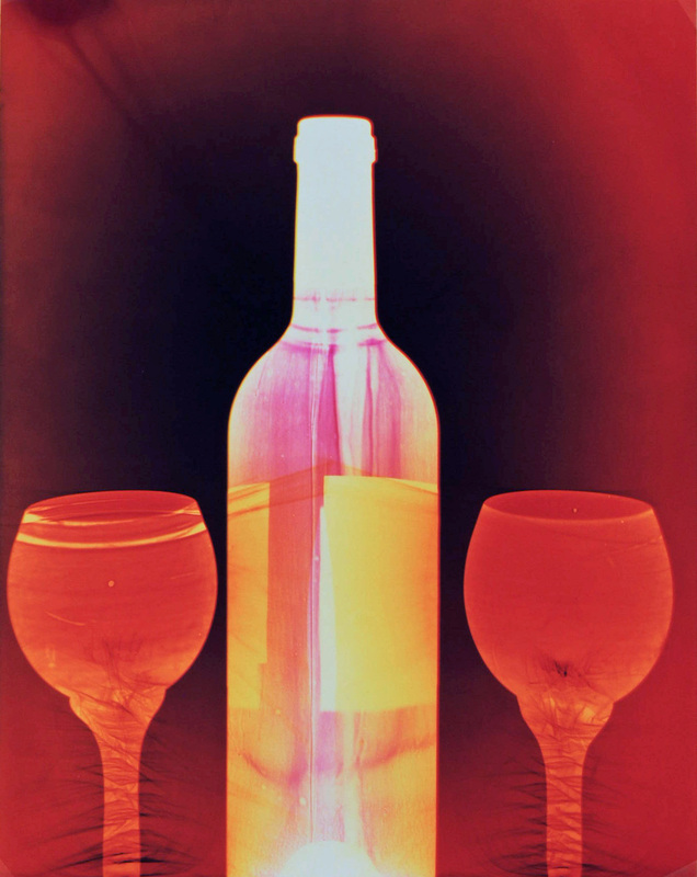

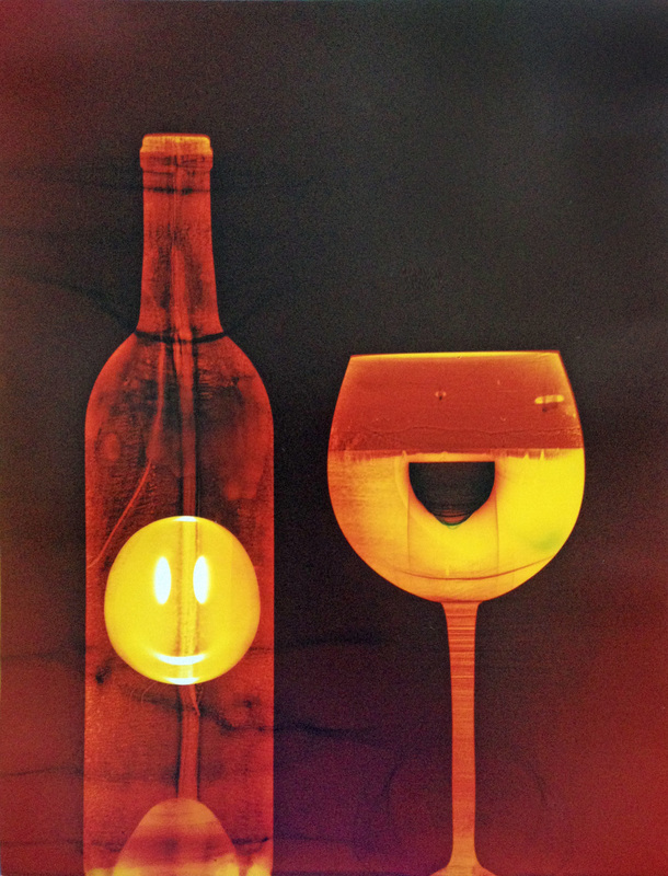

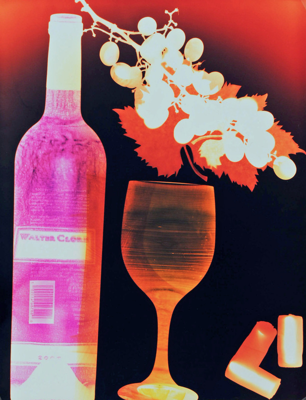
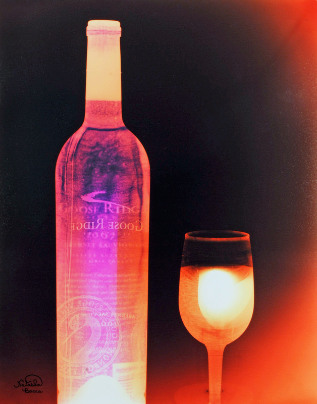
The second Penfolds Grange photogram (above center) was created for our mom.
Thank you for viewing!
If you have questions or comments I would love to hear them.
Much love to you all!
♥ Natasha
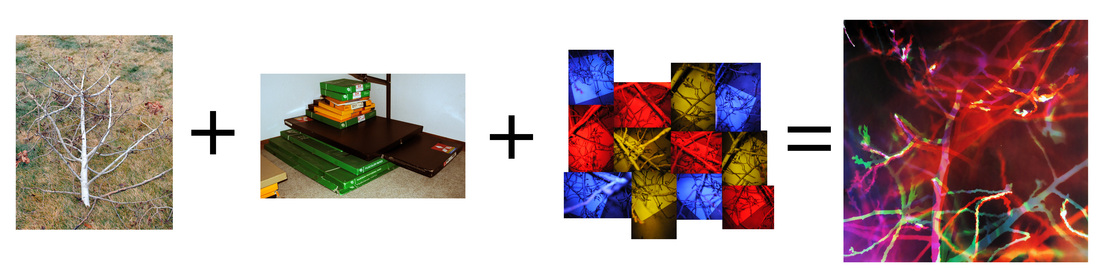
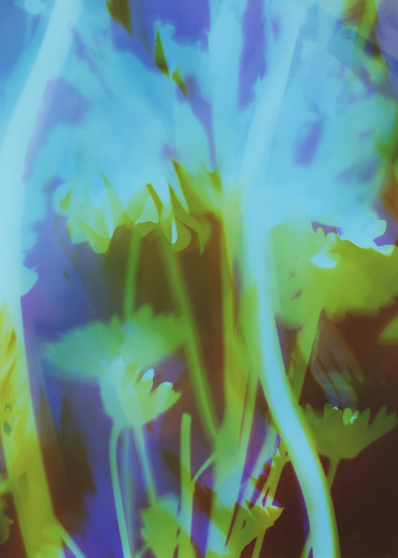
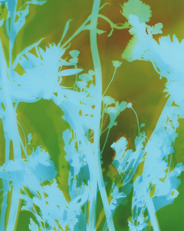
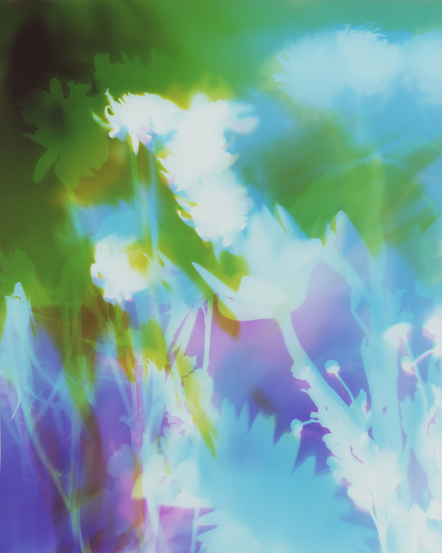
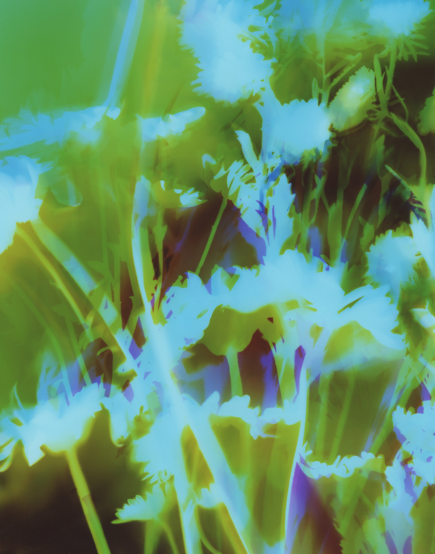
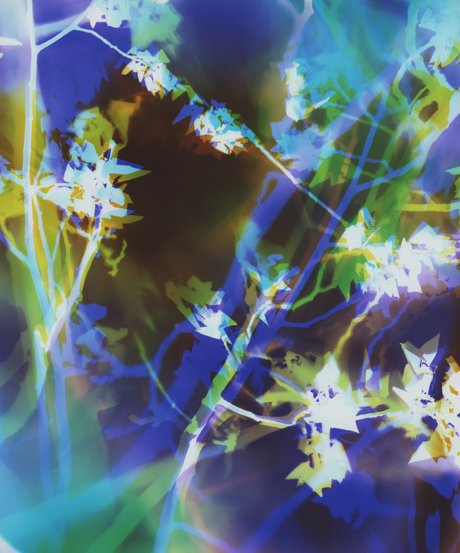
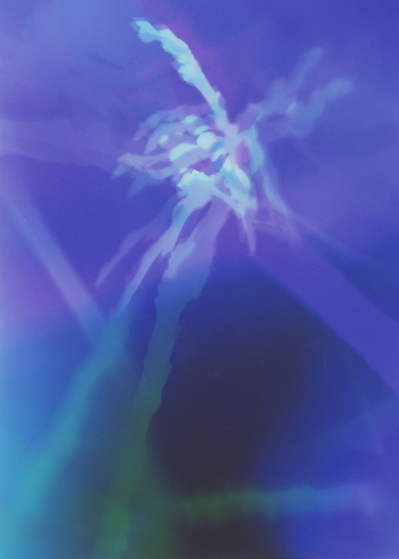
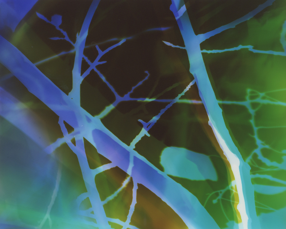
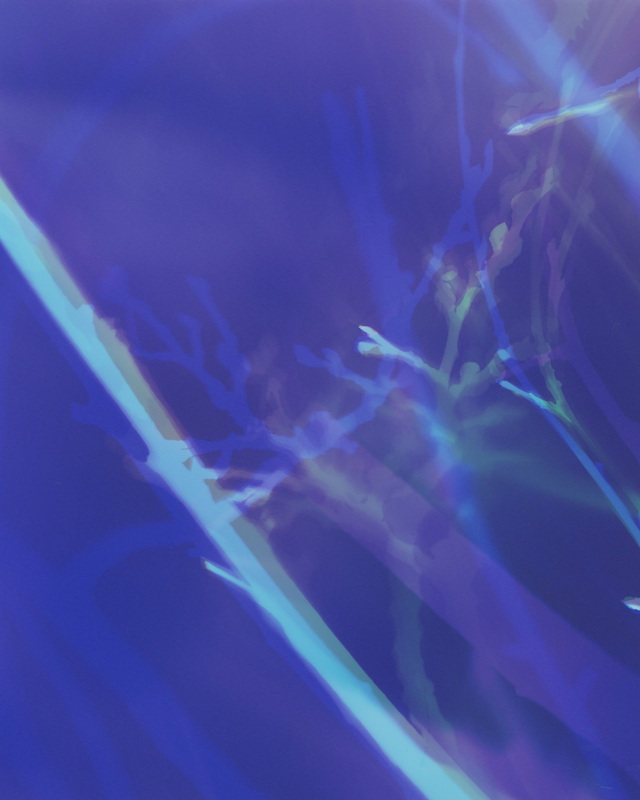
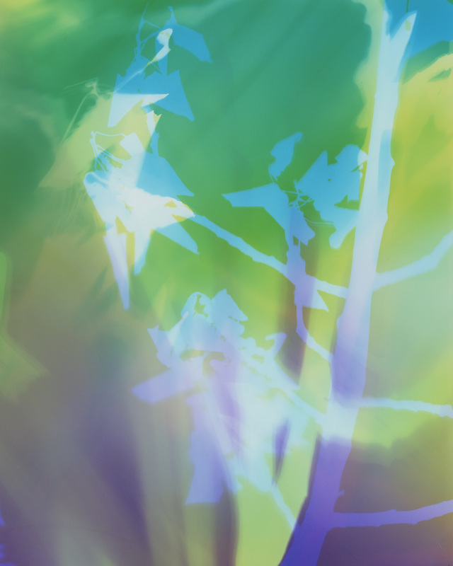
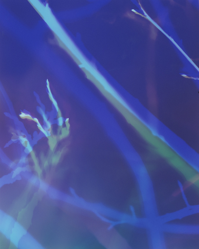
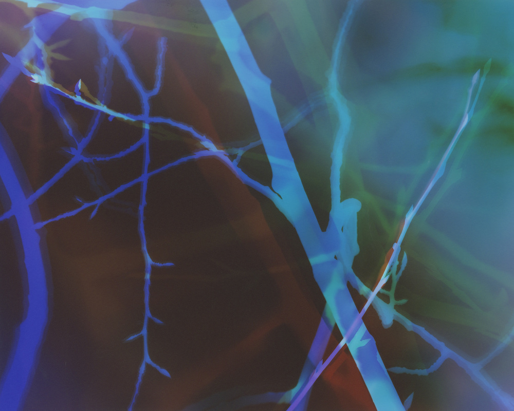
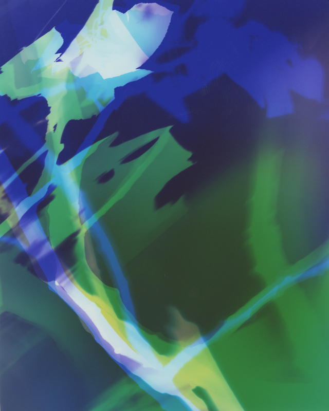
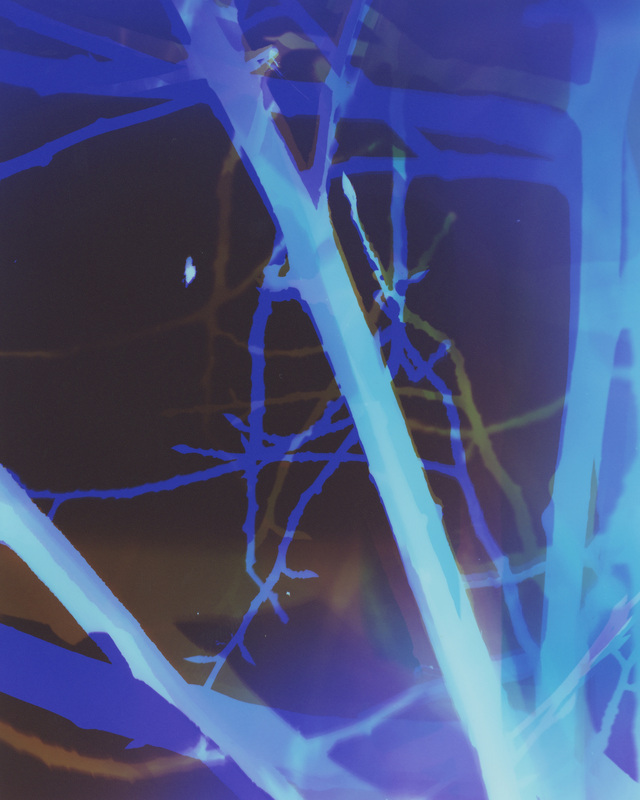
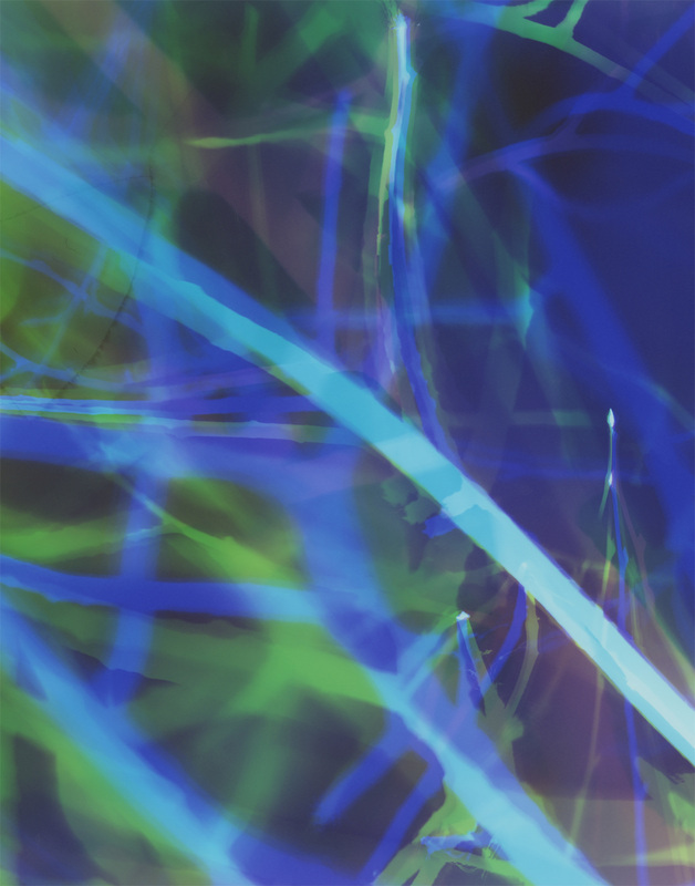
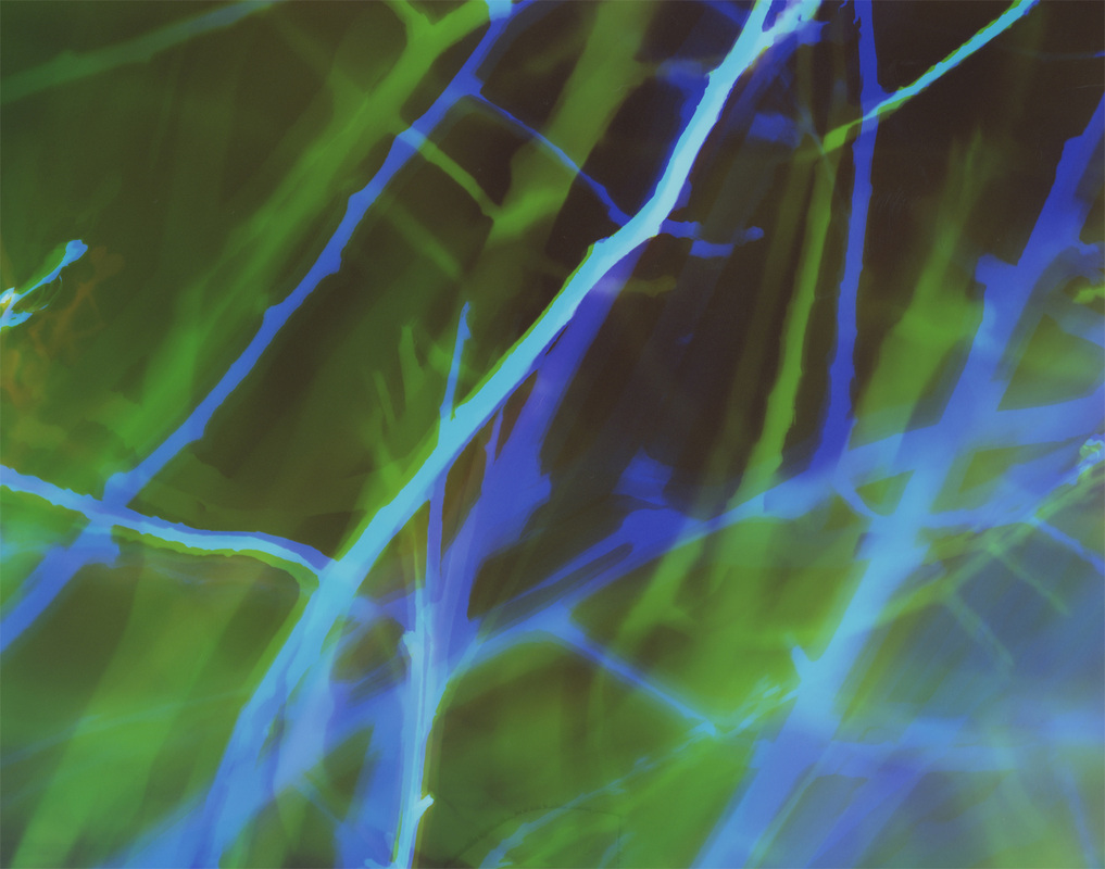
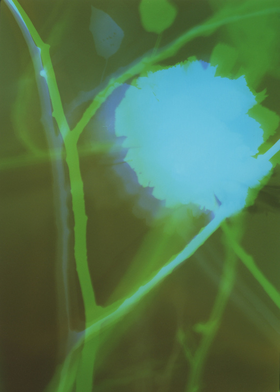
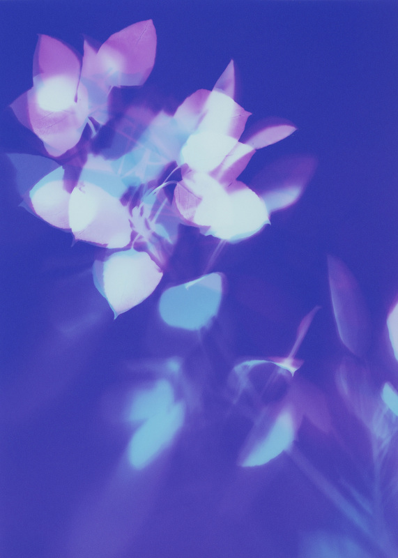
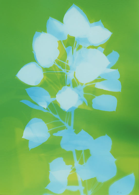
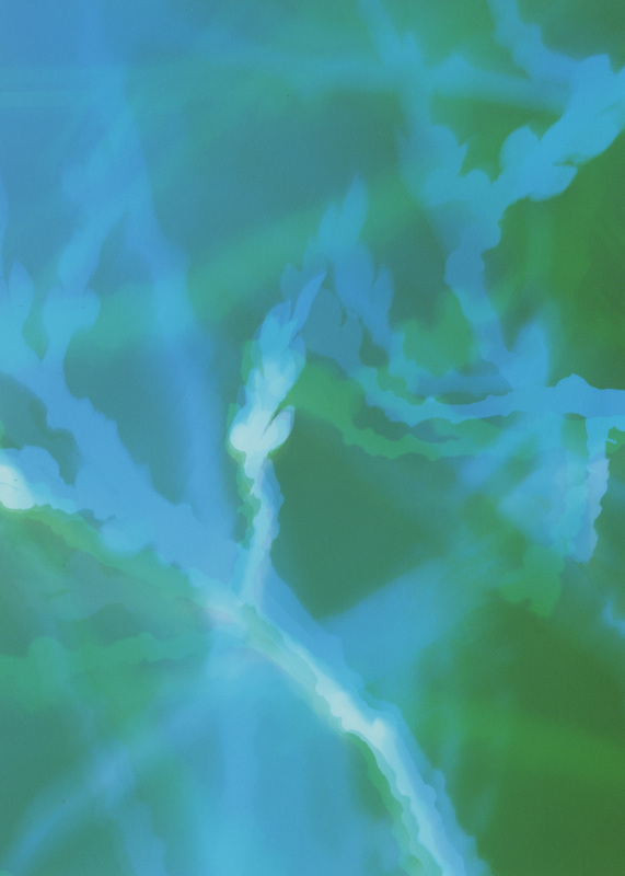
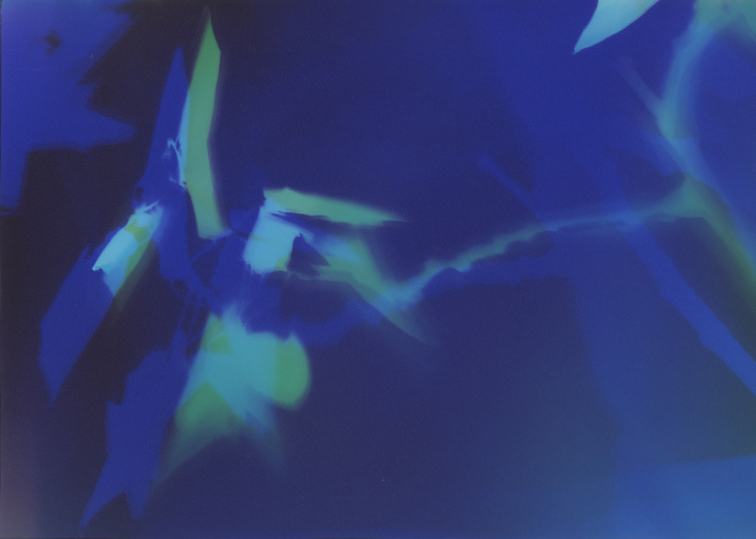
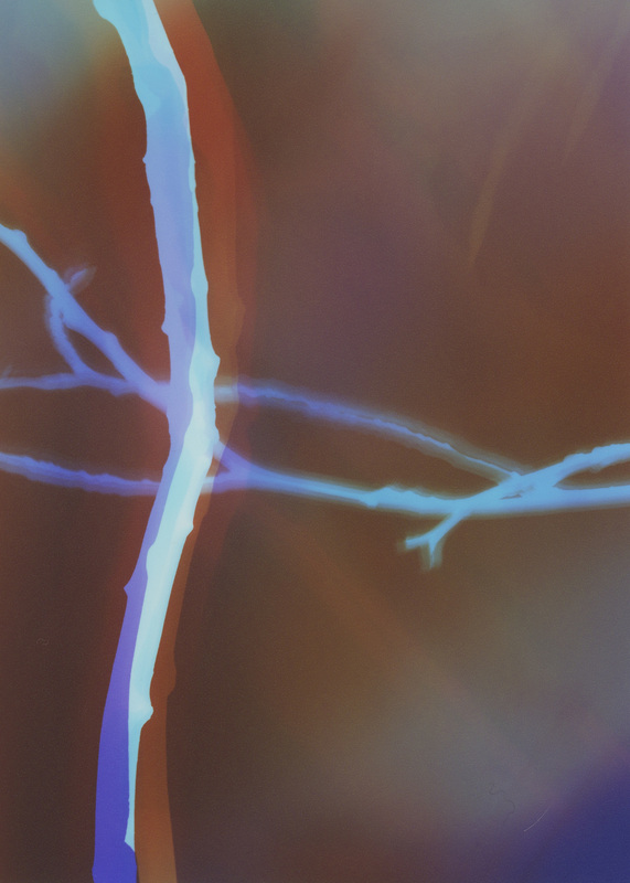
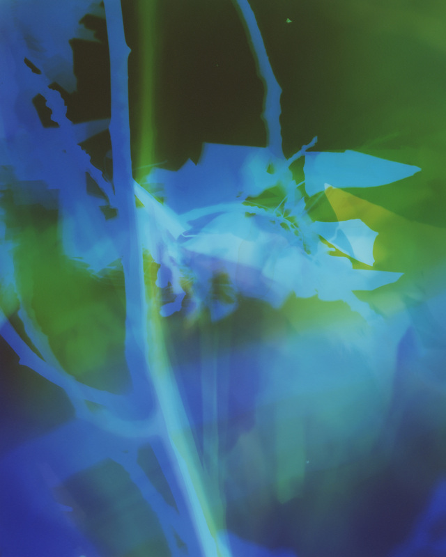
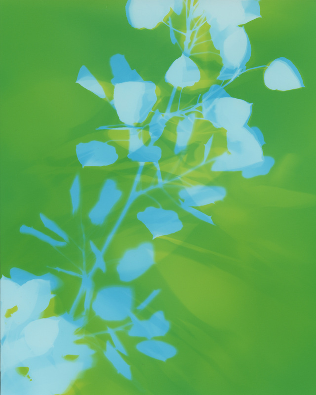
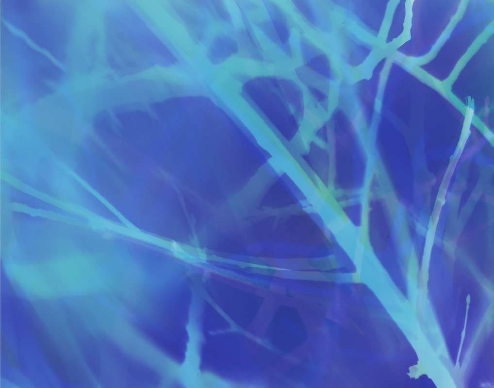
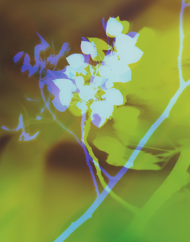
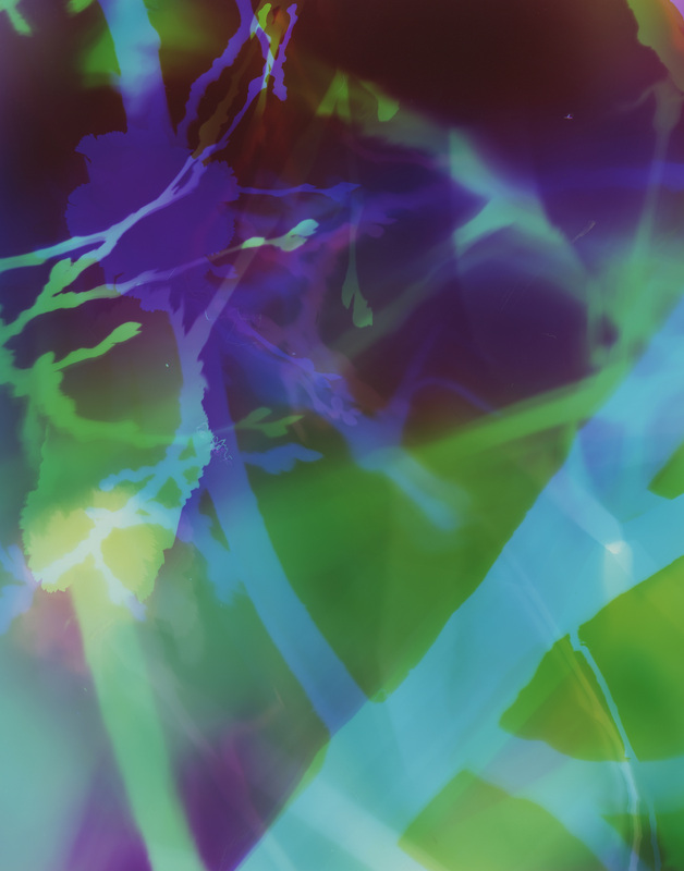
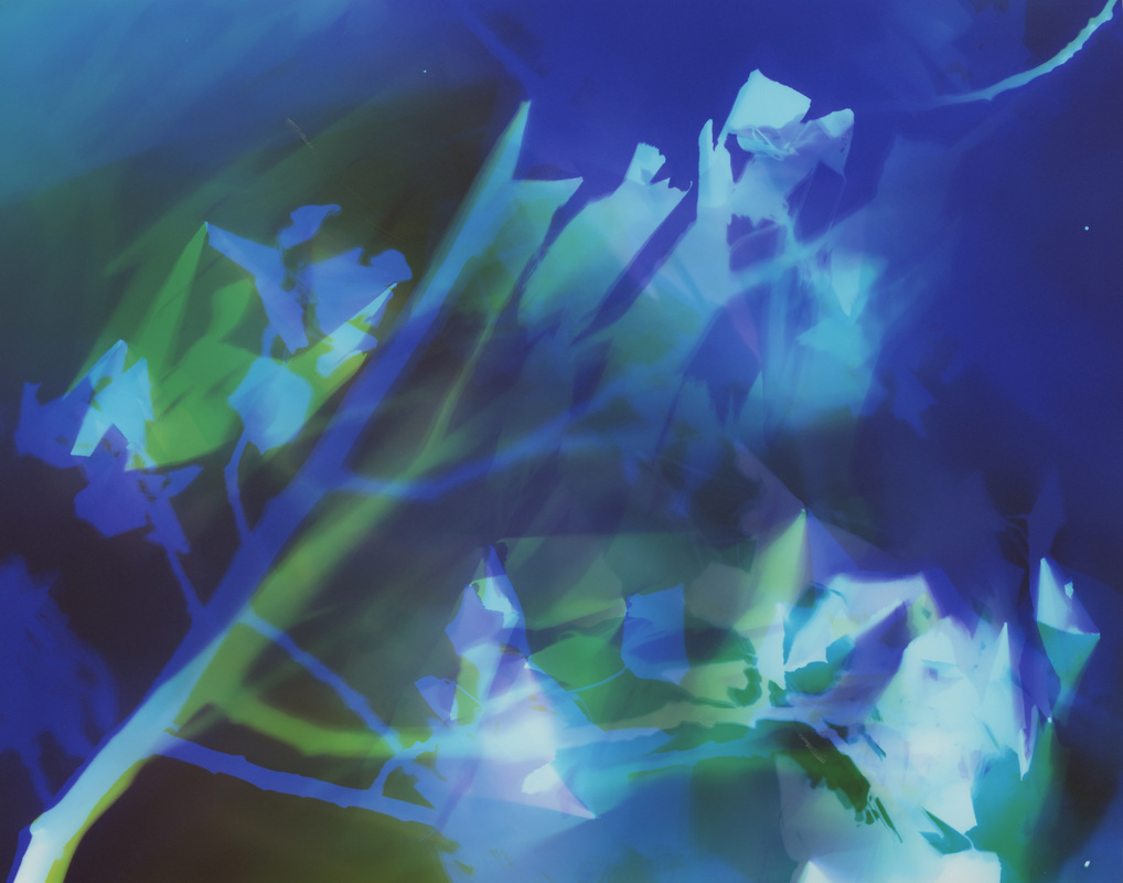
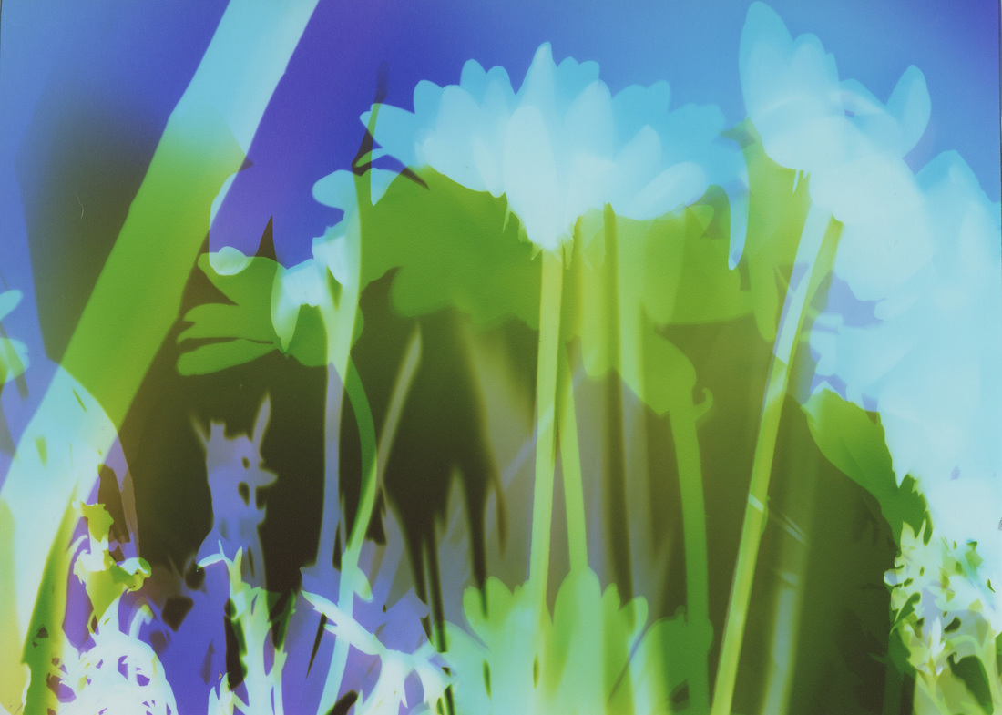
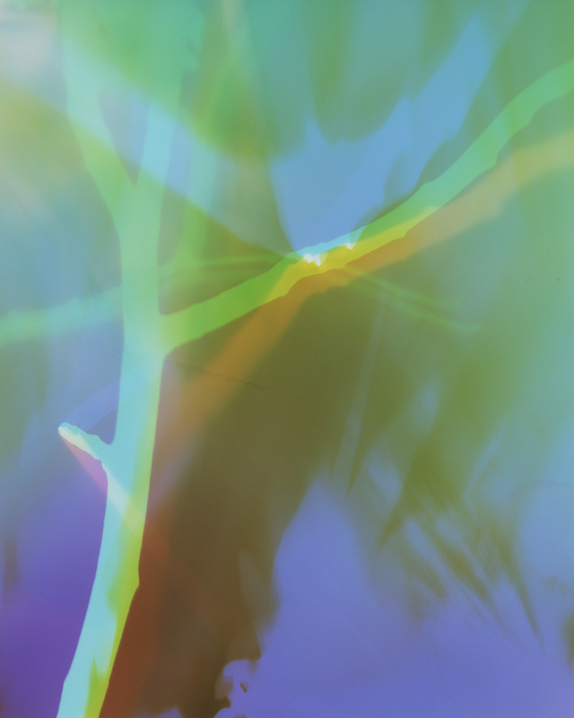
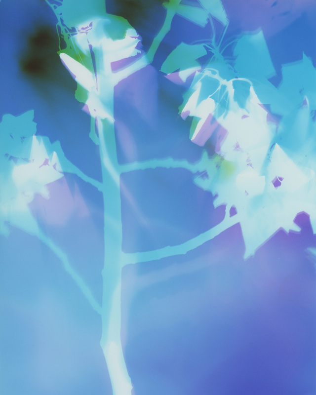
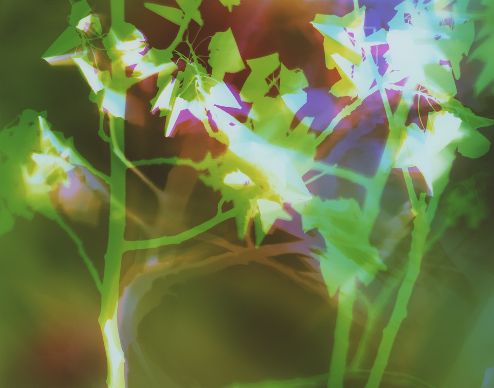
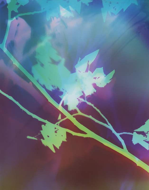
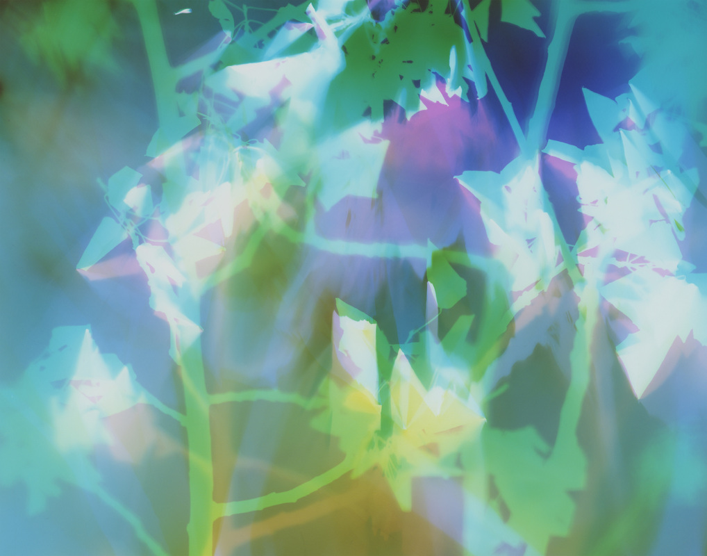
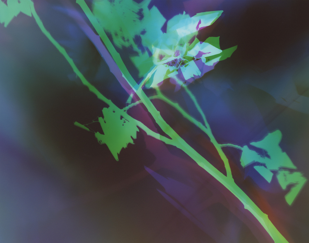
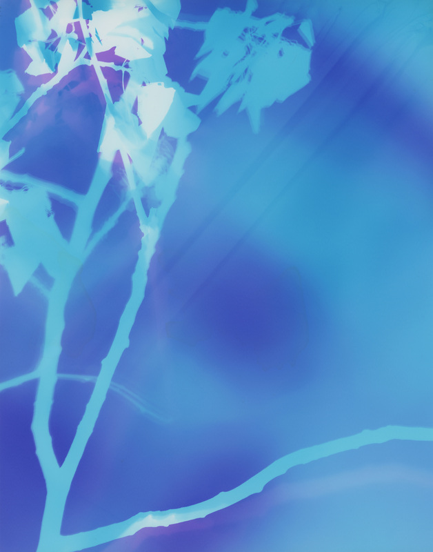
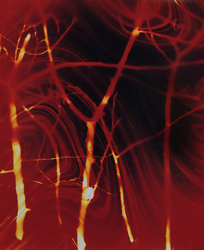
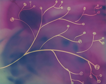
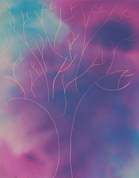
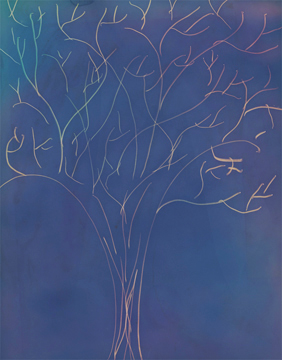
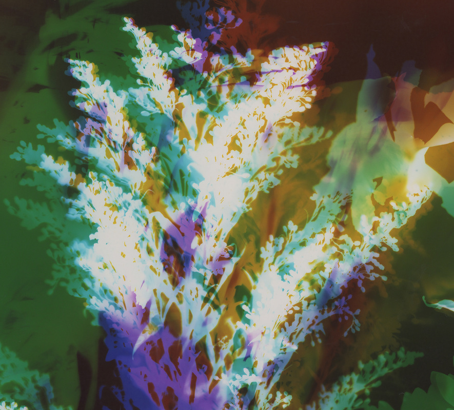
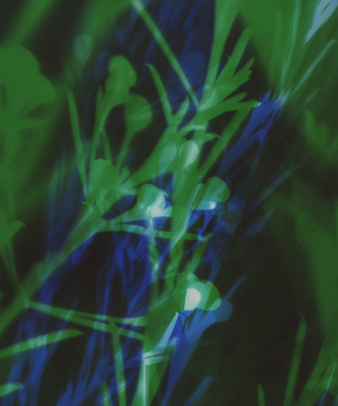
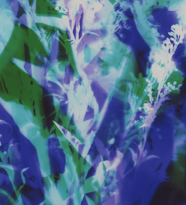
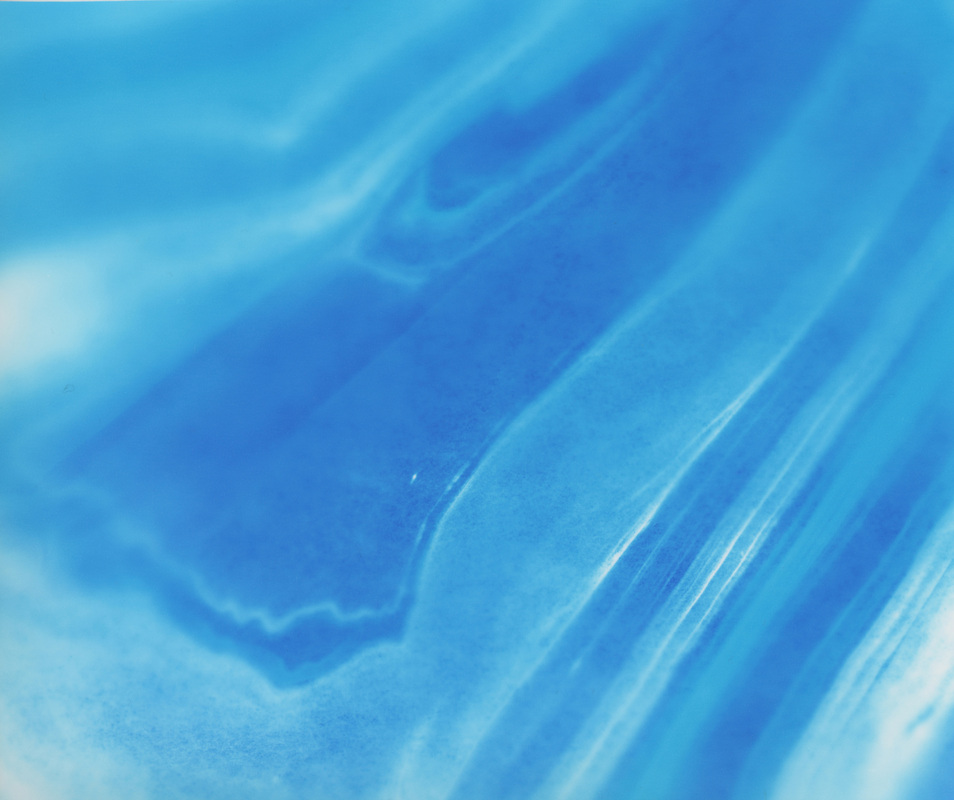
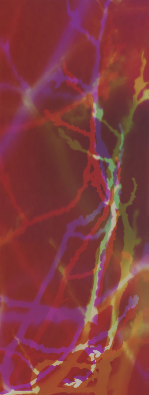
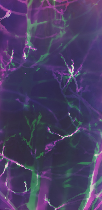
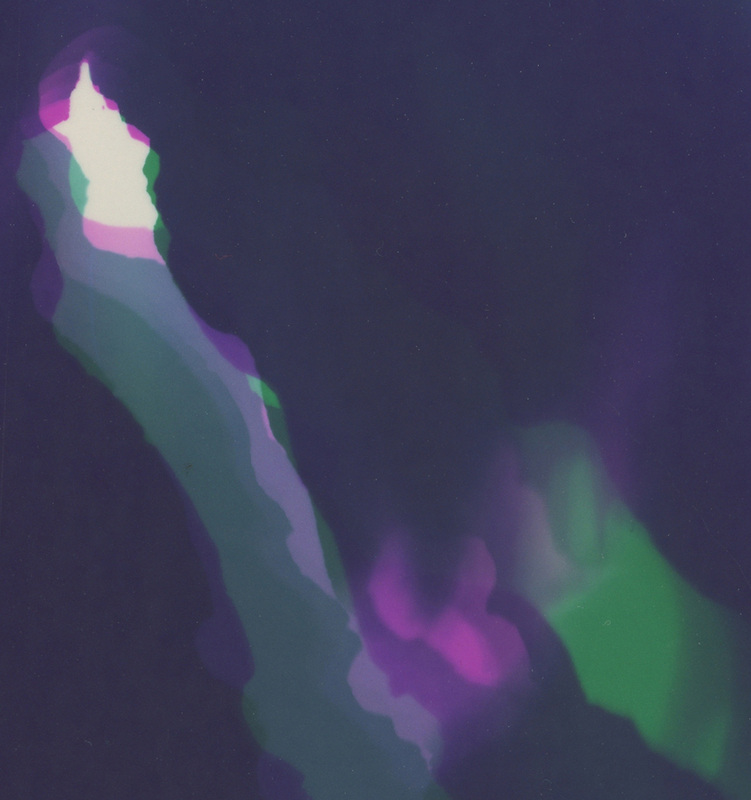
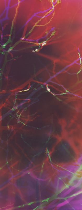
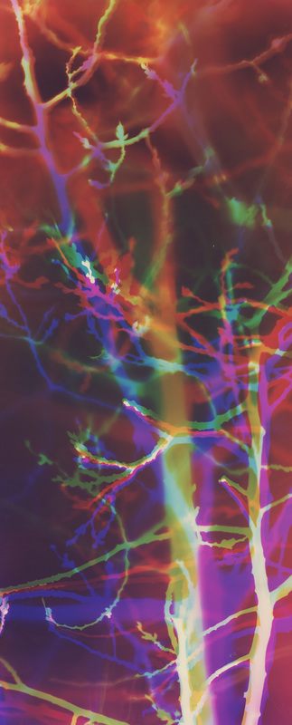
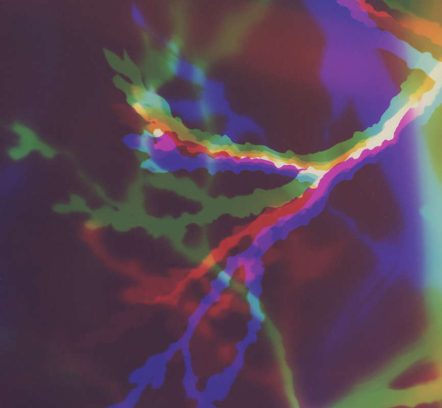
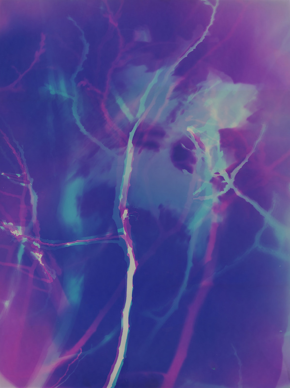
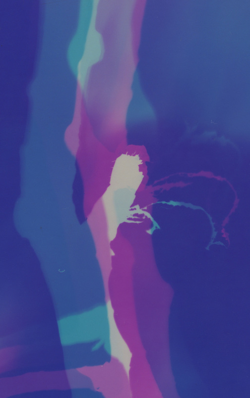
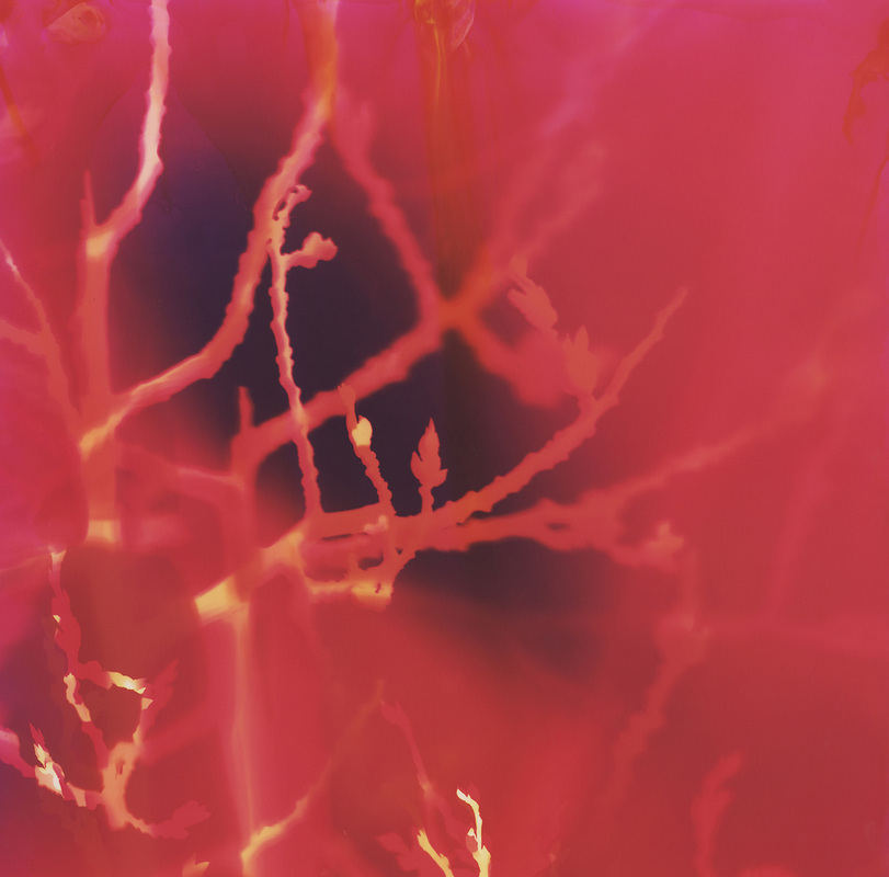
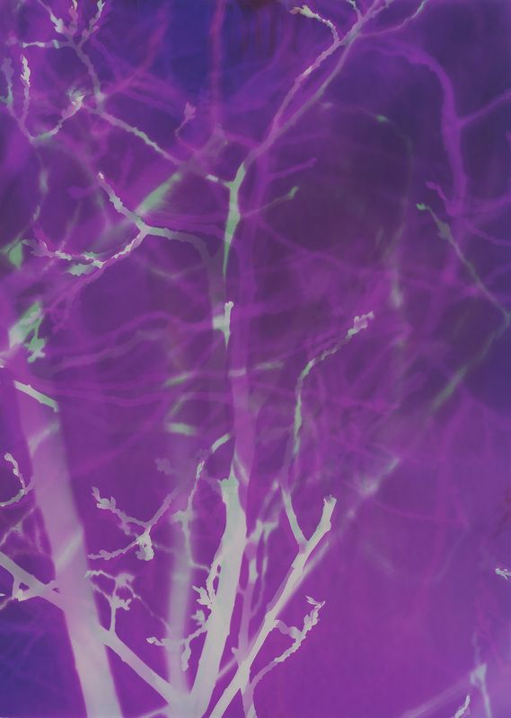
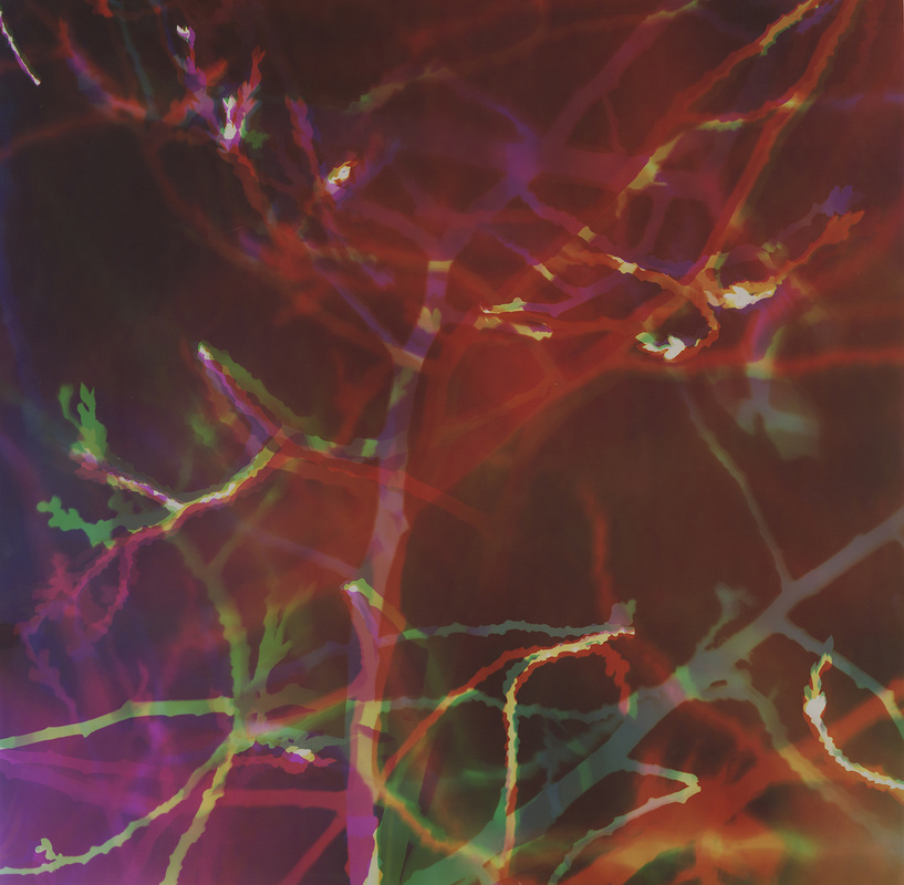
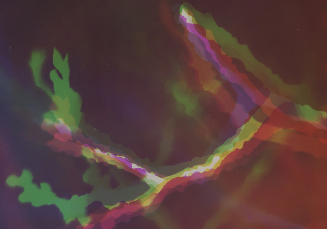
This lovely aspen tree in the front yard of my Bend, OR home has been the subject of many of my photograms. As it grows, it recently began brushing against the house causing undesirable noises and damage. My husband cut a significant portion of the tree down, and it easily became the subject for my 1st artworks of 2013. The detached branch measures approximately 4 feet wide by 7 feet long. This is much larger than my photographic paper, making it possible to find many different compositions within it.


I am most excited about the various and random sizes that I would not have otherwise invested in.
So, I delved into this stack for the 1st time and was pleased with the quality and outcome.
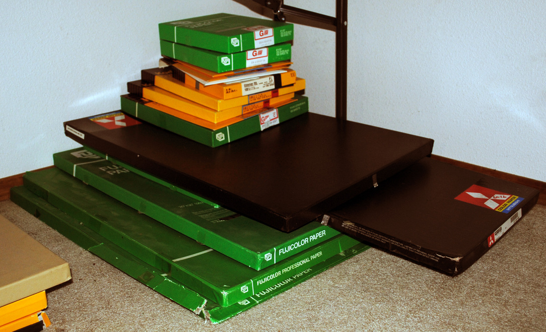
I expose various colors of light (LEDs) over the aspen branch in various locations of the photographic paper. Because photographic paper is designed for a negative, I use the opposite color of what I want the final outcome to be. And like paint, as the colors layer over one another new colors are made.
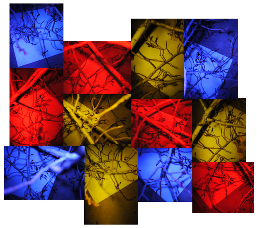
artwork + detail
(Click on the images to enlarge and see in slideshow format.)


If you have questions or comments I would love to hear them.
Much love to you all!
♥ Natasha
Welcome to my blog!
I am an artist working with light, combining contemporary & archaic processes to push the bounds of conventional photography.
In this blog I share information & images about my process, installations of my artwork, & more.
If you have questions or comments I would love to hear them.
Much love to you all!

Archives
August 2015
July 2015
June 2015
May 2015
April 2015
March 2015
February 2015
January 2015
December 2014
November 2014
October 2014
September 2014
August 2014
July 2014
June 2014
May 2014
April 2014
March 2014
February 2014
January 2014
December 2013
November 2013
October 2013
September 2013
August 2013
July 2013
June 2013
May 2013
April 2013
March 2013
February 2013
January 2013
Categories
All
Art In Every Room
Art In Hand
Artist's Dates
Collections
Curating
Darkroom Doodles
Epicurious Potato Heads
Galactic Series
Giveaway
Inspiration
Inspired By Nature
Installations
Licensing
Memento Mori
New Artwork
New Artwork
Newsletters
Performing Art
Preliminary Sketches
Process
Purchase
The Wine Series
Trades
Trees
Year End Review
 RSS Feed
