|
February Highlight: 
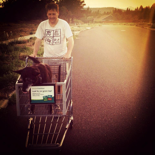
This artwork was created specifically for Arizona State University and sold to them in May 2012. It was installed last summer by Metropolitan Gallery, and this month I received installation photographs, taken by David Huff. Color Field 2.2 is displayed in Arizona State University's new student housing development, Casa de Oro, on the West Campus in Tempe, Arizona. 
Read and see more about this piece here. Other February News:
This Month's Blog Posts:
All of my newsletters include a discount code (not included in the blogpost). If you would like to receive my newsletters + discount codes sign up for my mailing list here. THANK YOU for all your support!
If you have questions or comments I would love to hear them. Much love to you all! ♥ Natasha
0 Comments
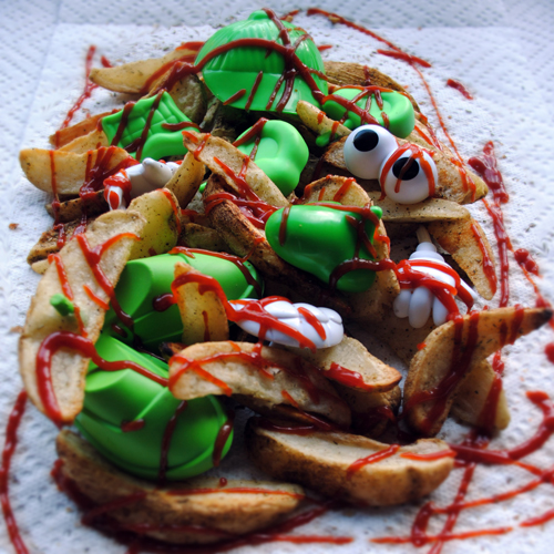
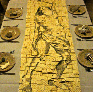
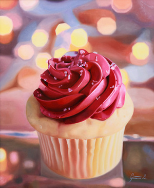
"An exhibition is idea-driven thesis and a curator's job is to find art to prove it." - Ted Decker, curator at Phoenix Institute of Contemporary Art. I am honored to be given the opportunity to curate my 1st art exhibition. After participating in almost 100 art exhibitions in the past 5 years I feel confident curating my 1st art exhibition under the given circumstances, and with the amazing world wide web at my fingertips research has led me to the following 10 steps: 1. Conceptualize Art Exhibition – CHECK! CONCEPT: an illustration of a variety of ideas about America’s relationship with food, featuring artists in Portland, Oregon. The obvious reason of location for featuring Portland artists is subsidiary to the food mecca Portland has become. Touted as a foodie destination, with more than 80 brewpubs and microbreweries, over 400 food carts, and renowned eateries such as Voodoo Doughnuts, Stumptown Coffee, Le Pigeon and many more, Portland artists have plenty of inspiration for gathering ideas. An intriguing juxtaposition between artworks, artists, and ideas will be exhibited. 2. Reserve Art Exhibition Space and Dates – CHECK! The exhibition will be in The Denizen Gallery at Milepost 5, a community for creatives in Portland, OR where I reside part-time. The exhibition will run from April 1st – April 30th with an opening reception on 1st Friday April 5th at 6:00 PM. 3. Procure Funding and Allot Budget – CHECK! Milepost 5 will be providing funding for printing costs. Food Not Bombs will be donating homemade vegan food for the opening reception. Gigantic Brewing will be donating beer for the opening reception. 4. Recruit Artists and Choose Pieces – IN PROCESS I am currently seeking artists to participate in the exhibition. I have a number of excellent participants already lined up, and I have several calls for art posted. Join or share the call for art on Facebook here. CALL FOR ART Details: Title: EPICURIOUS: America's Relationship with Food This will be a group exhibition featuring Portland artist's. Each artwork must relate to America's relationship with food. Artist may exhibit 1-5 artworks. Each artist will be required to post an artist's statement with their artwork. All work must be gallery ready. All media will be accepted. Selection Criteria: 1. Artwork -- quality and creativity 2. Statement -- how well developed it is and how well it relates to the theme Submit image(s) and artist's statement along with contact information by February 28th for consideration. On March 1st I will finalize my selection of artists and artworks and begin the next steps in the curating process, which I will blog about post-execution: 5. Write & Send Press Releases 6. Advertise & Send Invitations 7. Write Essay & Publish Catalog 8. Site Installation 9. Grand Opening 10. Take Down Exhibit In addition to curating this exhibition, I will participate by exhibiting the following artworks: Sweet Potato Head Muffins, 11x14 inch digital print Potato Head Fries, 20x20 inch digital print Potato Head Salad, 11x14 inch digital print 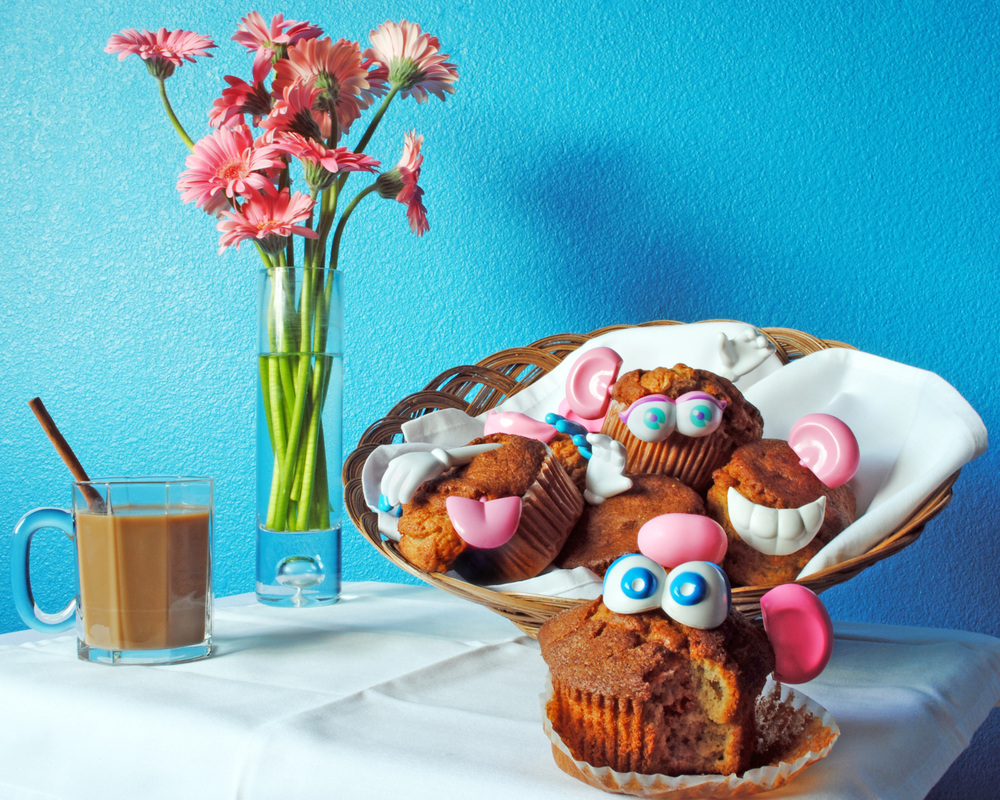  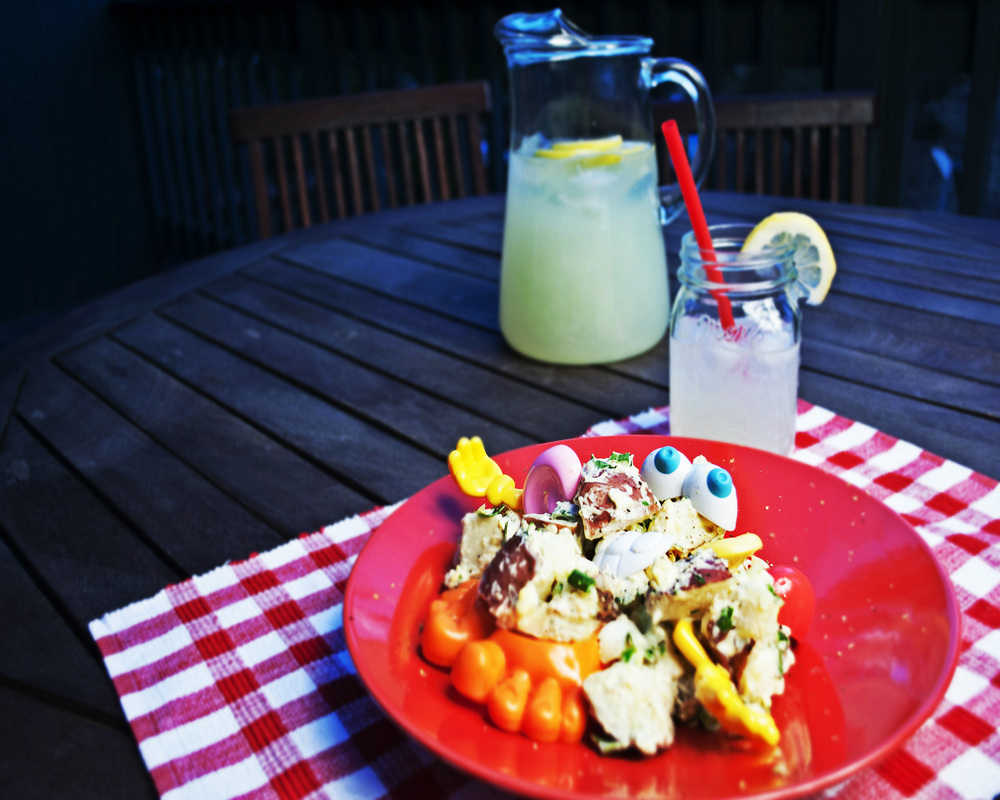 My statement about this series: "Epicurious Potato Heads is an exploration of American culture and the relationship we have with food. I anthropomorphize food by cooking potato heads and then memorialize them by photographing them. By ascribing human form and attributes to food we can more easily identify with it. Our anthropomorphic perceptions and ideas influence how we interact with the food. An emotional bond is created, and a personal relationship evolves between us and what we eat. Our relationship with food is not only the longest standing relationship in our life, but also the most complex. Food is much more than a simple fuel. It can be a sin, an escape, a reward, a comfort, or all of these at different times, making a balanced attitude toward food difficult to maintain. In addition to psychological influences, cultural attitudes, religious beliefs, and social expectations also shape the way we feel about what, how, why, when, where, and how much we eat. When we understand what precisely shapes our eating behaviors, we can cultivate a more harmonious relationship with our food. I invite viewers to become more aware of and actively cultivate a harmonious relationship with the foods they choose to consume." Below are 3 sneak peeks of artworks that will be in the exhibit:
Thank you for viewing!
If you have questions or comments I would love to hear them. Much love to you all! ♥ Natasha  This artwork was created specifically for Arizona State University and sold to them in May 2012. It was installed last summer by Metropolitan Gallery, and last week I received installation photographs, taken by David Huff.
Color Field 2.2 is displayed in Arizona State University's new student housing development, Casa de Oro, on the West Campus in Tempe, Arizona. Installation View 1:  Installation View 2:  Site Developer: American Campus Communities Site Design Firm: Sixthriver Architects More photographs of artworks installed at this site can be seen here. Thank you for viewing!
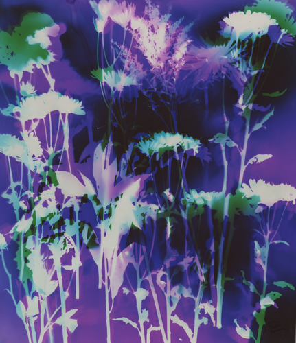
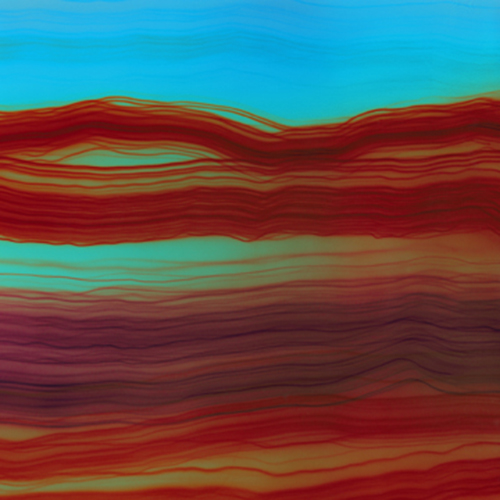
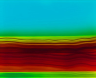
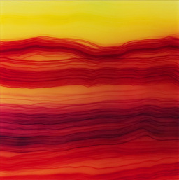
If you have questions or comments I would love to hear them. Much love to you all! ♥ Natasha I picked up these lovely flowers at Trader Joe's, and took them into the darkroom with me. 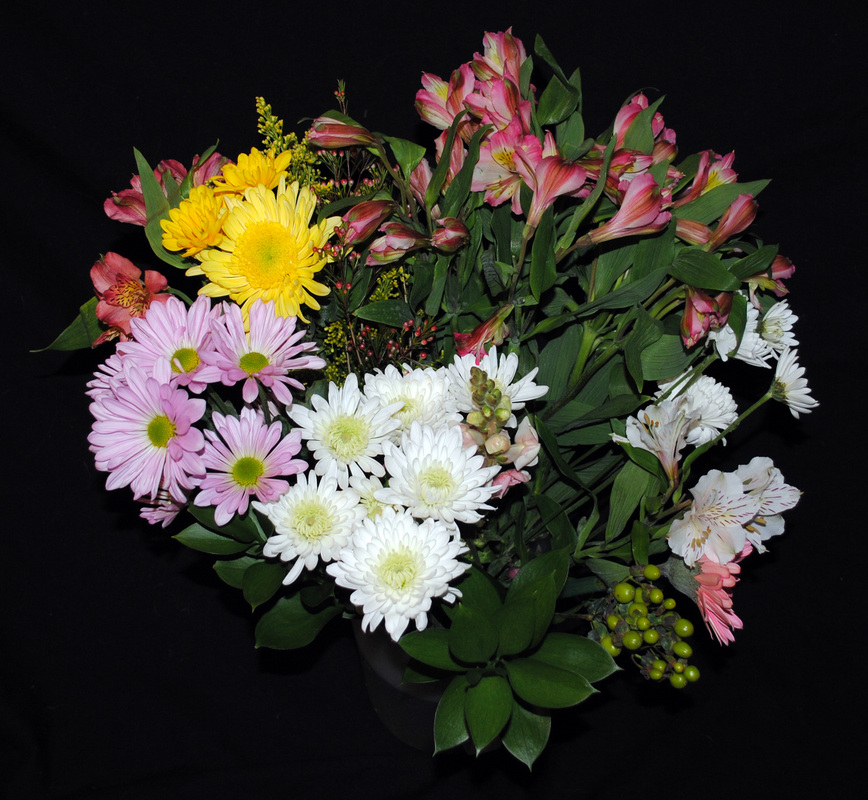 I laid them on photographic paper before exposing the paper to light. If I could see in my work in process, this is what this step might look like: 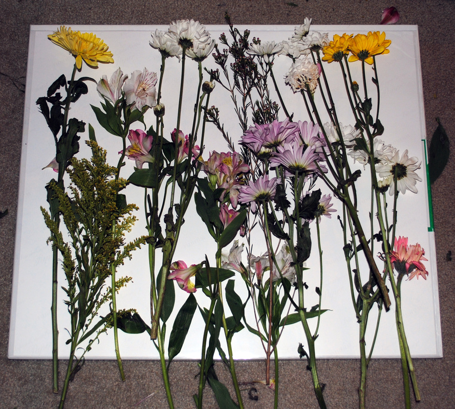 I exposed the paper to various colors and intensities of light with light-emitting diodes. If I could see in my process in time-lapse, this is what this step might look like: 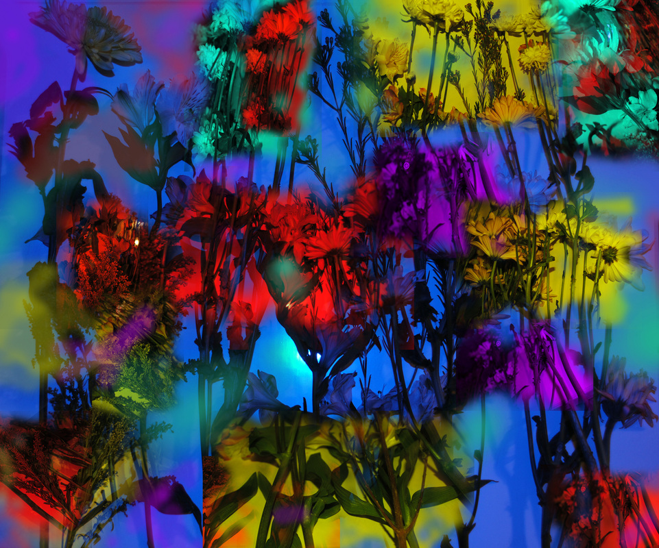 I work in darkness, and therefore feel more than see what I am working with. This allows me to create several pieces exactly the same but which yield different results. The 3 images below were all created the same. I used the same flowers, the same photographic paper, the same colors of LEDs. I placed the flowers in various locations on the photographic paper, feeling around the paper, and layering the flowers in different patterns. I then exposed the paper to the same amounts of the same colors of light, but in different places. green = purple | purple = green | blue = yellow | yellow = blue | red = cyan the mixed colors = brown | the white areas = no light The results are below. The top row is the final artwork, and under each piece are 2 details within the artwork. {Click on images to enlarge & view in slideshow format.} 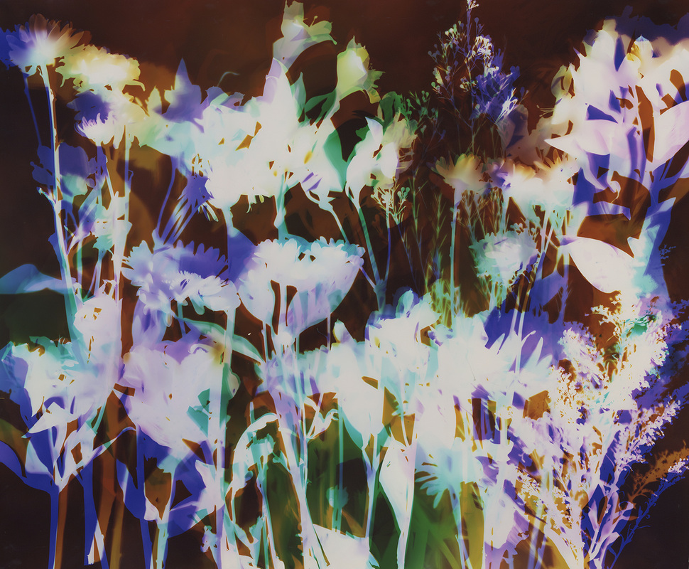 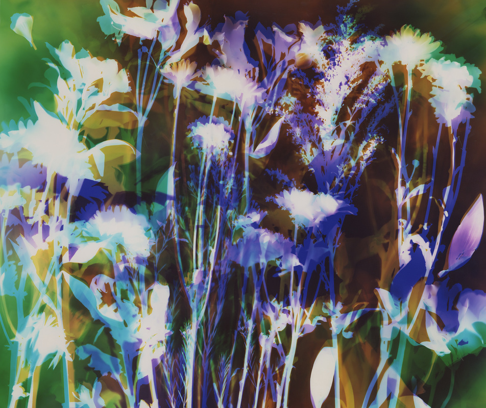 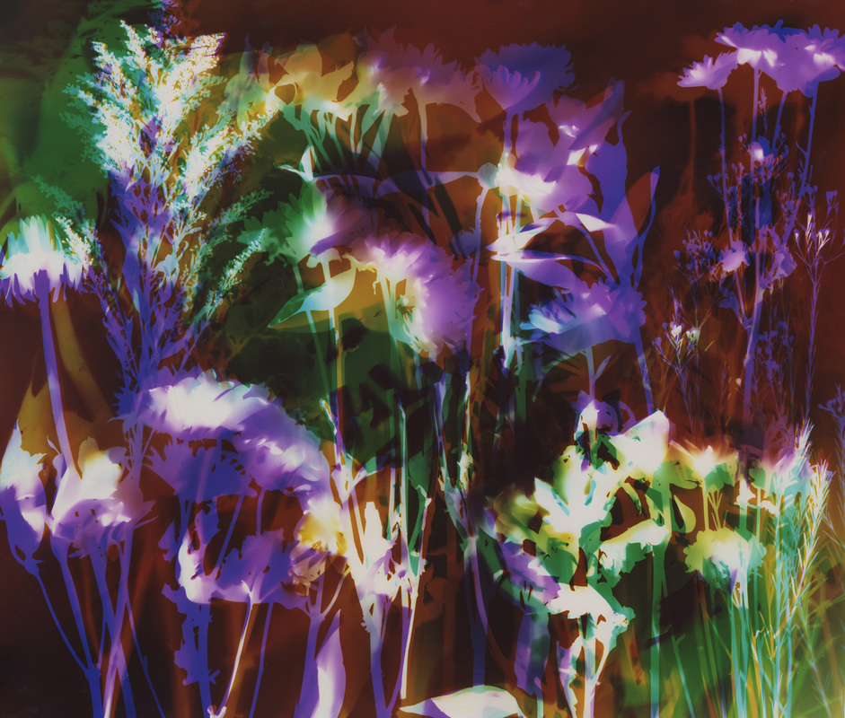 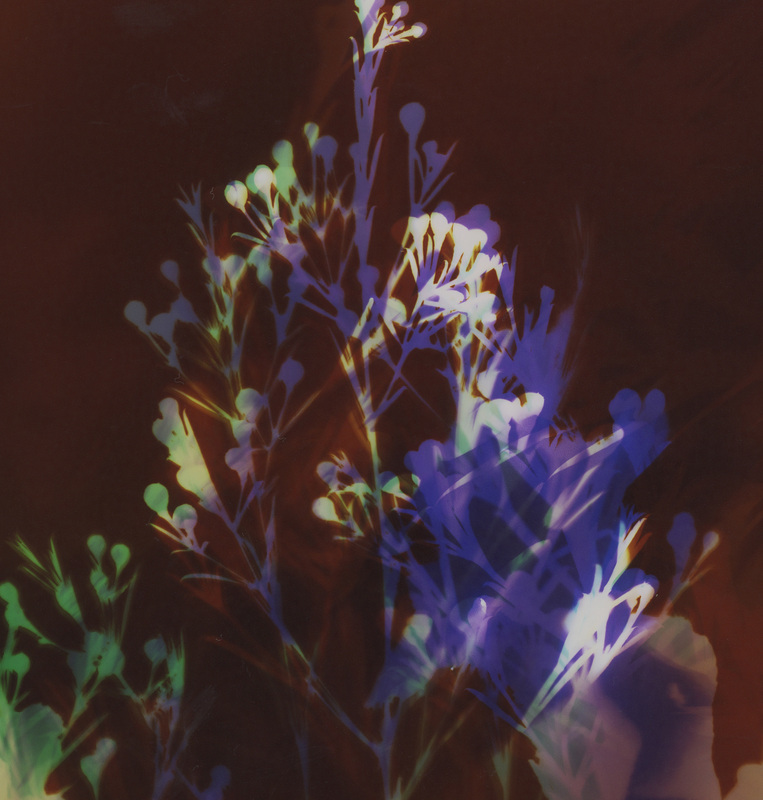 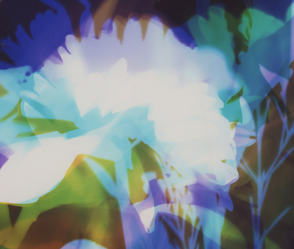 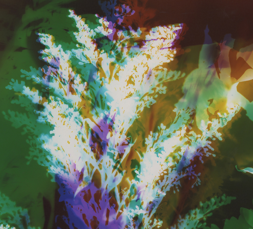 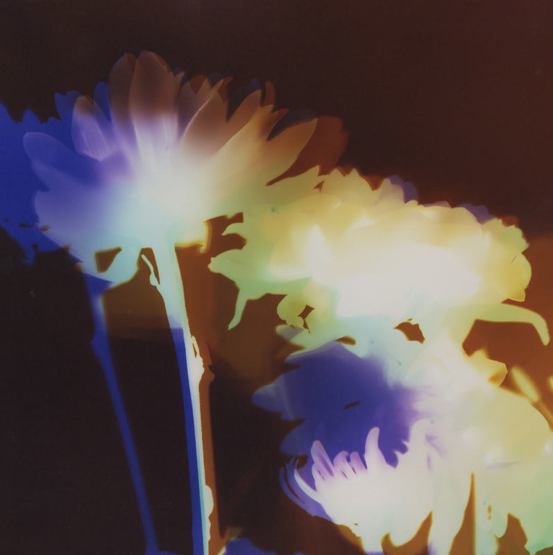 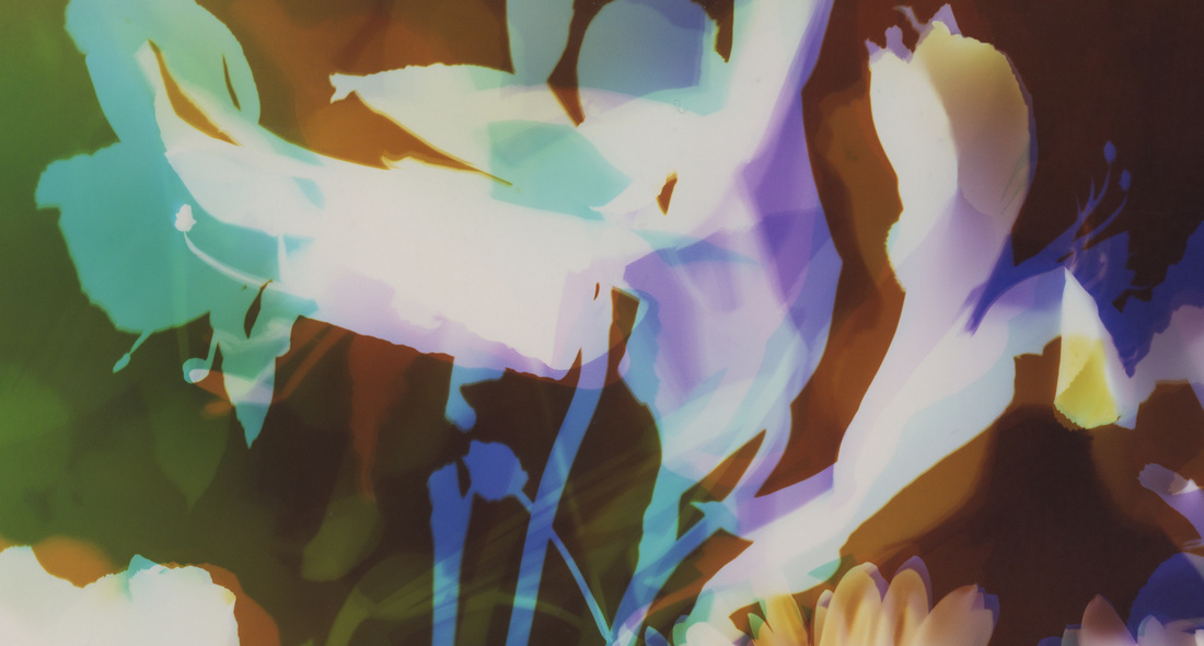 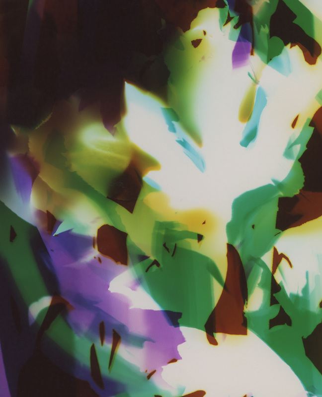 3 more artworks created similarly: The left and right pieces are more violet with green, while the center piece is more blue with green. I actually used the same colors of light (magnet = green & chartreuse = violet). The variation in color is a result of altering the temperature of my developing chemical. The top row is the final artwork, and under each piece are 2 details within the artwork. {Click on images to enlarge & view in slideshow format.}  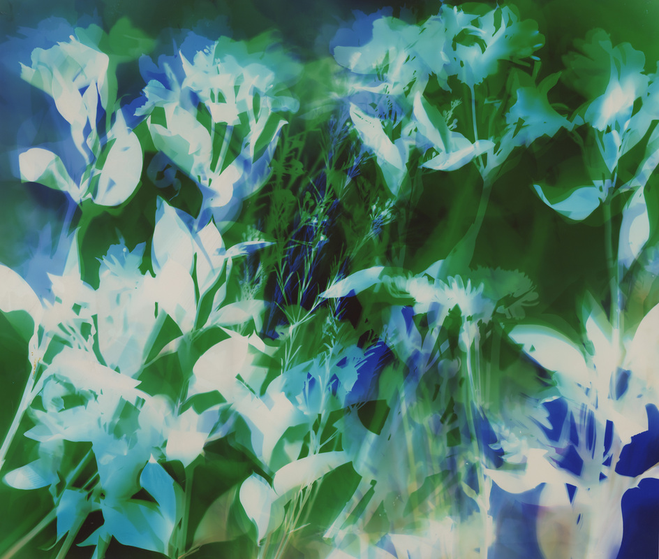 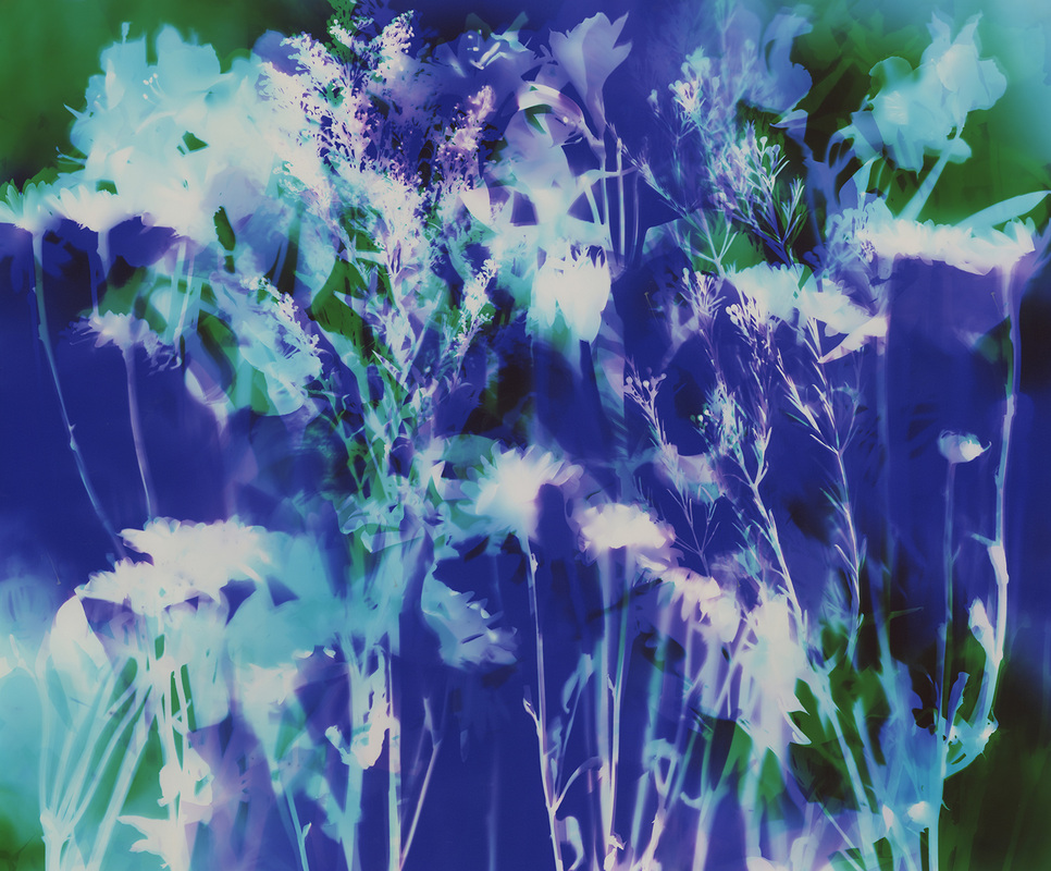  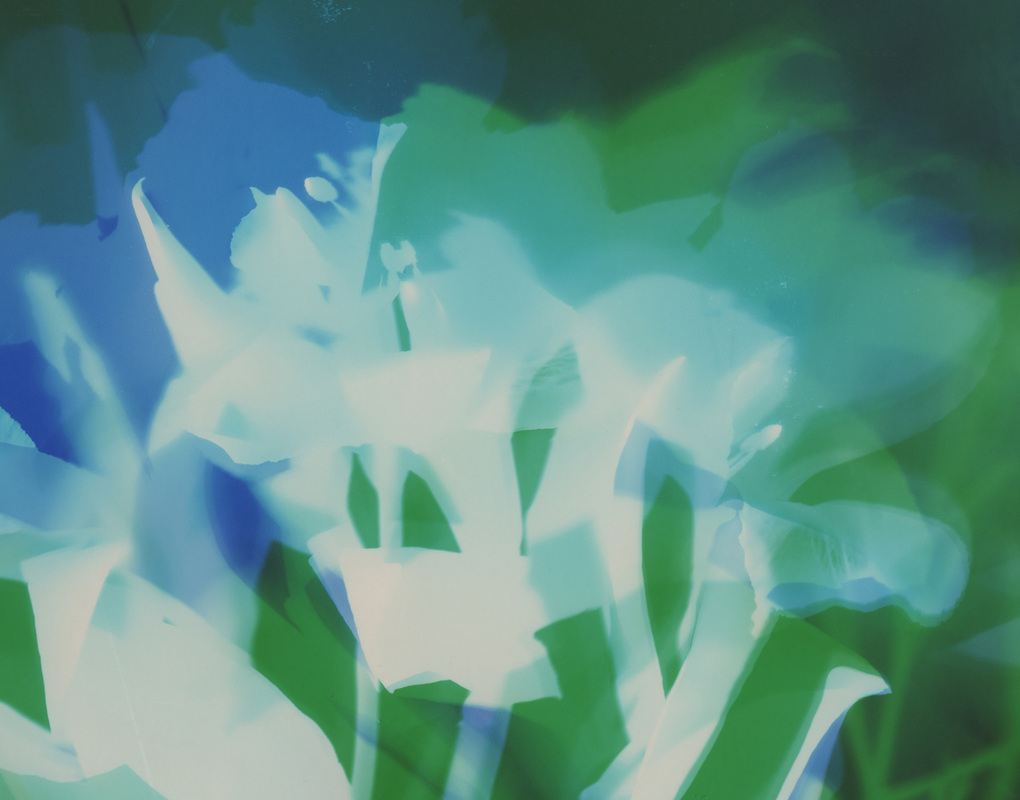 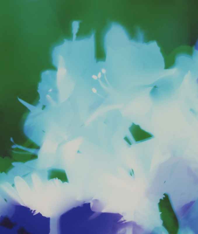  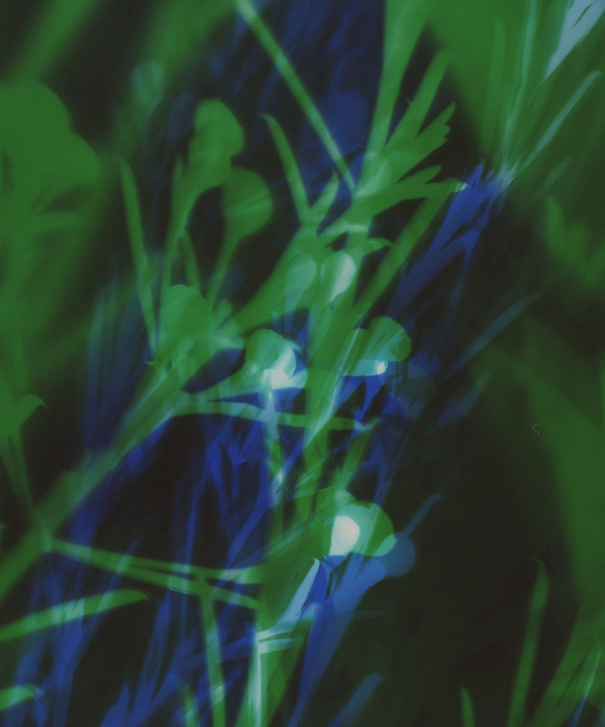 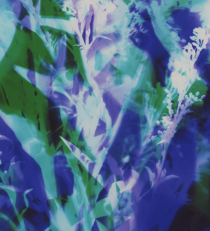 I never see my art piece until it is complete. While the light I emit allows me to see a bit, the paper remains white during exopsure. So I do not know how much of what color is where until after processing. Once the paper goes through the developing chemical the image appears, however the room is still dark at this point. The paper then goes through fixer which makes it no longer sensitive to light. At this point I can turn on the lights and see the results. This makes the process very exciting and magical for me! It is always a mystery until the end. The many variables including colors of light, intensities of light, temperature of the chemicals, and my manipulation make each piece the unique artwork that it is. So while I create many same, same pieces, they are all different. Thank you for viewing!
If you have questions or comments I would love to hear them. Much love to you all! ♥ Natasha |
Welcome to my blog!
I am an artist working with light, combining contemporary & archaic processes to push the bounds of conventional photography. 
Archives
August 2015
Categories
All
|


 RSS Feed
